

Hailing its roots from the much-prized Modern Didot and Bodoni families of the late 19th century, Pyes Pa re-introduces the intuition of calligraphic script while utilizing the contrast available to contemporary digital fonts to produce a highly refined alternative for those of us who are bloody serious about our Bodoni Poster Italics. Pyes Pa features automatic OpenType ligatures and contextual alternatives.
OTF | 3 Fonts | JPEG Preview | 1.5 Mb RAR


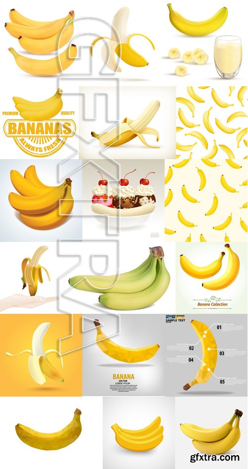
69 JPG | 1920x1200-2560x1600 | 109 Mb

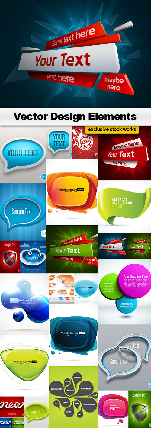
PSD | 4000x3000 PIX | 43.4 MB


PSD | A4 and US Letter Sizes | 121 MB


Being inspired by early Czech type design, Maiola is clearly a contemporary typeface, that is mindful of its historical heritage, implementing old-style features and calligraphic reminiscence, more frankly so in the Italic. Nevertheless, through its personality, it attempts to create a welcoming tension on the page, without shouting too loudly at the reader. It handles its expressive tendencies with care and in doing so increases its usability, with legibility being of great importance. Subtle irregularities of the letterforms enhance furthermore the dynamic spirit and liveliness of the typeface. With the advent of Opentype, allowing for bigger character-sets and better language support, as a natural consequence, Maiola Multiscript covers Latin A, Cyrillic and Greek. Although basically independent from each other, they are, however, designed in the same spirit as the Latin, and harmonize well in multilingual text settings. The update to this beautiful font family includes the addition of over 240 glyphs featuring new ornaments, stylistic alternates, ligatures, superior letters, fractions and more. Furthermore, several glyphs were significantly improved and the kerning was fine tuned for better performance. Originally released in 2005, Maiola was an immediate success. It won the renowned TDC competition in 2004 where it was also recognized as a “judge’s choice”, was part of the touring exhibition e-a-t, and was selected in the Creative Review design competition in 2005.
OTF | 6 Fonts | JPEG Preview | 5.5 Mb RAR

Arbotek has the original skeleton that the author used for the development of his typeface Arboria, a real ‘architect typography’, with a basic and radical approach to pure geometric forms. The three basic styles - Thin, Light and Light Rounded - try to approach the cartographic technique annotations and their output on plotters. The voluptuous style, Ultra, keeps the same structure of the Light versions, but develops as a historic Art Deco variant of this 20s and 30s graphic style.
OTF | 4 Fonts | JPEG Preview | 4.9 Mb RAR


EPS, AI | Print Dimensions: 8.267x11.69 | Layered | 63 MB


Dope VST Bass Engine v1.1 WIN x64 VST-MATRiX | 1.07GB
In our experience there are generally two types of bass synth, the 30Gb monsters that have twelve velocity layers on each note, multiple round robins and an unlimited number of options or the contemporary plug-ins that are aimed at electronic producers who love the real low end bass and 808 sound. Bass Engine is the brand new alternative…
SermonBox - Seasonal Collection

SermonBox - The Series Pack Collection

Top Rated News


Would you like to be a Author?


