
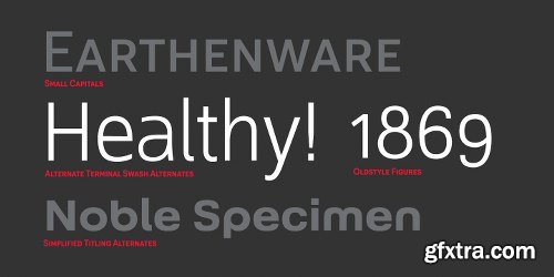
Rieux Font Family - 6 Fonts $150
Named after the steadfast doctor from Albert Camus’ The Plague, Rieux is an even-tempered slab-serif that is confident without being cocky and approachable without being casual. The aesthetic of Rieux is inspired by the industrial age. While the design is not directly derived from typefaces of that era, the shapes of letter-forms are informed by images of over-sized steel machines and the monolithic brick buildings that housed them.
Rieux is available in 5 weights and is ideal for uncatalogued, magazines, short publications and company collateral. In addition to supporting Western, Central and Eastern European languages, Rieux includes an array of OpenType features to provide a range of typographic options.
OTF| RAR 435 KB


http://www.myfonts.com/fonts/matteson-typographics/open-serif/
OPEN SERIF - answering the question “what font pairs well with Open Sans?”. Designed by Steve Matteson for extraordinary legibility and comfortable reading on screen and in print. Open Interpretation: Not quite Veronese – not quite Egyptian. A dash of panache in an otherwise sturdy serif typeface. Open Serif is an elegant text and display typeface family. Open Interiors: Visually open and legible at text sizes just like its cousin Open Sans. Open Serif reads smoothly but has an energetic texture. The chancery style italic contrasts nicely to the roman in a full bodied nod to Italian Renaissance forms. Open Type: Open Serif is full of OpenType features including Small Capitals for the Roman, Italic Swash Capitals and Old Style Figures for both. Open Translation: Supporting all the languages available in Open Sans, Open Serif completes the translation capabilities of international companies. Extended text is more pleasant to read in a serif typeface so go global with a unified typeface family! Open Face: Open Serif Titling is an elegant companion to round out the family. These ‘open-face' capital letters are ideal for initial letters, mastheads, titles and decoration.
OTF | 12 Fonts | + JPG Preview

CM 763510 - Ghisella
Ghisella is a interconnected font with beautiful welded letters. The font contains beautiful smooth and elegant letters and is great for creating cards such as wedding invitations and birthday cards but also can be used to create beautiful signs and decorate various items. This dynamic font comes with a sister font: Ghisella Two. Ghisella Two is a basic font with huge letters. Both fonts are compatible with Cricut Design Space and Silhouette Studio. The font is PUA encoded and can be used with Windows Character Map and Mac Font Book. Obviously the fonts also work with Adobe Photoshop, Illustrator, MS Word, Publisher and many other applications. Also supports in program, Adobe IllustratorCS, Adobe IllustratorCc, Adobe Photoshop, Adobe InDesign, Corel Draw X version, Microsoft Word.


OTF
Danos is a flexible family of modern sans serif and characterized by some humanistic. It has his own unique style in expressed perfect condensed forms, inspired by the classic industrial grotesque and geometric typefaces. Danos is an ideal font family for display, text, print, user interfaces, mobile devices, branding, signage, and especially web design creation, with a set of minimal ligatures and alternative characters for your design in any layout. The family has 18 weights ranging from Thin to Black and their italic.
Previews


OTF
Inspired by Art Deco packaging, Rosa fits comfortably into that classic genre. It’s namesake in the collection of La Sociéte Parisienne de Savons is described thusly: In mythological legend, Chloris, the goddess of Spring flowers transformed the body of a nymph into the first Rose. Aphrodite gave her beauty. Dionysus, the god of wine gave her a sweet fragrance and the Three Graces, charm, joy and radiance.
Equally compatible with Machine Age, Streamline, Moderne and even Memphis design motifs, it presents the unique option of serving as both the typographic and decorative components of a design. Use Rosa to evoke a sense of elegance, high style and historical context.
Previews


OTF
As designers, we seek perfection and originality. The more we step back and look at our work, the more changes we tend to find necessary. Drastic modifications are inevitable.
The same is true of Grayfel. Grayfel began as an exercise at insigne to explore the crowded space of neutral sans. While the world of sans serifs is admittedly crowded, I still managed to find something new and different.
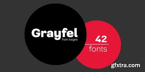
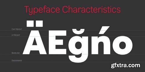
The final Grayfel consists of 42 full-featured OpenType fonts containing three widths: Regular, Condensed, and Extended. Every width consists of 14 fonts--seven weights with matching italics, making it a good companion for setting clear text and headlines for print and screen. OpenType features are also available. There’s figure choices, such as proportional and old style figures. Additionally, Greyfel includes sophisticated typographic attributes: ligatures, fractions, alternate characters, small caps, superscripts and subscripts. Its extended character set supports Central, Western and Eastern European languages.
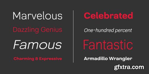
Optical compensations also mean the outcome of this family is a hybrid of humanistic proportions. It’s a well-finished design with optimized kerning gives it a friendly look. If you like sans serifs within the tradition of Futura, Helvetica, Avant Garde and Avenir, then you’ll love Greyfel, too.
Grayfel works well in a variety of applications. Subtly neutral yet fun, it’s suitable for headlines of all sizes as well as for text. Put it to the task for marketing, packaging, editorial work, branding and even on-screen projects. Try it out: it’s not just fun and playful; it’s Grayfel.
Previews

Acherus Grotesque Font Family - 16 Fonts $180
Acherus Grotesque is a sans serif font family. This typeface has sixteen styles and was published by Type&Design. Acherus Grotesque includes 10 OpenType features including Proportional Figures and Standard Ligatures making this font a great value. Acherus Grotesque has extensive Latin language support.
OTF | RAR 530 KB

Gordis Font Family - 6 fonts: $125.00
Gordis is a letter to display ideal for situations humorous and tender, based on rounded shapes that weigh about their weight. It comes in three versions combined Open Type, which can be used in layers for special effects.
OTF | RAR 419 KB

http://www.myfonts.com/fonts/kontour-type/odile/
Odile is a text typeface with bracketed head and bracket-free bottom lower case serifs, a quality that counters rigidness most traditional slab serif typefaces possess. This contemporary design draws inspiration from an experimental typeface named Charter originally designed by the American book and type designer William Addision Dwiggins. It consisted of an informal lowercase alphabet, a narrow seemingly non-inclined vertical letter with script attributes, featuring non-joining letterforms. Dwiggins’ contemplated Charter as the italic companion to Arcadia, Experimental No. 221. The Charter project progressed sporadic stalled during the Second World War and came to a halt in 1955. Charter remained incomplete and was never commercially released. Assessing Charter’s whimsical design, its fragments were rethought and developed into a comprehensive text family. Odile Upright Italic reveals recognizable similarities shared by Dwiggin’s Charter and defines the design approach for the family. The steep calligraphic outstroke and low junctions off the stem as in the upright italic “n” or “r”, for example, are gradually lessened in the italic and moved up for the roman weights. The six optically balanced weights range from the delicate Light to stark Black, accompanied by display variants with feminine flair and ardent Ornaments. Two sorts of Initials, one amplified with interweaving swashes, the other more restrained, both are clearly derived from the Upright Italic. This mid-contrast serif offers a wide range of tools for text and display typographies with a palette of strict to playful. This family shines in magazine, book and display use. The graceful serifed type harmonizes perfectly with Elido, Odile’s sans companion. Sans and serif share the family array and OpenType features in perfect tune. Odile offers an extensive character set, numerous OT features including roman and italic Small Caps, five sets of numerals, alluring ligatures, and many more. OT stylistic variants (with accents) offer a one-story “a” for the roman weights, alternate “g” and “s” designs for the italics, and a variant “s” for the Upright Italic.
OTF | 8 Fonts | + JPG Preview

CM 866424 - Mishall Typeface
Mishall Typeface a vintage typeface. Suits best for any vintage themed designs, logo, headline, letterhands tshirt, apparel etc.
• Over 124 glyps
• Bonus 16 vector
• Bonus grunge vector


Proudly presenting this typeface inspired by the classics DIN, Eurostile and a dash of Futura. Perfect for prints, t-shirts, posters and such.
HTML, OTF | 348 KB
https://creativemarket.com/daniel.feldt/765649-Frank-Display-and-signage-typeface

Modern ink Alphabet font. Letters painted with brush in modern calligraphy style. All Capital letters.
AI, JPG | CC+ | 2 MB
https://creativemarket.com/Supermne/706609-Long-brush-alphabet.

Mental Rounded - 6 Fonts $45
Mental Rounded is a sans serif font family. This typeface has six styles and was published by Type&Design. Mental Rounded features multiple weights and has extensive Latin language support.
OTF | RAR 84 KB

https://www.myfonts.com/fonts/psyops/haru-nami/
HaruNami (“spring wave”) fuses Japanese ornamentation with the Roman alphabet. All the motifs in the typeface are based on traditional Japanese wave ornamentation. HaruNami has a unique stylistic system that ranges from Simple to Ornate. The Simple font is a purely functional sanserif that is ready to use as text type. The three other styles, Decorative, Embellished and Ornate, progressively apply the wave ornamentation to the capital letters. HaruNami Complete ships as a unified OpenType font, and as a set of individual fonts. If you're using an application that supports OpenType features, we recommend using the Unified font. The three decorated styles will be accessible as feature sets. Otherwise, you can install the individual fonts and use them in any application. (It is also all right to install the Unified and individual fonts simultaneously.)
OTF | 4 Fonts | + JPG Preview

http://www.myfonts.com/fonts/rosetta/aisha/
Aisha originated from research about the Maghribi script – its regular Arabic weight is based on the foundry type Titus discovered in a 19th century book. In the process of design Titus reinterpreted the sources within the framework provided by current usage and technology. He developed a Latin face to accompany the Arabic, drawing both as independently usable, yet closely related typefaces. The Latin version of Aisha is one of the designs where the style of the Arabic version shaped the direction for the Roman letters, rather than the other way around. Drawing on research around Maghribi calligraphy, and inspired by expressive Moroccan lettering, the resulting designs feature generous curves and joyful variations, rendering Aisha a historically informed typeface for contemporary requirements, with a wide range of weights in both Arabic and Latin.
OTF | 8 Fonts | + JPG Preview
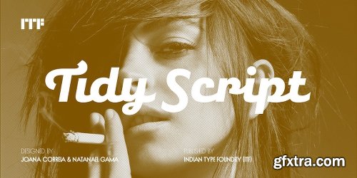
Tidy Script Font Family - 4 Fonts $99
OTF
Tidy Script is a cursive-style constructed sans. Almost all letters in the fonts connect. The typeface is inspired by engineering letters and obscure typewriter faces. Tidy Script’s letter structure is based on handwriting. Characters each have mild slant; about 7?. Counterforms are large, and the capitals are more decorative than the lowercase. When using Tidy Script, make sure to switch on the OpenType Contextual Alternate and Ligatures features. That way, you’ll have automatic access to the dozens extra glyphs in each of the fonts.
http://www.myfonts.com/fonts/indian-type-foundry/tidy-script/


OTF
Houseplants are commonly grown for decorative purposes, positive psychological effects, keeping fresh or health reasons such as indoor air purification. Actually, just like this font has a positive effect on your artwork!
This font comes with a heavy load of diacritics! On top of that, it has contextual alternates, which means your text cycles through 6 different versions of each letter! Hard to tell that this is actually a font!
Previews
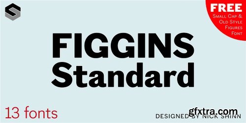
Figgins Standard Font Family - 13 Fonts
OTF
To meet the burgeoning demands of commerce, type founders in 1830s London introduced a plethora of new fonts which abandoned the traditional nib-informed model. Most radical were bold, capital-only designs with almost no stroke contrast, stripped bare of serifs. To all intents and purposes these minimal expressions of utility were identical to 20th century functionalism. Recontextualizing one of the original sans fonts, Shinn offers an alternative proposition to the myth of modernism.
http://www.myfonts.com/fonts/shinn/figgins-standard/

SermonBox - Seasonal Collection

SermonBox - The Series Pack Collection

Top Rated News


Would you like to be a Author?


