
http://www.myfonts.com/fonts/mawns/housegrind/
OTF | 1 Font | JPG Preview | 1 Mb RAR

http://www.myfonts.com/fonts/typeassociates/rhodamine-blue/
TTF | 1 Font | JPG Preview | 1 Mb RAR

http://www.myfonts.com/fonts/typeassociates/semaphone/
TTF | 1 Font | JPG Preview | 1 Mb RAR

http://www.myfonts.com/fonts/typeassociates/xaltier/
TTF | 1 Font | JPG Preview | 1 Mb RAR

http://www.myfonts.com/fonts/insigne/haboro/
Haboro is a powerful workhorse. It’s a neoclassical font developed for numerous uses, ranging from editorial and corporate to web pages and apps. This new face from insigne Design takes a modern twist on the high-contrast typeface genre known as the Didone. Recognized for their ability to convey clarity, the geometric simplification of the Didone genre adds a level-headed rationality to whichever work it’s applied. Didones are used to lend style and sophistication to a wide number of applications--everything from style or cosmetic labels to annual reports. With its unique take on this classic genre, Haboro--with its slight wedge-shaped serifs and unique terminals--is still defined by elegance, tradition and timelessness. Even more to its versatility, this multi-purpose text face features whimsical terminals, which liven up even the most serious texts. If you desire, you can also opt for the more usual ball terminals by activating OpenType alternates. The Haboro family consists of seven weights from a Thin to a Black along with matching italics. The contrast from the letters’ thick strokes and thin strokes draws the eye to your design, making Haboro a powerful visual tool for communicating your message. The typeface also contains numerous ligatures and alternates. Choose between serif variants such as ball terminals or standard serifs by utilizing OpenType alternates. We recommend using the default contextual alternates and discretionary ligatures in order to benefit from all members of this fantastic font family. In addition, Haboro has a sizable set of option glyphs and numerous other OpenType variables to give your text the unique touches it needs. Haboro has all of the attributes you need to undertake your next project. Use its modified elegance to shape and mold your next design, whether a web site, app, branding package, or magazine. You’ll find there’s no job Haboro can’t take on.
OTF | 54 Fonts | JPG Preview | 12.4 Mb RAR

http://www.myfonts.com/fonts/kastelov/nolan-next/
Nolan Next is a low-contrast humanist sans-serif with a large x-height and streamlined appearance. It is based on Nolan, but with a more compact letterforms and remastered curves. Designed to appeal to a broader audience due to its narrower width and subtle presence, Nolan Next is ideal for everyday usage. It is well suited for design applications ranging from branding and corporate identity to editorial and web design. Comprising of eight weights with matching italics, Nolan Next is easy to work with and accommodating to your needs. Designed to work as a universal typeface, it also stands its ground in headlines, presentation materials, logotypes, etc. Additionally, the typeface includes an extended character set supporting an array of languages.
OTF | 16 Fonts | JPG Preview | 1.6 Mb RAR

http://www.myfonts.com/fonts/urw/geometric/
URW Geometric is a sans serif typeface inspired by the German geometric typefaces of the 1920s but designed for modern usability. The character shapes have optimized proportions and an improved balance, the x-height is increased, ascenders and descenders are decreased. Special glyphs, which are often designed afterwards for the original geometric typefaces from the 1920s, are perfectly integrated in the URW Geometric. These design characteristics increase the usability and legibility tremendously. With its 10 weights ranging from Thin to Black, plus 10 additional oblique styles, it has a great versatility in mind. The extreme light styles shine bright in large sizes, the middle weights are perfect for body copy and the bolder variants for the use of emphasis information or bring a strong impact to headlines and information. The optically balanced styles are designed to work in perfect harmony together. URW Geometric is functional, strong, simple and harmonized in form, and at a glance appears as a modern variant of its predecessors. Apart from the basic characters the design has an extra focus on the special glyphs. These are designed for todays needs. For example: the email glyph looks modern and unique, including a perfectly balanced spacing. The numero sign, in modern use called “hashtag”, is space saving and optically balanced for body text. Additionally, various extra and alternate glyphs are designed to provide a friendly usability. Including a wide Latin language support and character sets, URW Geometric is perfectly designed for today’s requirements.
OTF | 20 Fonts | JPG Preview | 2 Mb RAR

25 EPS | + JPG Preview | 43 Mb RAR

http://www.myfonts.com/fonts/branding-with-type/bw-modelica/
Bw Modelica is a minimal, robust, reliable & pragmatic geometric sans. Its clean shapes and generous x-height makes it a very competent face for both, display and body copy purposes. It’s available in 8 weights with matching oblique italics. The main font files include two stylistic sets allowing for more expressive options, specially for display use. SS01 and SS02 are also available as stand-alone font files, for those who would prefer to use them directly without activating the OpenType feature.
OTF | 48 Fonts | JPG Preview | 4 Mb RAR


Wulf Utility Font Family $70 | 2 x TTF
http://www.myfonts.com/fonts/device/wulf-utility/
Wulf Utility is a heavily degraded font that evokes information in a utilitarian manner without any pretence to elegance, fuss or refinement. Gruff and direct, it is about as basic as a font can be. The Dirty version can be layered over the Rough version for two-tone effects.

Ywft Mullino Font Family $30 | 2 x TTF
http://www.myfonts.com/fonts/ywft/ywft-mullino/
Slightly distressed but possessing of serious underlying power, YWFT Mullino can be used as a display typeface or as a text face. This font brings huge diversity, beginning with the fact that there are two styles (Book and Medium) and plenty of alternate options. The Medium weight also contains the option to select misprinted letters, which results in extra typographic designs among other surprises. Be sure to explore the full range of YWFT Mullino in your design application.
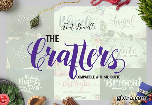
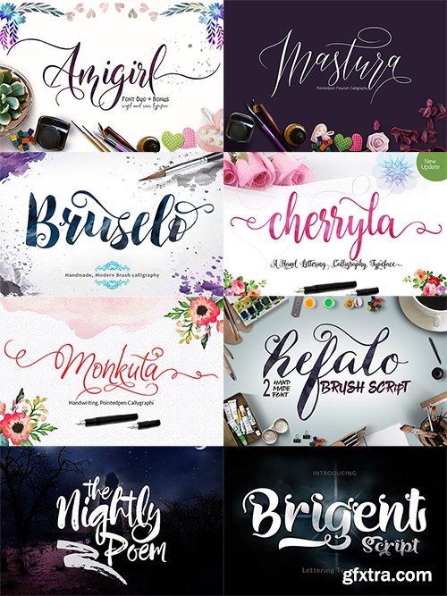
The Crafters Font Bundle
OTF | 9 Best Selling Fonts Family
Fonts are probably one of the most valuable resources for designers. And this deal is here to give a major boost to your typeface library. You will receive 9 best-selling fonts that are a perfect blend between classic and modern, with a touch of elegance!
From logos and wedding invitations to posters and pretty much everything in between- these fonts are suitable for all kinds of projects! This beautiful bundle will help you impress your clients and complete your work so much faster.
https://www.inkydeals.com/deal/the-crafters-font-bundle/

Daytona Font Family $300 | 18 x TTF | Turkish Support
http://www.myfonts.com/fonts/mti/daytona-pro/
The Daytona™ typeface family grew out of a desire to provide improved fonts for use in televised sporting events. Jim Wasco drew the design as sturdy squared letters based on humanist shapes and proportions. Letters were kept narrow for economy of space, and inter-character spacing was established for easy reading. While televised sporting events may have initially been his target, the design considerations he incorporated into the Daytona family also enabled it to perform well in a variety of other video and on screen environments.

Kollar Sans Font Family $50 | 4 x TTF
http://www.myfonts.com/fonts/seven-eight/kollar-sans/
Kollar Sans is a monoline, rounded face with strongly geometric bones, but enough quirks to give it a throwback character.It was originally designed for an exhibition at the Seattle Art Museum featuring Japanese woodblock prints from the collection of Allan and Mary Kollar.

CM - Winterfall Duo Font 50 493136
Winterfall is handlettring font specifically designed with a variety of alternate, ideal for posters, t shirts, typography, writing etc.
OTF | TTF | Vector EPS | JPG Image | RAR 1?4 MB

http://www.losttype.com/font/?name=lavanderia
Inspired by some lettering on a laundromat window in San Francisco’s Mission District, I set out to create Lavanderia, a casual script with some formal beauty. To stray away from the traditional “wedding invitation” style of script, I altered three fundamental traits: the slant, the x-height, and the width of the letters. By creating a typeface on only a slight slant, with a high x-height, and slightly condensed, the casual feeling of sign-painter lettering was achieved. Then by complementing the lowercase with a set of lavish caps, more formal elegance was brought to the set. OpenType was utilized to optionally add swashes, alter certain character, and take the capitals down to a more modest size and shape. Three weights. Delicate, Regular, and Sturdy. 291 glyphs.
OTF | 3 Fonts | JPG Preview | 1 Mb RAR

CM - Mallow Script 492343
Mallow Script is Modern Calligraphy. This font was designed by handwriting, and it has a modern and unique forms of calligraphy, the writing style is very natural.
OTF | TTF | RAR 186,3 KB

24 EPS | + JPG Preview | 145 Mb RAR


SermonBox - Seasonal Collection

SermonBox - The Series Pack Collection

Top Rated News


Would you like to be a Author?


