
http://www.myfonts.com/fonts/suomi/taint/
Taint is a modular squarish font with round corners for headlines and shorter strings of text.
OTF | 1 Font | JPG Preview | 1 Mb RAR

http://www.myfonts.com/fonts/suomi/tummy/
Tummy is part of the Game font set I made few years back; this one is for game packaging and logo design.
PFM, PFB | 1 Font | JPG Preview | 1 Mb RAR
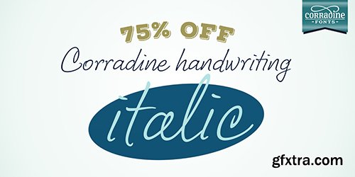
Corradine Handwriting Italic Font 1 Font $20
OTF
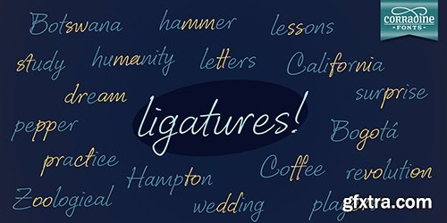
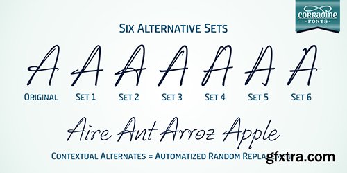
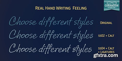
Few fonts reach the goal of simulate properly the hand writing aspect. Based on the hand writing of Manuel Corradine, Corradine Handwriting fonts have a lot of automatized alternates and ligatures that give them a natural hand writing feeling. Initially we were offering just the upright version of Corradine Handwriting but now here is the nice italic version.
http://www.myfonts.com/fonts/corradine/corradine-handwriting-italic/

http://www.myfonts.com/fonts/capearcona/ca-airespro/
This font was inspired by a postcard from the 30s. On the one side near the stamp were the words ‘BUENOS AIRES’. It looked so simple yet strange, that we started to make a font of it. It turned out to become Cape Arcona’s most popular freefont and we were even sent Spanish versions of the font. After a lot of requests for a full character set we started to draw the lower cases. They keep the simple but quirky style that makes the upper cases so interesting and versatile. To round it out we added an italic version to give a bit more artistic freedom.
TTF | 1 Font | JPG Preview | 1 Mb RAR

http://www.myfonts.com/fonts/capearcona/ca-blitzkrieg-pop/
What if the Ramones had been fontdesigners, would the result have looked like this? Probably not. And {this} is not the Ramones, he probably doesn't even know them because constantly listens to Elvis, or Barry White for a change. So we should not have bored you with the talk about the Ramones, but we had to, because this font speaks so much for itself that there isn't anything for us to say about it. Except maybe for one thing: all those who suspect a Clarendon behind it should know: It’s all built from scratch. And the basic idea... well yes it’s true, it was something back in the 90s.
OTF | 2 Fonts | JPG Preview | 1 Mb RAR


Creativemarket Astika Font 491349
OTF
We love fonts, we just addicted in making one everyday.. (wew... ) This one font is really special, really suitable for making invitations, wedding hampers, greeting cards, logos, business cards, and waaayy many others. Crafted by our deepest heart.
https://creativemarket.com/esokcerah/491349-Astika


Creativemarket LaSpacino Typeface 491699
OTF
LaSpacino Typeface is handmade brush and marker handlettering. Combining strong, rough, bold,and brushy typography with many features inside. Suitable for posters, shirt, or any design requirements.
https://creativemarket.com/miaodrawing/491699-LaSpacino-Typeface-%28-DISCOUNT-%29


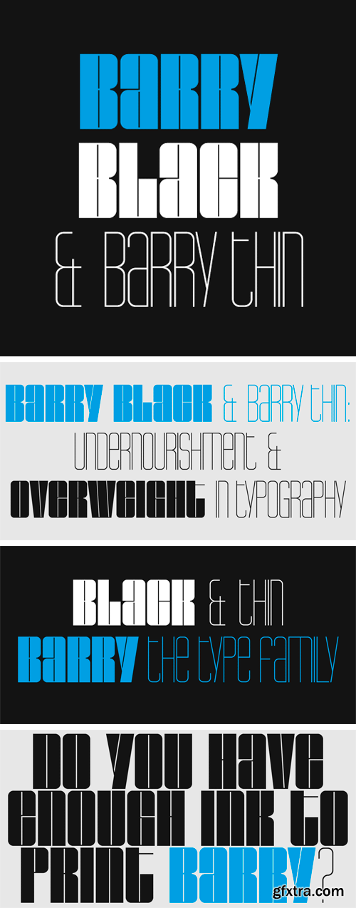
http://www.myfonts.com/fonts/juraj-chrastina/barry/
The Barry family combines two opposite weights. This display face has a great effect if the two fonts are used together. If you want to make your design ordinary, Barry is not the right choice.
OTF | 2 Fonts | JPG Preview | 1 Mb RAR
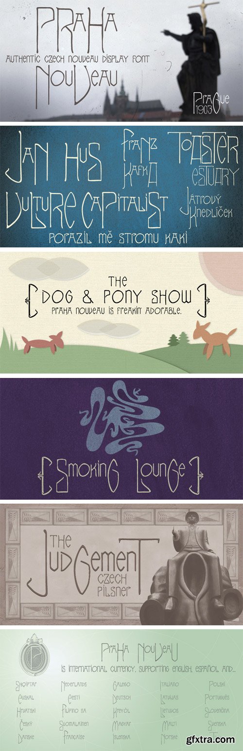
http://www.myfonts.com/fonts/matt-frost/praha-nouveau/
I found this type specimen on the statue of Jan Hus in Prague’s Old Town Square. The statue was designed in 1903 by Ladislav Saloun, and its writing is the cutest Nouveau font I've ever seen. Filling in the blanks, I realized the need for a standard lower case because the caps are so wild. The result is a very type-able and dynamic Nouveau. I encourage you to mix up your upper and lower cases for curious results. Use the lower case for running type.
TTF | 1 Font | JPG Preview | 1.2 Mb RAR
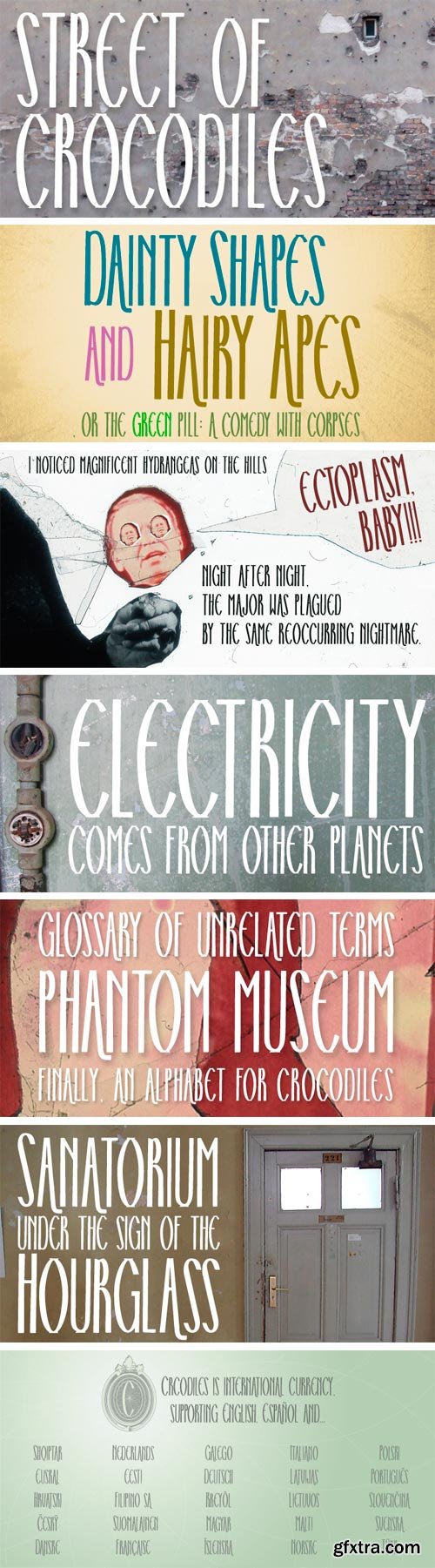
http://www.myfonts.com/fonts/matt-frost/street-of-crocodiles/
Well here’s a tall, knobby condensed font. It’s so condensed I bet you could make a big word like “bewitching” fit in a smaller space than you thought possible. Squish. I wonder what you'll do with it. It’s a byproduct of a Quay Brothers box set that I designed in 2006.
TTF | 1 Font | JPG Preview | 1 Mb RAR
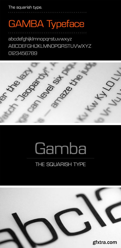
http://www.myfonts.com/fonts/juraj-chrastina/gamba/
This squarish type is designed to create strong and clean layouts. Gamba combines futuristic shapes with high legibility, utilitarian design and personality.
OTF | 1 Font | JPG Preview | 1 Mb RAR
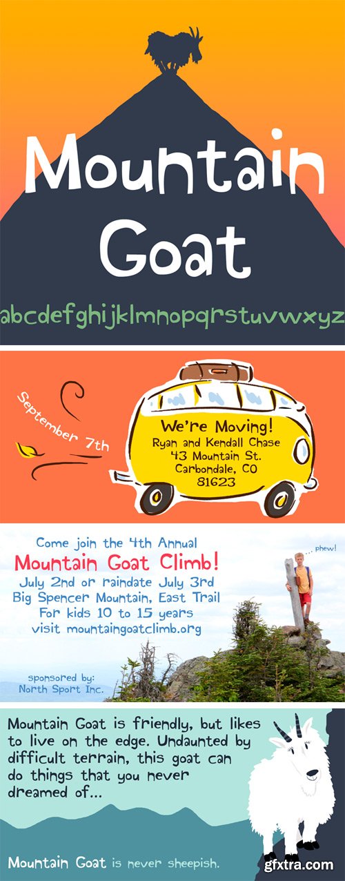
http://www.myfonts.com/fonts/kenrusselldesign/mountain-goat/
Mountain Goat is friendly, but likes to live on the edge. Undaunted by difficult terrain, this goat can do things you never dreamed of...
OTF | 1 Font | JPG Preview | 1 Mb RAR
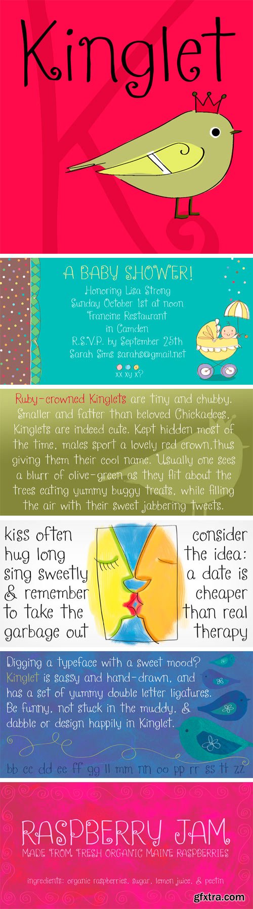
http://www.myfonts.com/fonts/kenrusselldesign/kinglet/
Digging a typeface with a sweet mood? Kinglet is sassy, hand-drawn, and sports a royally fun set of double letter ligatures. Like it’s namesake, Kinglet is lively and lovable.
OTF | 1 Font | JPG Preview | 1.5 Mb RAR

http://www.myfonts.com/fonts/mawns/barkants/
TTF | 2 Fonts | JPG Preview | 1 Mb RAR

http://www.myfonts.com/fonts/mawns/rakoon/
TTF | 1 Font | JPG Preview | 1 Mb RAR

http://www.myfonts.com/fonts/mawns/beckasin/
TTF | 1 Font | JPG Preview | 1 Mb RAR

http://www.myfonts.com/fonts/mawns/dollie-script/
OTF | 1 Font | JPG Preview | 1 Mb RAR

http://www.myfonts.com/fonts/mawns/denigan/
TTF | 2 Fonts | JPG Preview | 1 Mb RAR

http://www.myfonts.com/fonts/reserves/velvet/
Velvet is a heavy rounded block retro face inspired by the typeset album cover of the protopunk rock band The Velvet Underground’s debut. Stylistically, Velvet’s extreme angled terminals exude a sense of tension and irreverance, contrasting the smooth rounded block letter forms.
OTF | 2 Fonts | JPG Preview | 1 Mb RAR

http://www.myfonts.com/fonts/positype/fugu/
When Baka and Baka Too did very well commercially (Baka was named the Best Cursive Rough Script in 2005), I shied away from doing rough, handwritten scripts in fear as being seen as a one-trick-pony. A few years have passed and some early sumi-e brush ‘doodles’ kept appealing to me. I initially thought this new font would just fall under the Baka mantle and just become a new sibling, but as brush hit paper over and over again, the letters took on a different personality from Baka. This new font was turning out to be far more expressive, smooth and rough, tasty but sticky. This dichotomy demanded a new name. The rough and smooth texture suggested the name Fugu—oddly delicate while rough and functional.
OTF | 1 Font | JPG Preview | 1 Mb RAR
SermonBox - Seasonal Collection

SermonBox - The Series Pack Collection

Top Rated News


Would you like to be a Author?


