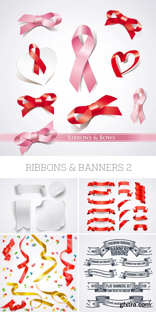
![]()
CM - Blush Typeface + Logo Kit 470485
It's a brand new year, so why not ring it in with some gorgeous, new branding?!
Introducing the Blush Typeface and DIY Logo Kit for Illustrator!
I've been working long and hard on this one! And now it's easier than ever to design beautiful branding for 2016! This kit comes loaded with 120 hand-painted graphics, 14 pre-designed logo templates, and the Blush Typeface too! Just install the fonts, open up Illustrator (or similar software), edit the text, and BOOM! Gorgeous. New. Logo.
TTF | OTF | Vector EPS | Ai Illustrator | JPG Image | CS+ | RAR 147,9 MB

CM - Coffee Font 488489
Coffee Handmade great font. Signs t-shirts and use space limited by your imagination .
TTF | RAR 15 KB
25 EPS | + JPG Preview | 76 Mb RAR
Duplicate Font Family Collection $700 | 36 x TTF | Turkish Support
https://commercialtype.com/catalog/duplicate
Druk Condensed Font Family $150 | 6 x TTF | Turkish Support
https://commercialtype.com/catalog/druk/druk_condensed
Of the families in the Druk collection, Druk Condensed is the most explicit homage to Willi Fleckhaus. Drawn for the 2011 “Year in Review” issue of Bloomberg Businessweek, Druk Condensed features three widths in the same Super weight. The Condensed and X Condensed are very graphic, and the XX Condensed can appear almost abstract. Designer Berton Hasebe introduced a purposeful and subtle change to the texture of the typeface by preventing terminals and crossbars from lining up too often on the horizontal axis. This keeps an emphasis on the verticality of the letterforms and prevents words and headlines from becoming monotonous. The maximum point size for this family is limited only by the size of the page; however, minimum sizes should be respected. The Condensed does not work well below 40pt; X Condensed should be used only at 48pt and above; and XX Condensed is limited to 72pt and above.
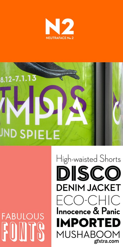
Neutraface No 2 Display & Text Font Family $400 | 14 x OTF | Turkish Support
http://www.houseind.com/fonts/neutraface2
Neutraface No. 2 is an extension of the Neutra legacy, where form and function meet at the nexus of practicality and versatility. It is by no means intended as an improvement or replacement of the original Neutraface, but as an expansion of the original concept. Neutra’s highly sought-after residential and commercial designs have stood the test of time, as will the typography that bears his name.
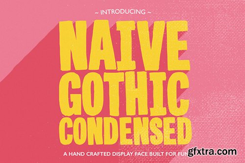
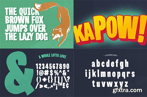
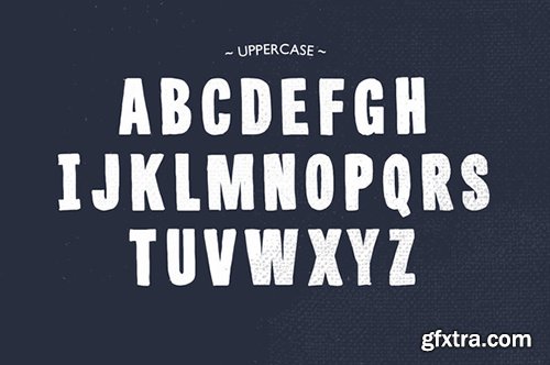
Creativemarket Naive Gothic Condensed 486387
OTF
Naive Gothic from Yes! Creative is a fun and friendly, hand drawn, display typeface in open type format for use on your projects. The Font contains both upper and lowercase character sets as well numbers, punctuation, math and currency glyphs. 130 characters in all and growing.
https://creativemarket.com/petercostello/486387-Naive-Gothic-Condensed
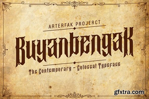
Creativemarket Buyanbengak 486456
OTF
The ornamental typeface, inspired from old manuscript and gothic style. Looks good for you who passionate in traditional or ornamental style. Elegant and clearly to use for your poster, books, flyer, quotes and etc. Tested on Adobe Illustrator, Photoshop, InDesign and etc.
https://creativemarket.com/Arterfak/486456-Buyanbengak
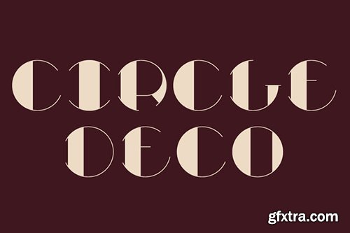
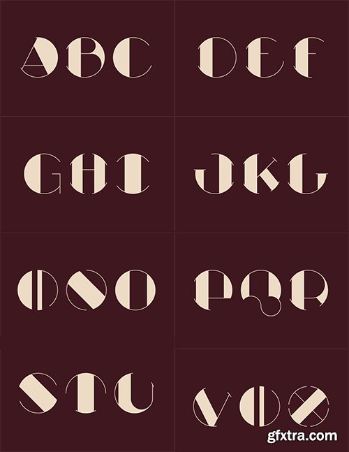
Creativemarket Circle Deco 486567
OTF
Circle Deco is a face sketched up and built for use as a Drop Cap.
We really wanted to explore a deco approach to a letterform placed within a specific boundary. This is definitely a more specific execution of a very display focused letter set and we really think the trick or value is found in each individual letter.
We had a lot of fun developing these over this past weekend and approached as a design sprint – sketch to vector. The plan was to move fast and design with instinct.
https://creativemarket.com/AlmanacDesign/486567-Circle-Deco
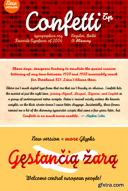
http://www.myfonts.com/fonts/tipo-pepel/confetti-tp/
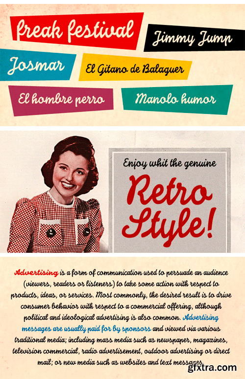
The Confetti is a typeface created about 1930 by the defunct José Iranzo foundry in Barcelona, and imitates the forms and gestures of handwriting created with a round nib as “Speedball”Series B. The original typefaces were a pair, called “Escritura Energica ” and “Escritura maravilla”. The typography has a dynamic air, caused partially by irregular alignment of the characters respect to the baseline and aesthetics takes us to the proposed commercial lettering or advertising of years 20-30.
OTF | 3 Fonts | JPG Preview | 1 Mb RAR
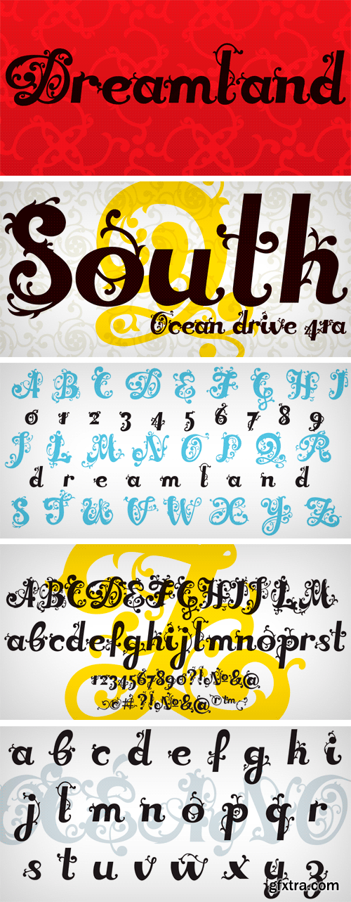
http://www.myfonts.com/fonts/lhs-vv/dreamland-roman/
OTF | 2 Fonts | JPG Preview | 1.2 Mb RAR
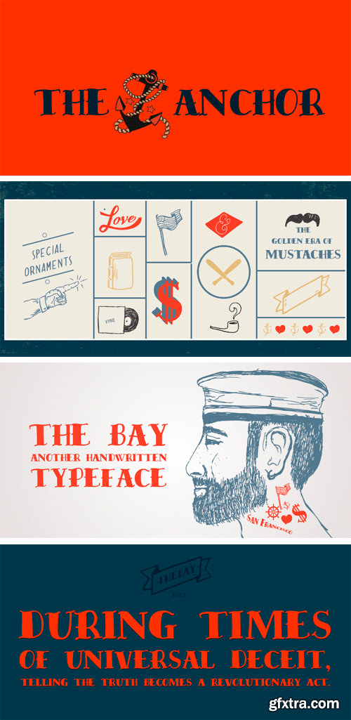
http://www.myfonts.com/fonts/resistenza/the-bay/
OTF | 1 Font | JPG Preview | 1 Mb RAR

http://www.myfonts.com/fonts/armtype/ghea-lilit/
The font family includes: Armenian, Cyrillic, and Latin alphabet systems. Containing styles: Light, Light Italic, Regular, Italic, Medium, Medium Italic, DemiBold, DemiBold Italic, Bold, Bold Italic, Extra Bold, Extra Bold Italic, Heavy, Heavy Italic. This font is recommended to be used in books, magazines, office documentations.
OTF | 14 Fonts | JPG Preview | 1 Mb RAR

http://www.myfonts.com/fonts/typesetit/ingrid-darling/
A feminine script style, Ingrid Darling adds spunk to scrapbooks, greeting cards, and other fun uses.
TTF | 1 Font | JPG Preview | 1 Mb RAR

http://www.myfonts.com/fonts/typesetit/licorice/
Handwritten letters are great for scrapbooking, cards, invitations and other fun things.
TTF | 1 Font | JPG Preview | 1 Mb RAR

http://www.myfonts.com/fonts/filmotype/havana/
Filmotype Havana was among the company’s earliest connecting brush-lettered casuals and was introduced by Filmotype in 1955 as a smoother, condensed weight of its popular cousin Horizon. Filmotype Havana was developed from the original font filmstrips and includes a full international character complement, automatic fractionals, ordinals, and a wonderful assortment of alternate characters and ligatures to create a genuine connecting hand-painted look in dynamic OpenType format.
OTF | 1 Font | JPG Preview | 1 Mb RAR

http://www.myfonts.com/fonts/urw/hogarth-script/
OTF | 1 Font | JPG Preview | 1 Mb RAR

http://www.myfonts.com/fonts/pink-broccoli/fat-rhino/
A heavyweight playful typeface with a children’s comic feel.
OTF | 1 Font | JPG Preview | 1 Mb RAR

http://www.myfonts.com/fonts/pink-broccoli/hot-streak-pb/
If you're looking for something offbeat and animated with an attitude, well, you've found it! Hot Streak is a retro font inspired by an old pulp paperback called Sin on Wheels, and it gives what started as a simple title a lot of life. Let Hot Streak turn up the heat on your designs! You'll find the Standard Ligatures feature changes up double letter combinations, the Stylistic Alternates feature raises up all of the smallcaps to align at the top of the capitals, and the Contextual Alternates feature turns on an automatic bounce feature that brings eve more life and attitude to an already spunky font.
OTF | 1 Font | JPG Preview | 1 Mb RAR

http://www.myfonts.com/fonts/pink-broccoli/hip-hopper/
An offbeat typeface inspired by the lettering on an art poster by Patrick Owsley for the cartoon character Hoppity Hooper. This typeface goes beyond the basic opentype features you've seen (i.e. extended language character sets, stylistic alternate character variations, etc) and offers not only a ligature feature that automatically alternates between the Capitals & Lowercase (Alt Capitals) sets, but also a unique Contextual Alternates feature that enables an automatic alternating BOUNCING effect. All this piled into a single typeface with loads of personality, just waiting to be played with!
OTF | 1 Font | JPG Preview | 1 Mb RAR

http://www.myfonts.com/fonts/pink-broccoli/hideaway/
A light hearted comic flare serif typeface inspired by a 1964 Speedy Gonzalez cartoon title.
OTF | 1 Font | JPG Preview | 1 Mb RAR

http://www.myfonts.com/fonts/pink-broccoli/fathoms-pb/
A totally off-the-wall sans serif font based on the titling from one of ABC’s Movie of the Week series from 1969 called Daughter of the Mind. Turn on Contextual Alternates to automatically alternate between Capitals and Lowercase as you type to really make the font dance!
OTF | 1 Font | JPG Preview | 1 Mb RAR

http://www.myfonts.com/fonts/flat-it/talking-five/
Talking Five is a hand-drawn sans serif font family. The idea for creating this font family came to me with the Mexican hot and dry wind.
OTF | 5 Fonts | JPG Preview | 1 Mb RAR
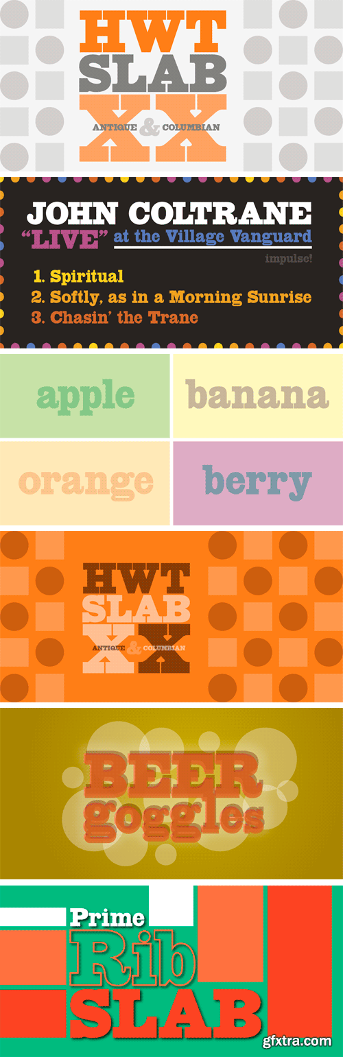
http://www.myfonts.com/fonts/hwt/hwt-slab/
These two extra bold fonts are classic slab serif wood type styles with one detail of difference. Columbian is an extra bold Clarendon wood type that was manufactured by many of the wood type manufacturers in the late 19th century. “Clarendons” feature bracketed or rounded serif joins whereas “Antique” was a class of typefaces that features squared off slab serifs. Some type designs have only minor differences from others. The Columbian design is essentially identical to Wm. Page & Co.'s “Antique no. 4”, with the difference being the bracketed serifs. In researching material for the digitization of Columbian, we started with a 15 line font identified as “Columbian” shown in the Angelica Press wood type portfolio (printed in 1976). This font is in fact “Page Antique no. 4”. Comparing Antique #4 to Columbian specimens from Hamilton and other manufacturers confirms the only real difference is the serif treatments. Therefore, both fonts are presented as a pair. Each font features a full Western & Central European character set.
OTF | 2 Fonts | JPG Preview | 1 Mb RAR
SermonBox - Seasonal Collection

SermonBox - The Series Pack Collection

Top Rated News


Would you like to be a Author?


