
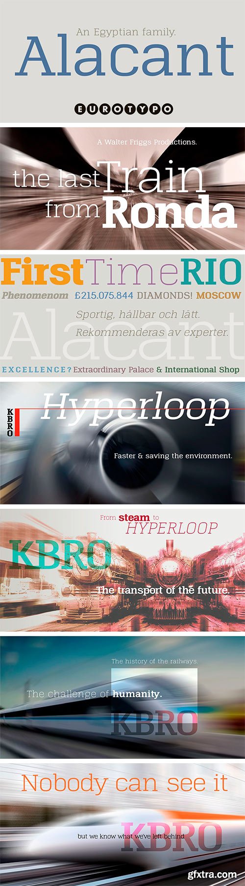
https://www.myfonts.com/collections/alacant-font-eurotypo
Alacant is a family of slab serif fonts composed of seven weights and their versions in italics. One of the most characteristic advantages of this font is its particularly square shape, very short descenders, open counter-forms and precise kerning that provides a very good visual impact and clear legibility.


https://www.myfonts.com/collections/vinque-antique-font-typodermic
Vinque Antique is an earthy rendition of a nineteenth-century Arts & Crafts revival of medieval lettering. There are OpenType fractions, f-ligatures, and old-style numerals. Three texture variations of letters are automatically shuffled in OpenType-savvy programs to give a more natural impression. To disable this effect, toggle the standard ligatures functionality in your application. Vinque Antique comes in three weights and italics. Most Latin-based European, Vietnamese, Greek, and most Cyrillic-based writing systems are supported.

Sphiger Font
Sphiger is a tall and bold serif font. No matter the topic, this font will be an incredibly asset to your fonts’ library, as it has the potential to elevate any creation.


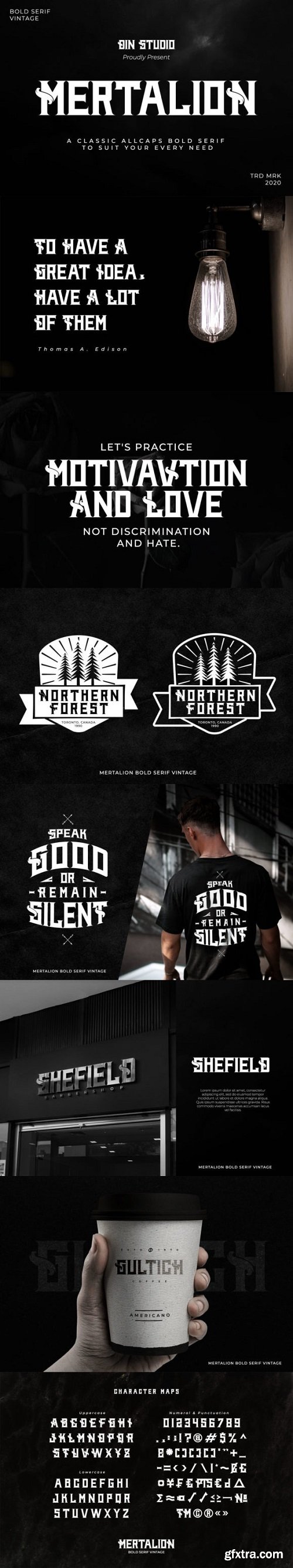
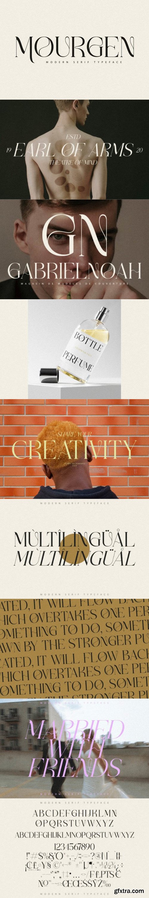
Mertalion Font
Mertalion is an incredibly distinct serif font. It can easily be matched to an incredibly large set of projects, so add it to your creative ideas and notice how it makes them stand out!


https://www.myfonts.com/collections/dihjauti-font-io-media
Dihjauti /di:.'hjau.ti: | dee.'hyow.tee/, predominantly based off Dwiggin's Electra with shades of Palatino and Perpetua, is modern and stately. Like its inspirers, it has broad counters and spacing, which temper it and give it warmth, making it comfortable and well-suited for longer texts. It is balanced in all aspects, from its punctuation to its reference marks and symbols. Its design takes into consideration all extra characters for languages that few fonts support, such as African and First Nation. These extra characters, such as Edh, Esh, Gamma, Ezh, Yogh, the pharyngeal fricatives, the click consonants, which have added capital versions, the glottal stops, et cetera, actually look like they belong, as opposed to being afterthoughts. The italic incorporates a touch of Arrighi. It includes all transcription systems relevant to the Latin, Cyrillic, and Greek alphabets, as well as standard Coptic, plus extra characters for Teuthonista and First Nation. It also includes, to list a few, Egyptian-styled pictographs (where applicable), APL, a plethora of mathematical symbols and arrows, and a number of alternatives in the PUA.
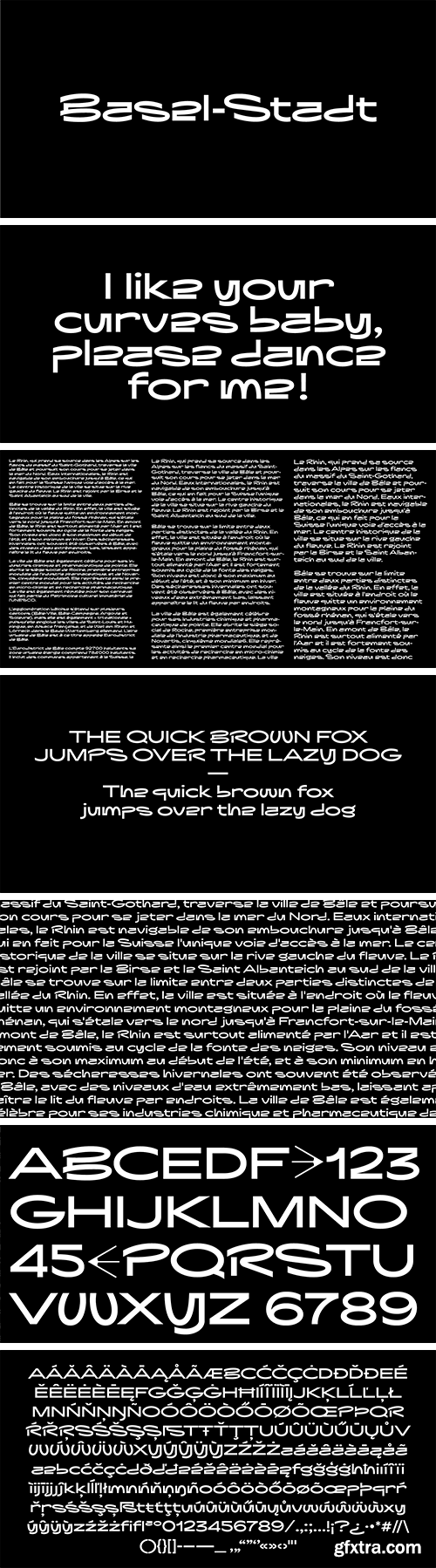
https://www.myfonts.com/collections/basel-stadt-font-rp-type
Basel-Stadt is a typeface strongly contrasted by long and wide curves and angular shapes in 6 weights from Thin to Bold. The character set contains 401 playfull glyphs and support all latin languages. Basel-Stadt is deeply graphical and looks like dancing, it is a perfect choice for titling, posters, music, magazine, etc… Basel-Stadt is definitely a typeface you will have fun to play with.

SermonBox - Seasonal Collection

SermonBox - The Series Pack Collection

Top Rated News


Would you like to be a Author?


