Video: .mp4 (1280x720, 30 fps(r)) | Audio: aac, 44100 Hz, 2ch | Size: 3.58 GB
Genre: eLearning Video | Duration: 89 lectures (7 hour, 45 mins) | Language: Türkçe
Kurumsal İleri Office Eğitmeninin Hazırladığı Ofis Programları Eğitimi (Word-Excel-İleri Excel-PowerPoint) Eğitimi


Tinkercad İle Uygulamalı Arduino Eğitimi |Robotik-Kodlama|
Video: .mp4 (1280x720, 30 fps(r)) | Audio: aac, 44100 Hz, 2ch | Size: 2 GB
Genre: eLearning Video | Duration: 36 lectures (4 hour, 38 mins) | Language: Türkçe
Uygulamalarla Kendi Projelerini Geliştir


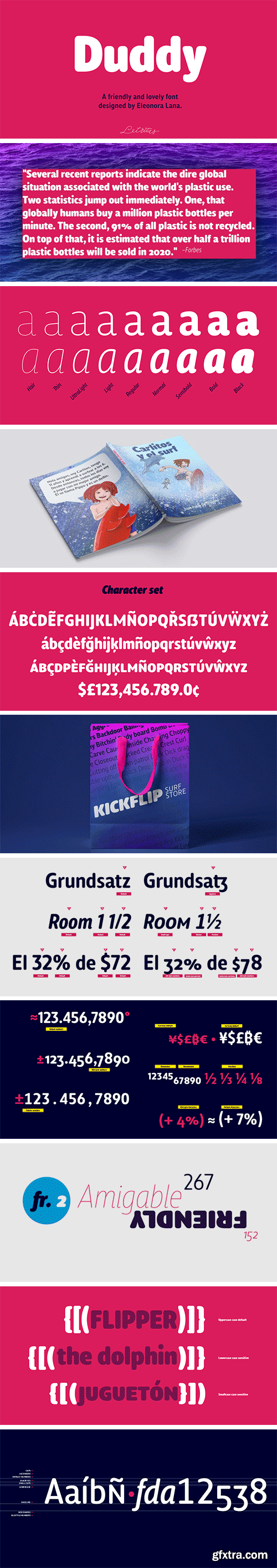
https://www.myfonts.com/fonts/letritas/duddy/
Duddy is a “friendly” sans-serif typography designed by Eleonora Lana and the Letritas team. The shape of Duddy was created based on sketches that looked after carrying the concept of kindness as far as possible, keeping always in mind the readability and functionality of the font.


https://www.myfonts.com/fonts/paratype/reed/
Reed is a refined calligraphic font based on humanist italic. It contains two weights and a high-contrast Display style for extra large point sizes. Two unusual stencil styles add zest to the type family. The character set includes lots of swashes and contextual alternates. This makes text set in Reed look very close to live calligraphy. Reed works perfectly in labels and packaging of confectionery, cosmetics, perfumery and sparkling wines, as well as greeting cards and event design. Reed was designed by Isabella Chaeva and released by Paratype in 2020.

https://www.myfonts.com/fonts/konstantynov/ki/
Ki is a monospaced display typeface inspired by older VCR / camcorder OSD (on-screen display) fonts. It is peculiar for its diagonal angles being restricted to 45°, which results in a specific textural effect perfectly legible in small type sizes. Ki comes in 7 weights with corresponding italics, and features extensive language support with over 500 glyphs, including Cyrillic.
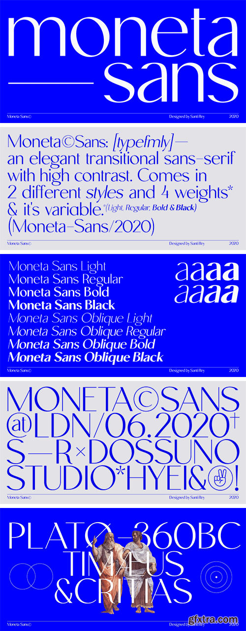
https://www.myfonts.com/fonts/santi-rey/moneta-sans/
Moneta™ Sans is an elegant transitional sans-serif with high contrast. Its morphology is based on the study of traditional broad-edge pen script. It comes in 2 styles and 4 different weights (Light, Regular, Bold and Black) and has variable features.
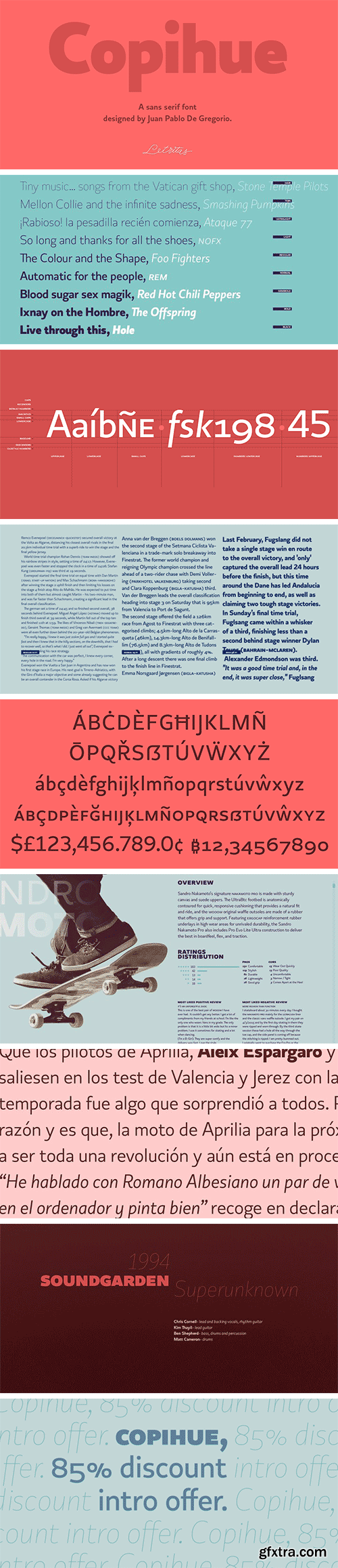
https://www.myfonts.com/fonts/letritas/copihue/
Copihue is the newest font from the foundry of Juan Pablo De Gregorio. A Sans-Serif with some humanist hints, it displays simple and subtle yet sober, vivid strokes. This font’s personality unfolds itself as long as we are reading it.

https://www.myfonts.com/fonts/comicraft/quigglesmith/
It's just downed a Cortado in one gulp, it's shaved the sides of its head and its grown a magnificent beard groomed with the very best beard oils. Turn around and you'll find that it has illustrated today's specials in chalk on the wall sized blackboard behind the espresso machines it's Quigglesmith!
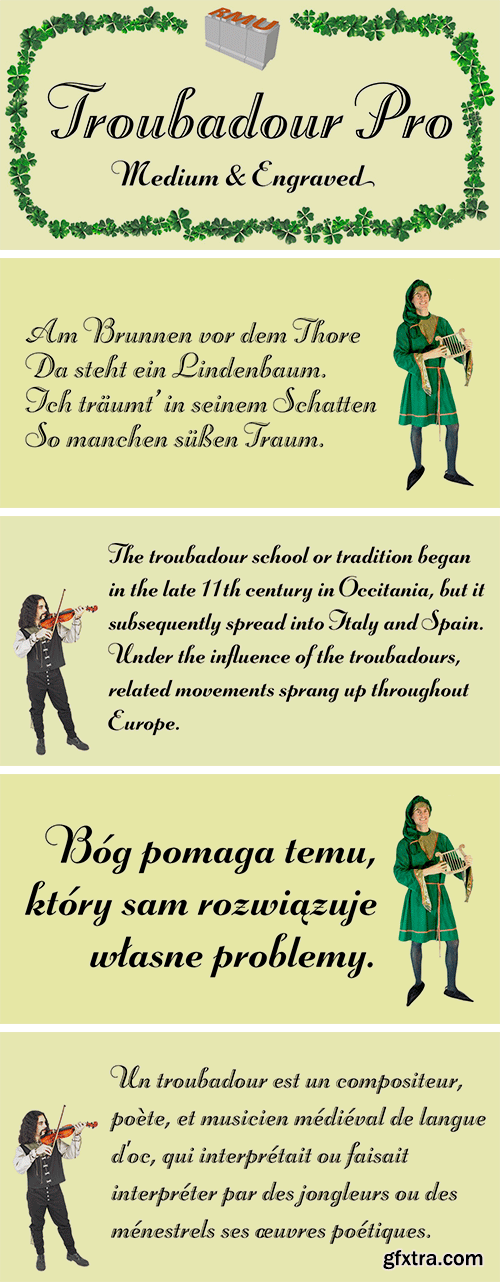
https://www.myfonts.com/fonts/rmu/troubadour-pro/
A script font of broad nib style, both plain and engraved.

https://www.myfonts.com/fonts/hanoded/kingsmead-script/
Last year I spent some time exploring the city of Bath in England. Its claim to fame are the Roman Baths in the city center, which are well worth a visit. Kingsmead is an electoral ward within Bath and I thought it was an apt name for this rather stylish - if old fashioned - font. Kingsmead Script is a handmade font. It comes with diacritics and some discretionary ligatures for double lower case letter combinations.
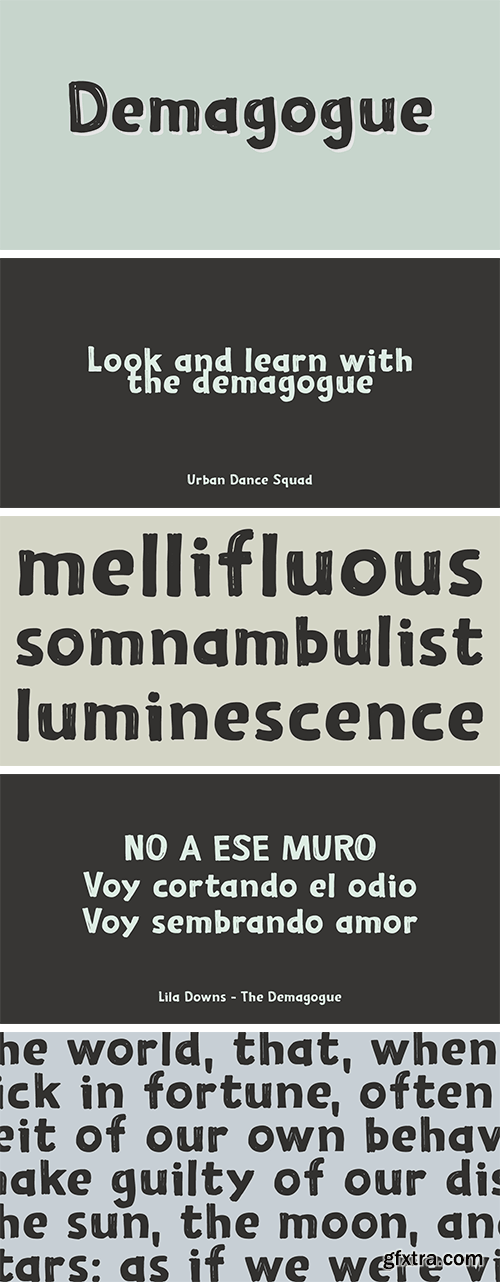
https://www.myfonts.com/fonts/hanoded/demagogue/
I was listening to the radio and a song caught my attention. It was ‘Demagogue’ by a band called the Urban Dance Squad. That song brought back memories from when I was a student, so I decided to name this font after it. Demagogue was made using a Sharpie pen and a piece of expensive paper. The result is a very legible, very neat and very bold font. Demagogue is ideal for when you want to get your message across, but hopefully not in a demagogue-ish way! ;-)


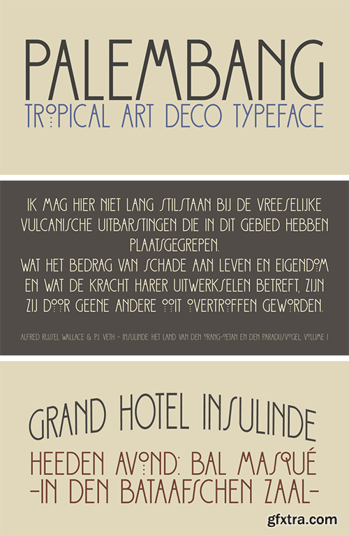
https://www.myfonts.com/fonts/hanoded/palembang/
Palembang is the second largest city on the Indonesian island of Sumatra. It is also one of the oldest cities in Indonesie and used to be the capital of the powerful Buddhist Kingdom of Srivijaya. After finishing Semarang and Semarang Kolonial fonts, I sort of stayed in the Indonesian mood and named this font Palembang. It is a narrow, tall, all caps Art Deco typeface and would be most suited for headlines, cards, headers and luxury packaging. Palembang comes with royal language support.
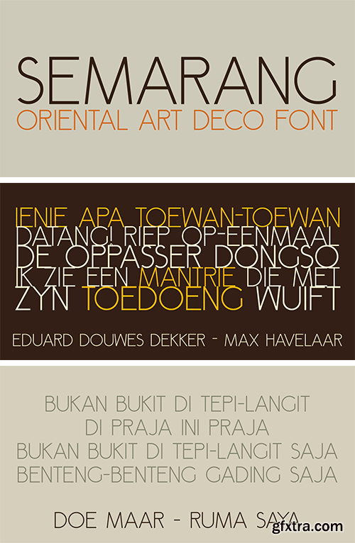
https://www.myfonts.com/fonts/hanoded/semarang/
Semarang is a stylish, all caps Art Deco font. It is not a recreation of a particular typeface; merely my salute to a bygone era and to the birthplace of my father in law, who recently passed away. Semarang comes with all diacritics.

SermonBox - Seasonal Collection

SermonBox - The Series Pack Collection

Top Rated News


Would you like to be a Author?


