
Summer holiday and vacation collection elements design 7
9 eps, ai + 9 jpeg, tif / prew / 147,4 Mb

Infographics modern Business elements collection 275
18 eps, ai + 18 jpeg, tif / prew / 137,7 Mb

JPG | Adobe CS1+ | 4500x3000 px | 169 MB

Compatibility: OS X 10.7 or later
The best Mac video software ever, allowing users to easily download, convert and edit videos including 4K videos as well as homemade DVDs on Mac.
Homepage: http://www.aiseesoft.com/mac-video-converter-ultimate/
Duration: 2hr 4m | Video: h264, yuv420p, 1280x720 30fps | Audio: aac, 44100 Hz, 2 ch | 257 MB
Genre: eLearning | Language: English
Software required: After Effects CC, Illustrator CC, Photoshop CC.

English | 2015 | ISBN: 1440342644 | 688 pages | EPUB | 7 MB
The Successful Photographer's Secret!


Now available on DVD/Blu-ray Disc™: your own captivating home movies, multimedia photo albums, and music compilations-complete with dazzling menus, special features, and custom soundtracks. With DVD Architect™ Studio software, you can swiftly create professional-looking DVDs, even stunning widescreen productions, on your home computer. Simply drag-and-drop to start building your next blockbuster.


CM - Vol.3 Party Packaging MockUps 1542024
PDF, PSD, All Files
https://creativemarket.com/incybautista/1542024-Vol.3-Party-Packaging-MockUps
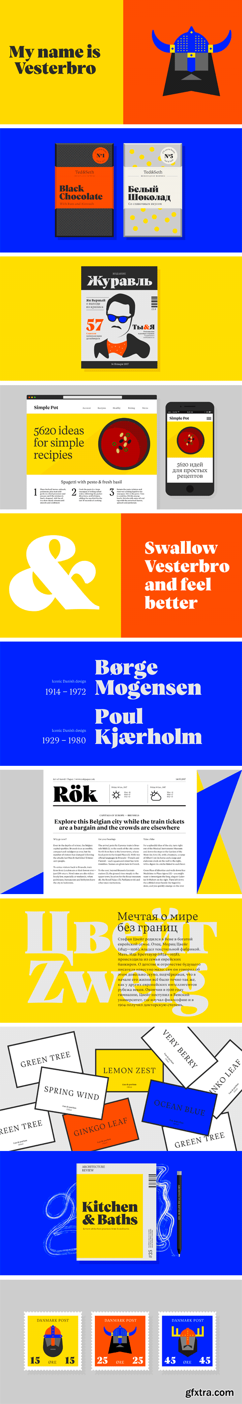
http://black-foundry.com/vesterbro/
Named after the city district located where the old Western Gate of Copenhagen used to be, Vesterbro is an attractive new serif face from Black[Foundry]. It is the brainchild of Jérémie Hornus, who developed the type family in collaboration with Alisa Nowak and Ilya Naumoff. The core design of the Vesterbro family is the Poster weight. The imaginative high-contrast typeface combines characteristics from Scottish and Garalde models. Vesterbro Poster is warmer than most Didot-inspired display faces. It has friendly, organic shapes, with a generous x-height and short serifs. Its tilted axis and supple curves lend Vesterbro Poster an inviting, jovial personality; just look at that radiant smile on the lowercase ‘e,’ or how the ampersand licks the next word. Surprised at how well this typographic mashup works, the team derived a text version with the same properties. The Regular weight has more pronounced serifs and a fairly low contrast, giving it a calm yet confident look on the page. Leaf terminals on letters like ‘a,’ ‘c,’ and ‘f’ add an elegant calligraphic touch. As the weight increases, the typeface gains impact without losing its supple charm. Thanks to the multinational team at Black[Foundry], the Greek and Cyrillic alphabets were added early in the development of Vesterbro. The comprehensive character set includes several types of numerals, an extensive ligature set, and a full complement of arrows. Pleasantly readable in text sizes and attention-grabbing when used big, Vesterbro is a versatile type family for global communication that can be applied to any design project, from editorial design and graphic identities to advertising, branding and packaging.
SermonBox - Seasonal Collection

SermonBox - The Series Pack Collection

Top Rated News


Would you like to be a Author?


