
http://www.myfonts.com/fonts/fontmesa/old-thunder/
Old Thunder is a revival of an 1800’s Tuscan style font called Lavinia, we've expanded the original font to include a lowercase, an Open faced version, a very attractive Black face and last this set just wouldn't be complete without a Fill font. When you see the word Fill in a fonts name this describes its purpose which means the font is intended to be used for filling in the open space of its parent font or the Open faced shadowed version from that font family or group. Some Fill fonts look as if they may be used as stand alone fonts but others simply do not look good used as a plain font. The Fill font for Old Thunder was designed to work as both a fill and a regular font, although when used as a regular font the letter spacing will appear a little wide. If needed the spacing can be adjusted in some applications font settings, check the help file in your application for further information on spacing. You will need an application that allows layering of your fonts in order to take advantage of FontMesa Fill fonts.
TTF | 4 Fonts | JPG Preview | 1 Mb RAR

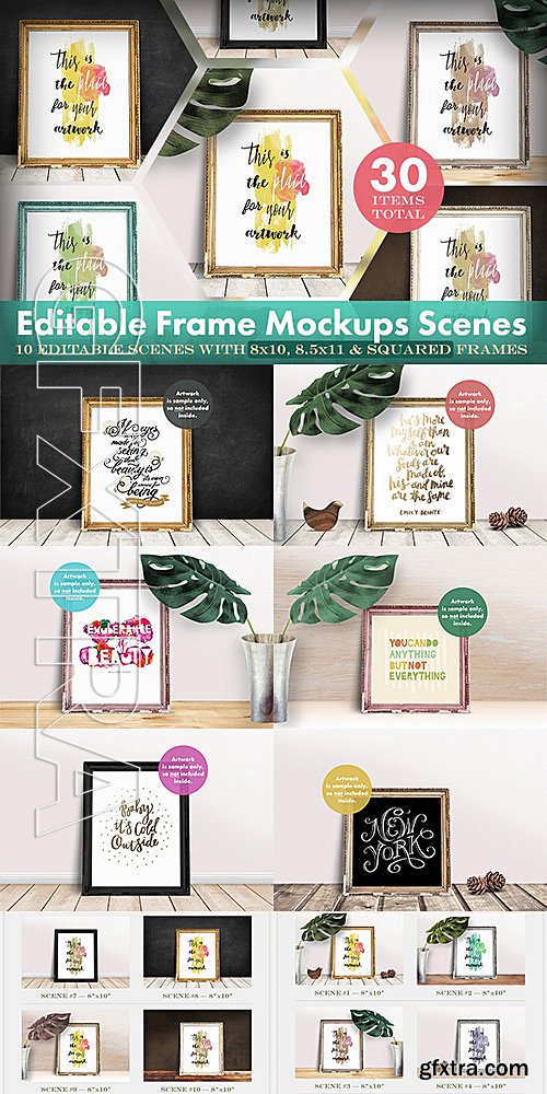
CM - Editable Frame Mockups Scenes Bundle 514974
Layered PSD | 1800x1200 | JPG Image | CS3+ | RAR 577,3 MB
25 EPS | + JPG Preview | 93 Mb RAR
25 EPS | + JPG Preview | 50 Mb RAR

25 EPS | + JPG Preveview | 77 Mb RAR
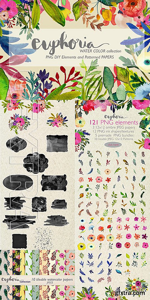
CM - Watercolor DIY Collection 534874
This big watercolor DIY collection can be used for wedding invitations, logos, newsletters, blog banners and lots of presentations.
PhotoShop PNG | JPG Image | RAR 449,9 MB
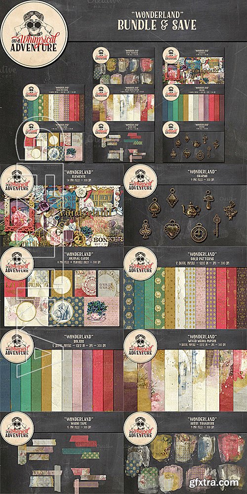
CM - Bundle - Wonderland 541040
The "Wonderland" Collection, inspired by Alice's Adventures in Wonderland, is jampacked with whimsical, romantic and artsy elements and papers. The colours are warm and vibrant with beautiful greens, blues, and pinks, and with touches of gold, in a perfect mix of bold and faded, realistic and artsy, vintage and contemporary. Are you getting curiouser and curiouser? Then grab this digital scrapbook collection and create your own digital Wonderland!
PhotoShop PNG | JPG Image | RAR 521,5 MB

http://www.myfonts.com/fonts/type-together/alverata/
Gerard Unger’s new typeface Alverata is a twenty-first-century type-face inspired by the shapes of romanesque capitals in inscriptions of the eleventh and twelfth centuries, without being a close imitation of them. It is additionally based on the early twentieth-century model, but tweaked so as to prevent blandness and monotony. Alverata performs beautifully in both screen and on paper, delivering excellent legibility. Its letters are open and friendly in small sizes and lively and attractive in large sizes. They are robust, and show refinement in their detail. It is an extensive type family, with versions for both formal and informal applications.Visually, some written languages, such as Czech and Maltese, differ quite strongly from languages like English and German, notably because of their many accented characters. While other typefaces will show this difference, Alverata removes it. As a result, Alverata enables harmonious convergence of languages.
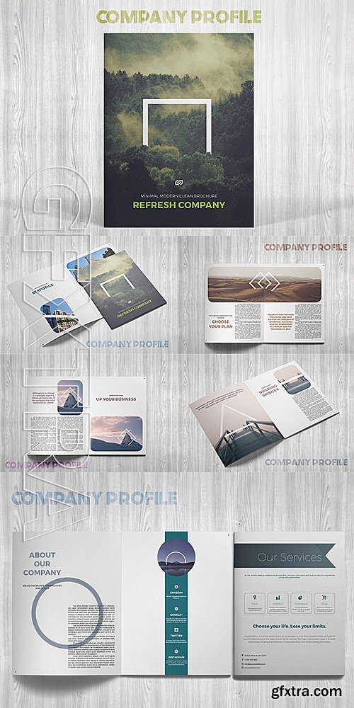
CM - Refresh Company Profile 542430
This is a modern, clean and minimal template for your business. 16 pages possibility of creating many unique spreads
InDesign INDD | 8.5 x 11 | CS4+ | RAR 4,9 MB

https://avondaletypeco.com/atc-duel/
Bold and bolder, ATC Duel is an extended grotesque sans-serif font family comprised of over 500 glyphs in 5 weights and 10 styles. Duel is an ultra wide display font whose rounded shapes and sharp edges are inspired by the letterforms and lines of 1960s cars, the Golden Age of automotive design. ATC Duel is well-suited for high DPI screen resolutions and printed display copy. Duel introduces Cyrillic letterforms in an ATC typeface for the first time. Ligatures, accents, and alternate glyphs are included and can be activated as OpenType features. ATC Duel was designed in 2015, by Alex Sheyn.
OTF, WOFF | 10 Fonts | JPG Preview | 1.56 Mb RAR

Lynda - Excel 2016: Advanced Formatting Techniques
Genre: eLearning | Language: English

Lynda - GoPro HERO and Session Fundamentals
Genre: eLearning | Language: English

Excel for Mac 2016 Essential Training
Genre: eLearning | Language: English


After Effects Apprentice 01: CC Pre-Roll
Genre: eLearning | Language: English
9 eps, ai + 9 jpeg / prew / 87 mb

10 eps, ai + 10 jpeg, tif / prew / 82,9 mb

10 eps, ai + 10 jpeg, tif / prew /112,6 mb

Lipa Agate Font Family $799 | 24 x TTF | Turkish Support
http://www.myfonts.com/fonts/type-together/lipa-agate/
Lipa is the name of the Slovenian national tree ‘Linden’. The typeface Lipa Agate by Croatian designer Ermin Me?edovi?, is part of a bigger type collection, comprising various type groups into one coherent system which Ermin developed over the past 10 years. Lipa Agate is the first to be released; a sans serif designed and engineered to be used in the smallest text sizes, best under 10pt, and in very bad printing conditions. It is perfect for phone books, classified ads, directories or any other job requiring economy without jeopardising legibility. To achieve this, Lipa Agate employs a range of tools, such as deep ink-traps, narrow proportions and a tall x-height. Contemporary editorial design requires a high amount of flexibility to respond to various design situations in a consistent fashion. Lipa Agate — with its 3 levels of condensation, 4 weights and 2 sets of different x-heights, ‘High’ and ‘Low’, which share the same width — fulfils these requirements wonderfully. That’s a total of 24 fonts! To make this clean and honest workhorse face complete, its large character set also includes small caps, arrows, info-numerals and much more.

Anisette Petite Font Family $281 | 7 x TTF
http://www.myfonts.com/fonts/typofonderie/anisette-petite/
Following Anisette designed in 1996, Anisette Petite is the young sister featuring capitals of an intermediate width together with lowercases. Subtle imperfections in the r, l, and the particular g, help to create a unique typeface. The weights of the “Petite” family match exactly Anisette and provide a wider diversity of use. Designed in 2001, Anisette Petite’s lowercases shares the sobriety of geometrical typefaces and the dynamics of the tension in the curves. This geometrical sans offer strong identity to any branding and editorial projects.


SermonBox - Seasonal Collection

SermonBox - The Series Pack Collection

Top Rated News


Would you like to be a Author?


