

The Responsive Slideshow Photo Gallery has a fluid / flexible / responsive layout. Basically the grid is added into a html page into a div of your chosing and it’s adapting based of that div’s width, the grid height is modified based on the number of thumbnails and if other elements are below the grid div they will be pushed down automatically (document flow). In the examples provided you can see a few ways in which you might use this grid, of course that other configurations are possible (please note that the code of this examples is provided in the download files).
Pure OOP javascript code, no usage of jQuery or other libraries, in this way there will be no incompatibilities with HTML pages that might be using jQuery or other javascript libraries.
The Responsive Slideshow Photo Gallery is using the GPU (hardware acceleration) using HTML5 standards. The rendering speed and performance is impeccable on desktop computers and most importantly on mobile devices, the way it works it will try to use CSS3 and if this is not available it will down fall to CSS2 or CSS1 for older browsers like IE7 and IE8.
Great performance on mobile devices, you can see in the video demo that it runs just like a native app!, it was coded and optimized for mobile devices and it is 100% mobile compatible and of course it will run just as great on desktop computers including on older browsers like IE7 and IE8. We have tested it on IPAD3(ios) and on a SAMSUNG GALAXY S3(android) and it runs great on both devices, below are the links to view this demos.


GRD | 666 Gradients | 1.44 Mb

GRD | 600 Gradients | 1.72 Mb

GRD | 432 Gradients | 1.44 Mb

GRD | 512 Gradients | 1.25 Mb

GRD | 450 Gradients | 1.42 Mb


PSD + 18 PNG + 6 JPG | max 3600x3600px | 300dpi | 56.86 Mb


PSD | 1000x600 | CS3, CS4, CS5, CS6 | Smart objects | Fully Customizable | Easy to use | Fully Layered | 30.94 Mb


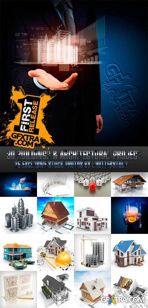
Stock Photos - 3D Buildings & Architectural Project
30 UHQ JPG Render Images in Original Filenames | Up to ~8000x6000 Pixels | 234 MB

Features
- Compatible with wordpress 3.5.
- Responsive Design: On iPad, iPhone and Android, Enable Or Disable Responsive.
- Compatible with All in one SEO pack and Yoast SEO plugins.
- Friendly for SEO: All headings has been made in order (h1, h2, h3, ..., h6) from the most important to less.
- Advanced Admin Panel: customize just about any part of your site quickly and easily.
- Portfolio Custom Post Type: support 1/2/3/4 columns, jquery sortable and classic sortable, Youtube & Vimeo & local Video(Mp4, Ogv, Webm), images, Slideshow Support.
- Blog Posts: Post Formats With Image, Slideshow, Youtube & Vimeo & local Video(Mp4, Ogv, Webm), Audio, Quote, Link Support.
- Pages: left sidebar, right sidebar, fullwidth, contact, archives page.
- Unique and different look
- Custom Logo by image uploader
- Many visual shortcodes
- Custom css support by admin panel
- Html5 & CSS3
- Google Analytics & Google Maps
- Crossbrowser compatible
- Google fonts on almost all elements (manage from admin)
- And More…

The template comes loaded with options such as a custom highlight color to set your own color scheme, a custom highlight font, social icon integration, and much more!

This product gives you a possibility to create professional forms on pages of your CMS pro! content without requiring knowledge of HTML, MySQL and PHP.
SermonBox - Seasonal Collection

SermonBox - The Series Pack Collection

Top Rated News


Would you like to be a Author?