OTF
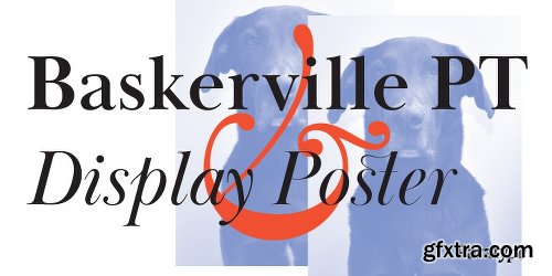
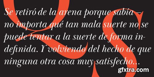
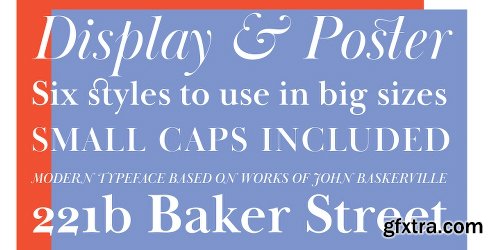
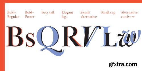
Baskerville Display PT is a type family intended for large and extra large point sizes. It was inspired by the faces of John Baskerville and designed for expressive display typography. Two weights of Baskerville Display with matching italics are much lighter than the existing text versions of Baskerville. Each of them is an ideal partner for ITC New Baskerville. A good addition to the family is Baskerville Poster which will look great in very large sizes. The font was designed by Arina Alaferdova under the supervision of Dmitry Kirsanov and released by ParaType in 2016.
Previews


Valise Montreal Font
TTF
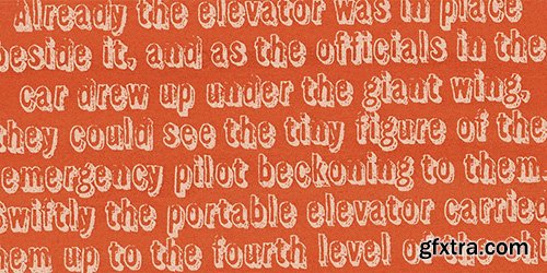
A condensed loose brush style.
This font has a breezy elegance and casual sophistication, yet in a different context or color, it could be seen as nervous and urban. A weird dichotomy.
Set in smallish text blocks, it has a surprisingly even color. This is due to a balace that has been struck between keeping the roughness and idiosyncracies of a hand-drawn face but ensuring an overall regularity.
http://www.myfonts.com/fonts/device/valise-montreal/
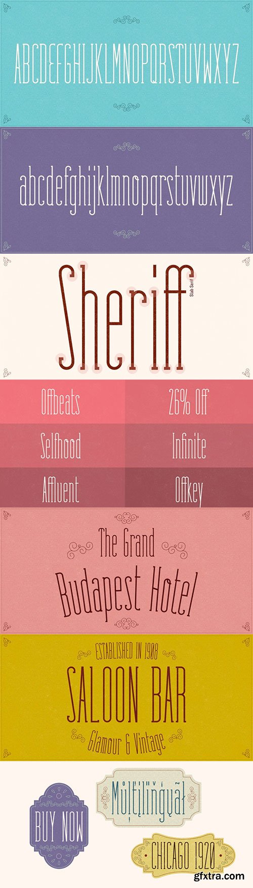
Fabuleuse Slab - Retro Look & Bohemian Feeling $18
OTF Font File | Designer: Nuno Dias | Publisher: Nuno Dias | Turkish Support
http://www.myfonts.com/fonts/nuno-dias/fabuleuse-slab/
![]()
![]()
![]()
![]()
![]()
![]()
![]()
![]()
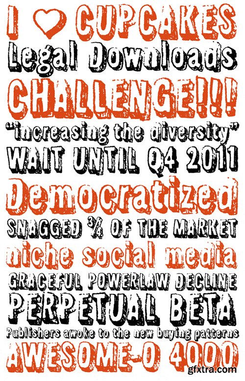
Fabuleuse Slab is a one-style font that features a thin, condensed and high cap height and x-height. This gives the font a distinct retro look & bohemian feeling that is great for logos & branding, packaging, titles, magazines, posters, signs, shirts, scrap-booking, … This display font comes in Capital letters as well as Lowercase. It also comes equipped with Ligatures, Numbers, Punctuation Marks, Diacritic Marks and a well stocked supply of special characters.


Hurme Geometric Sans No.Font Family - 56 Fonts $2744
OTF | 1.46 MB
Sale PaGe No.1 Sale PaGe No.2 Sale PaGe No.3 Sale PaGe No.4
Hurme Geometric Sans No.1 includes seven weights with true Small Caps and obliques. Please see the specimen PDF for complete overview of the typeface and its features. Alternate characters and other Opentype features make for a versatile family that can be adjusted for specific needs. Hurme Geometric Sans No.1 and No.2 are essentially the same fonts, but with different sets of characters set as default. All the other characters can be accessed through the Opentype features. When buying HGS No.1, you will receive corresponding weights of HGS No.2 free of charge.Hurme Geometric Sans is a series of font families all with distinctive qualities and features but share the same basic construction and proportions. See also the other Hurme Geometric Sans families.
Hurme Geometric Sans No.3 includes seven weights with true Small Caps and obliques. Please see the specimen PDF for complete overview of the typeface and its features. Alternate characters and other Opentype features make for a versatile family that can be adjusted for specific needs.Hurme Geometric Sans No.4 includes seven weights with true Small Caps, obliques and swash alternates. Uppercase swash alternates can be automatically applied to all characters or just to first and last characters of each word. Please see the specimen PDF for complete overview of the typeface and its features. Alternate characters and other Opentype features make for a versatile family that can be adjusted for specific needs.


OTF
Danos is a flexible family of modern sans serif and characterized by some humanistic. It has his own unique style in expressed perfect condensed forms, inspired by the classic industrial grotesque and geometric typefaces. Danos is an ideal font family for display, text, print, user interfaces, mobile devices, branding, signage, and especially web design creation, with a set of minimal ligatures and alternative characters for your design in any layout. The family has 18 weights ranging from Thin to Black and their italic.
Previews


Kopius Font Family - 16 FONTS $799
OTF
The Kopius™ family is a contemporary serif type that features friendly characteristics with round, open counters conveying a relaxed ambiance. The robustness of the characters supports a wide variety of applications including editorial and display use.
The uniquely defined novel glyph construction and serif shapes convey an allusion to a brush stroke that bestows a contemporary, texture-rich appearance entirely in tune with functionality. The top and bottom slightly curved stems imply flow and reading direction.
Kopius is an exuberant family with a genuinely multifaceted repertoire. This upbeat type comes with a multitude of weights to satisfy any fanciful appetite for a colorful typographic palette. With packaging solutions in mind the family includes sets of expandable and combinable box heading material for a boundless range of adjusted composites.
In addition, pertinent labels, weight-adjusted arrows, and word logos complete the Kopius family. OpenType provides advanced layout features including figure sets, small caps, fractions, and more.
Herbert Thannhaeuser’s Liberta, an Antiqua type family designed for the East German type foundry VEB Typoart between the middle to end 1950s, has stirred the initial inspiring force for Kopius. Baskerville-like open and modern typeface proportions further characterize Kopius’ letter dimensions. With its affable yet serious demeanor, Kopius is confidently assuming numerous tasks
http://www.myfonts.com/fonts/kontour-type/kopius/
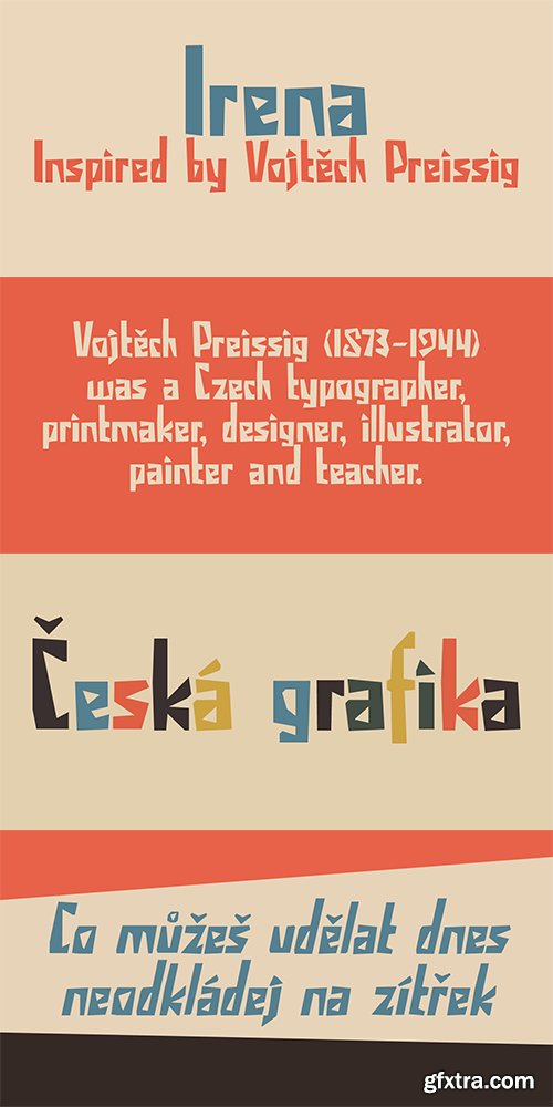
Irena Fonts - 2 Font
OTF
Irena is a cubist/expressionist font inspired by Vojt?ch Preissig. Preissig (1873-1944) was a Czech typographer, printmaker, illustrator and teacher, whose work was influenced by Japanese Art and Symbolism. During WWII, Preissig supported the Czech resistance and he was arrested in 1940. He died on June 11th in Dachau concentration camp. This font was named after his daughter Irena Bernášková. The Irena font is angular and square(ish), yet easy to read. It comes with extensive language support.
http://www.myfonts.com/fonts/hanoded/irena/
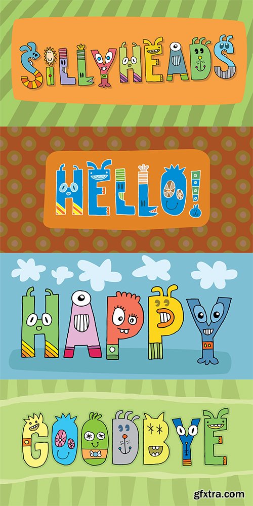
Sillyheads Font
OTF
Need something VERY silly for your headlines and still keep the legibility?!
Then Sillyheads could be your no. 1 choice!
Sillyheads has got that funny, weird, cute, crazy look!
http://www.myfonts.com/fonts/pizzadude/sillyheads/

OTF | TFF | 5.77 MB
Sale Page
Walken is a sure-footed slab serif font family.
A stencil font, you ask? Sometimes . . . maybe . . . maybe you should stop asking so many questions.

OTF | TTF | 300 KB
Sale Page
The typeface was designed at Double Alex Font Studio by Alexey Chekulaev in 2006 based on Dido by Firmin Didot, 1799.

OTF | TTF | 1.23 MB
Sale Page
Compasse is a semi-condensed sans-serif family designed by Ryoichi Tsunekawa and the whole family consists of 12 style: six weights from Thin to ExtraBold and their matching Italics. The range of styles provides flexibility for title, headline and body text. And the large x-heights increases legibility and readability.
The basic skeleton of their letterform was not designed over-modularly but moderately semi-modularly (adjusted by designer’s experience). Therefore the typical artificiality and unnaturalness which come from module-design does not exist in this family. The sophisticated letterform and its universal, neutral, and standard design make it possible to be used across a wide range of applications in all medias, all purposes.
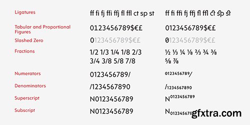
Compasse supports almost all european languages: Western, Central, South Eastern Europeans and afrikaans. And superior figures, inferior figures, denominators, numerators and fraction can be accessed by using OpenType features.


Fonts can be a very powerful tool when properly used in a design project or a website. Different fonts send out different messages or emotions, making them a very important aspect in a project.
But there’s a big issue regarding them – the price. A good set of fonts for commercial use can create serious holes in your budget.Wanting to help you, we’ve partnered with the guys from SummitSoft to bring you FontPack Pro Master Collection with 7,640 OpenType fonts!
Sale Page
http://www.myfonts.com/fonts/ywft/whisky/
The Precursors. The Founders. The Engineers. Known by many names in popular culture, this colony of erudite masters from Long Before were as style-conscious as they were technically adept, and their written glyphs certainly might have resembled YWFT Whisky. A masterpiece of friendly curves and powerful graphical flair, YWFT Whisky evokes the torch-lit corridors under Giza, with plenty of pre-kerned patterns and stylistic surprises under the hood. Bold, patterned abstractions await in the bottle of this Whiskey. Neat, one cube only please.
OTF | 2 Fonts | + JPG Preview


60 Font Family - 474 Fonts 14500$
Sale Page 1 Sale Page 2
Fontfabric is an independent type foundry, which was launched at the close of 2008 by type designer Svet Simov who is based in Sofia, Bulgaria. Our goal is to create high-quality fonts which stand in a unique class of their own, and which will serve as a good base for any designer project whether it be web, print, t-shirt design, logo etc.
In less than three years, our Fontfabric collection has grown to almost thirty type families, many of which have become top sellers. Our typefaces are in perfect tune with the current revival of 1970s geometric lettering and ornamentation, a style of graphic design which we loves and admires, while adding subtle new flavors to the repertoire of available fonts.
OTF | 1.46 MB
Sale PaGe
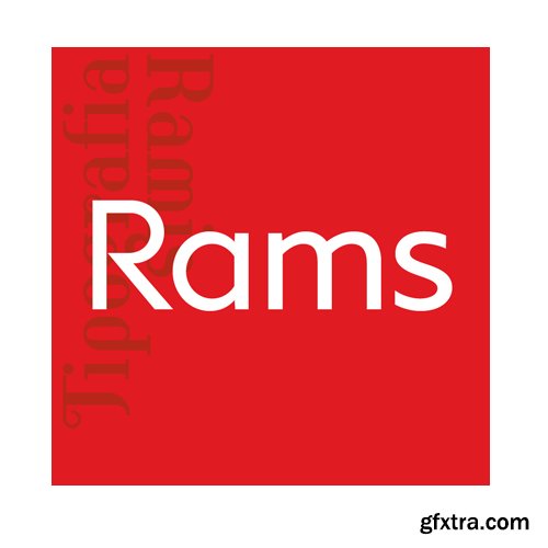
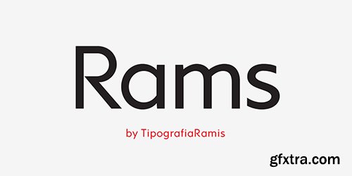
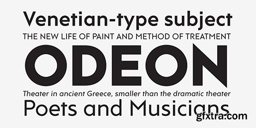
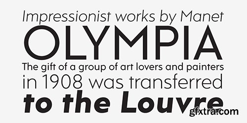
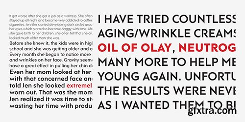
RAMS is a Sans Serif type family of four weights with matching italics. The typeface’s design was influenced by the geometric style of Sans Serif faces of the 30s. The letter shapes – based on geometric forms – have been optically corrected for better legibility, thus enabling geometric concepts to be adapted by typographic tradition.
While the typeface is intended for use in display sizes, it is also quite legible in text and is well suited for editorials.
Rams is released in OpenType format with extended support for most Latin languages and includes some opentype features – proportional/tabular figures, slashed zero, ligatures, fractions...
OTF | 566 KB
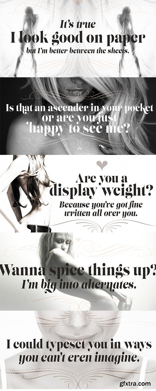
- The original Lust (and later, Lust Script) was my overly indulgent attempt to infuse wanton sensuality in a typeface. I wanted to create an over the top, curvy serif that was a little sexy. Lust Slim signifies a maturation of the individual families as it branches out into further useful typographic indulgences. Lust Slim is just that, slimmer, more compact, more economical of space. It works lock-step with Lust and Lust Script. Both weights and each variant still appear… just optimized for a narrower setting. Everything that was under the covers before, still remains–with a few surprises—Lots of contrast, almost demure, coy contrast mixed with the flowing curves of a woman’s body, incomplete, almost teasing ball terminals, and serifs that went on forever…so sharp they would draw blood if you touched them...

https://www.myfonts.com/fonts/cheapprofonts/kremlin-ii-pro/
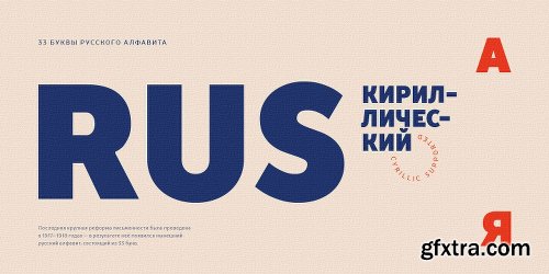
Most uppercase letters of these constructivist fonts are made to look like cyrillic letters, so by carefully interspersing those you can set your text and headlines with it and make it look Russian! To a native Russian this of course looks very silly indeed, so to make amends for toying with their letters I have also included a full proper and genuine cyrillic character set. So these are the first CheapProFonts fonts to support languages using the cyrillic script in addition to the usual 65 latin-based languages.
OTF | 4 Fonts | + JPG Preview

http://www.parachutefonts.com/typefaces/allfonts/regal-swash-pro
The objective of this project was to design a new typeface series for Grazia magazine. First published in 2010, Regal was later revamped and redesigned for commercial use, evolving into a type system with five related superfamilies. According to the brief, this typeface had to be elegant, luxurious, sexy, vibrant, reflect the female sensitivity and take into consideration a modern woman who is more proud, more connected, more spontaneous, open-minded and eager to try a whole host of new products and services. Targeting this consumption-wise and well-educated woman, required a typeface that is not strictly based on classic forms, but incorporates several distinct elements that express a modern woman’s personality and the products she consumes. In that respect, a whole series of 5 related superfamilies was designed, which not only emphasize femininity but also reflect both the romantic as well as the dynamic side of the female personality. For that matter, elegant curvy details were introduced in order to create a link to the female figure; teardrop terminals which reflect a woman’s sensitivity; pronounced quirks on upper and lower arms for her eyelashes; high-contrast, sharp corners at thinning terminals for her high heels; alternate glyphs for the woman who prefers to express her individuality -rather than slavishly follow trends- by using various accessories which can dramatically change her appearance; elegant endings and long curves to reflect her predisposition to dream; bell-shaped serifs with an inward rather than outward direction which recall streamlined seventies fashion. This series of typefaces is diverse in its construction as it consists of five related superfamilies i.e. text, display, ?nesse, swash and stencil. There is a variety of weights which range from regular to ultra black for each one of the five families. These families share common attributes but they di?er in content according to each one’s usage. The whole superfamily type system is comprised of 47 weights with an average of 898 glyphs per weight. It supports simultaneously Latin, Cyrillic and Greek and comes with many alternate glyphs.
OTF | 6 Fonts | JPG Preview | 1.1 Mb RAR

OTF | TTF | 260 KB
- Same Same, But Different is a loose, handwritten font with excellent legibility. It evokes post-it scripts, or notebook doodles and can be used virtually everywhere!Same Same But Different comes with extensive language support.
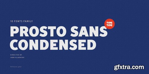
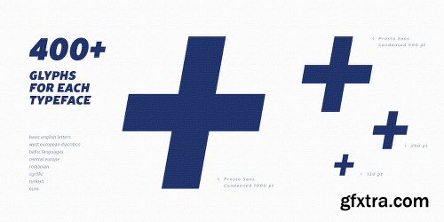
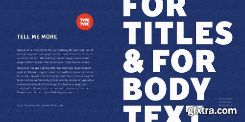
TT Prosto Sans Condensed Font Family - 10 FONT 500$
OTF
‘Prosto’ in the name of the font is translated into Russian as “Simply”. Prosto Sans Condensed is the condensed version of the Prosto Sans font family. We created the simplest font possible, and it will fit perfectly into any design.
Each line of this typeface is emotionally neutral and aims to not emphasize the text in its graphic representation, but only to use the text to convey the meaning. Having Prosto Sans and Prosto Sans Condensed in your collection is like having a universal tool that helps you every day when you need to ‘mend’ or ‘repair’ something. Due to condensed proportions, any text array fits a smaller text field than usual.
https://www.myfonts.com/fonts/type-type/tt-prosto-sans-condensed/
PF Regal Swash Pro Font Family
The objective of this project was to design a new typeface series for Grazia magazine. First published in 2010, Regal was later revamped and redesigned for commercial use, evolving into a type system with five related superfamilies. According to the brief, this typeface had to be elegant, luxurious, sexy, vibrant, reflect the female sensitivity and take into consideration a modern woman who is more proud, more connected, more spontaneous, open-minded and eager to try a whole host of new products and services. Targeting this consumption-wise and well-educated woman, required a typeface that is not strictly based on classic forms, but incorporates several distinct elements that express a modern woman’s personality and the products she consumes. In that respect, a whole series of 5 related superfamilies was designed, which not only emphasize femininity but also reflect both the romantic as well as the dynamic side of the female personality. For that matter, elegant curvy details were introduced in order to create a link to the female figure; teardrop terminals which reflect a woman’s sensitivity; pronounced quirks on upper and lower arms for her eyelashes; high-contrast, sharp corners at thinning terminals for her high heels; alternate glyphs for the woman who prefers to express her individuality -rather than slavishly follow trends- by using various accessories which can dramatically change her appearance; elegant endings and long curves to reflect her predisposition to dream; bell-shaped serifs with an inward rather than outward direction which recall streamlined seventies fashion. This series of typefaces is diverse in its construction as it consists of five related superfamilies i.e. text, display, ?nesse, swash and stencil. There is a variety of weights which range from regular to ultra black for each one of the five families. These families share common attributes but they di?er in content according to each one’s usage. The whole superfamily type system is comprised of 47 weights with an average of 898 glyphs per weight. It supports simultaneously Latin, Cyrillic and Greek and comes with many alternate glyphs.
OTF | 6 Fonts | JPEG Preview | 4.9 Mb RAR

Tungsten Font Family $496 | 32 x OTF | Turkish Support
http://www.typography.com/fonts/tungsten/overview/
Smart, tough, and sexy. Hello Tungsten.That rarest of species, Tungsten is a compact and sporty sans serif that’s disarming instead of pushy — not just loud, but persuasive.Flat-sided sans serifs have been a vital part of graphic design since its very beginning. Like many of typography’s loveliest styles, these letters are an import from sign painting, where the style — doubtless because its kit of lines and curves resembles plumbing — is colorfully known as "Modern Gaspipe." These modular letters were an important part of the twentieth century poster, bright and optimistic in the propaganda of the Works Progress Administration (WPA), and peremptory in the Constructivism of the young USSR. In the service of any agenda, what these letters always signified was modernity, industry, and zeal.It was an unusual design brief for ourselves, completely without visual cues, instead trading in cultural associations: “more Steve McQueen than Steven Seagal,” reads one note; “whiskey highball, not a martini” suggests another. We decided to reduce the letterforms not to circles and squares, but to a manageable set of stated interrelationships — between inside and outside, uppercase and lowercase, and one letter and the next — that could be applied with equal consistency throughout the design. The result is Tungsten, a family of high-impact fonts that doesn’t sacrifice wit, versatility, or style.

http://www.typography.com/fonts/gotham/inside/gotham-narrow
A new and economical Gotham, specifically designed for text.Typefaces whose letterforms are rooted in the square and circle are known as "geometrics," and they're one of typography's great paradoxes. Their wide proportions and open shapes make them easy to read at text sizes, and a well-designed geometric can reinforce this clarity through careful attention to the design's internal proportions as well. (Gotham's large lowercase has dilated features, succinct ascenders and descenders, and a generous fit, which combine to make Gotham especially clear at text sizes and below.) But because geometrics are wider than average, they can be difficult to use in narrow columns, which is exactly where text most often appears.
SermonBox - Seasonal Collection

SermonBox - The Series Pack Collection

Top Rated News


Would you like to be a Author?


