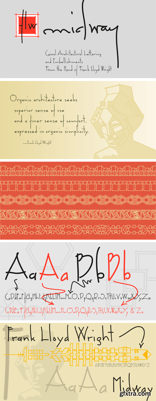
FLW Midway Font Family
This font set is based on Frank Lloyd Wright's hand-lettering found on the Chicago Midway Gardens working drawings from 1913. This type of architectural lettering is a bit more casual than standard lettering found on most blueprints. It evokes the personality of Frank Lloyd Wright and complements the other fonts in the P22 FLW font series.
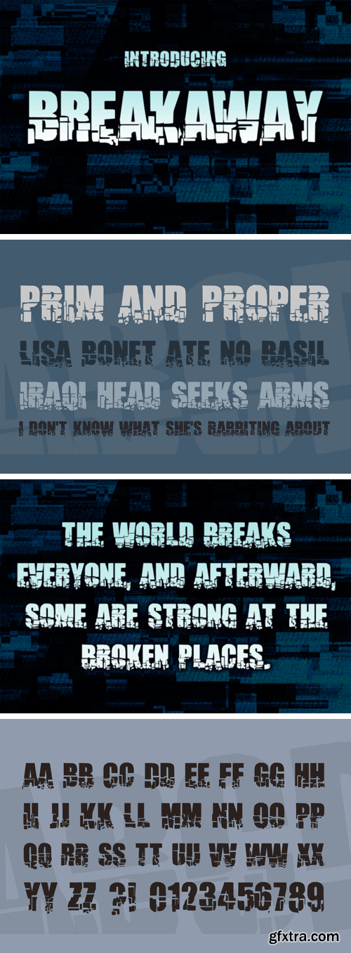
Creativefabrica - Breakaway 444749
Breakaway is a stunning shattered display font, perfect for action-based themes and more! This bold, blocky font has a ton of style!
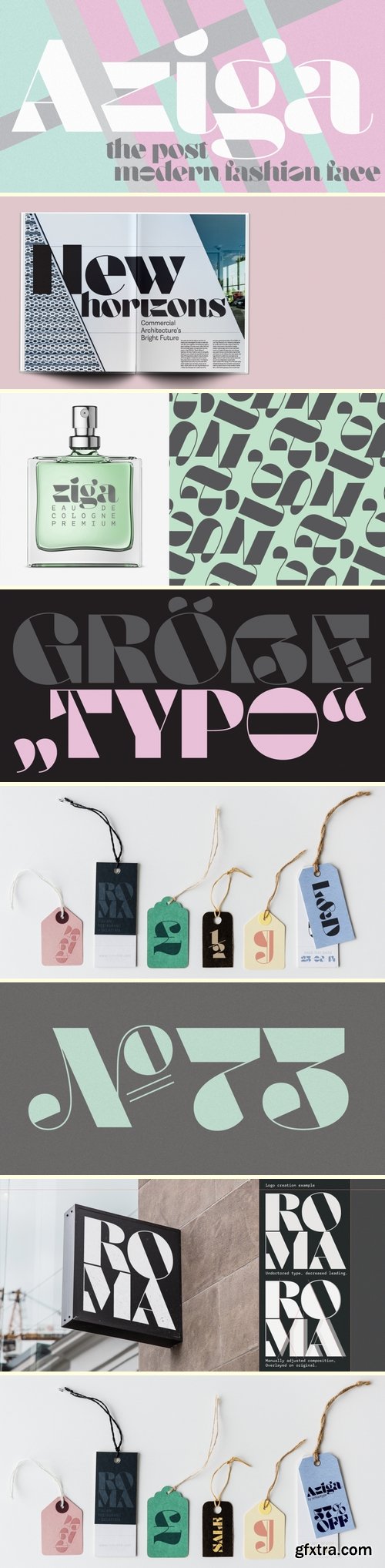
Aziga Font
https://www.fontspring.com/fonts/schizotype/aziga
In a typeface category that has been sorely under-represented until now, Aziga is a high (occasionally reversed) contrast, postmodern, deconstructed-reconstructed, serifless (mostly), fashion didone! Aziga lends itself to being set loud and proud, and the consistent angles throughout the glyphs make it a good candidate for more abstract typographic compositions. For the really graphically inclined (excuse the pun) a rotaion of 66° will make the main diagonals in the font horizontal and vertical. Features include stylistic and contextual alternates, ligatures and case sensitive forms.
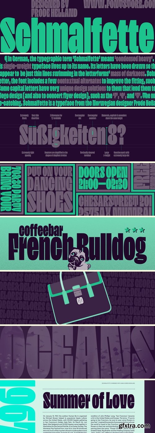
Schmalfette Font
https://www.fontstore.com/font/schmalfette
In German, the typographic term ‘Schmalfette’ means ‘condensed heavy’. This single-weight typeface lives up to its name. Its letters have been drawn so that they are both narrow and dark. The counterforms are particularly interesting, as they appear to be just thin lines swimming in the letterforms’ mass of darkness. Schmalfette is spaced very tightly; the amount of white space placed between each letter is optically about the same size as those line-thin counters. To make this work even better, the font includes a few contextual alternates to improve the fitting, such as a ‘j’ with a different tail and a few separate versions of the ‘g’, each of which has a subtly different treatment of the descending loop. Schmalfette’s x-height is tall, and its ascenders rise to the exact same height shared by the tops of capital letters and numerals. Some capital letters have very unique design solutions to them that lend them to logo design (and also to concert flyer design), such as the ‘F’, ‘Q’, and ’T’. The numerals are also all quite eye-catching. Schmalfette is a typeface from the Norwegian designer Frode Helland.

Passenger Display Font Family - 14 Fonts
https://www.myfonts.com/fonts/indian-type-foundry/passenger-display/
Passenger Display is a high-contrast “modern” or Didone-style font family. It is intended for use in headlines, signs, or posters – any place where you need to set large, elegant-looking type. Passenger Display takes the idea of early-nineteenth century types – vertical axes of stress, combined with ball terminals – and dials up the stroke-contrast and degree of sophistication. It features serifs that thin gradually into fine lines and points. The family is ready for use in editorial design and corporate communications projects. Passenger Display includes seven weights, ranging in style from Extralight through Extrabold. Each weight has both an upright font and an italic on offer. The fonts’ default numerals are proportionally-spaced lining figures. Via the OpenType features, there are also oldstyle figures and tabular figures available, as well as a full range of numerators and denominators for typesetting fractions. The ascenders of the lowercase letters rise up above the tops of the capitals. In the upright fonts, the ‘a’ and the ‘g’ are double-storied. In the italics, they are single-storied. Each font includes 13 f-ligatures. Passenger Display has a companion typeface available for larger-sized applications: Passenger Text. Passenger Display and Passenger Text can be used together to powerful effect in magazine layouts, or in exhibition design graphics.. The Passenger families were designed by Diana Ovezea and Samo A?ko.
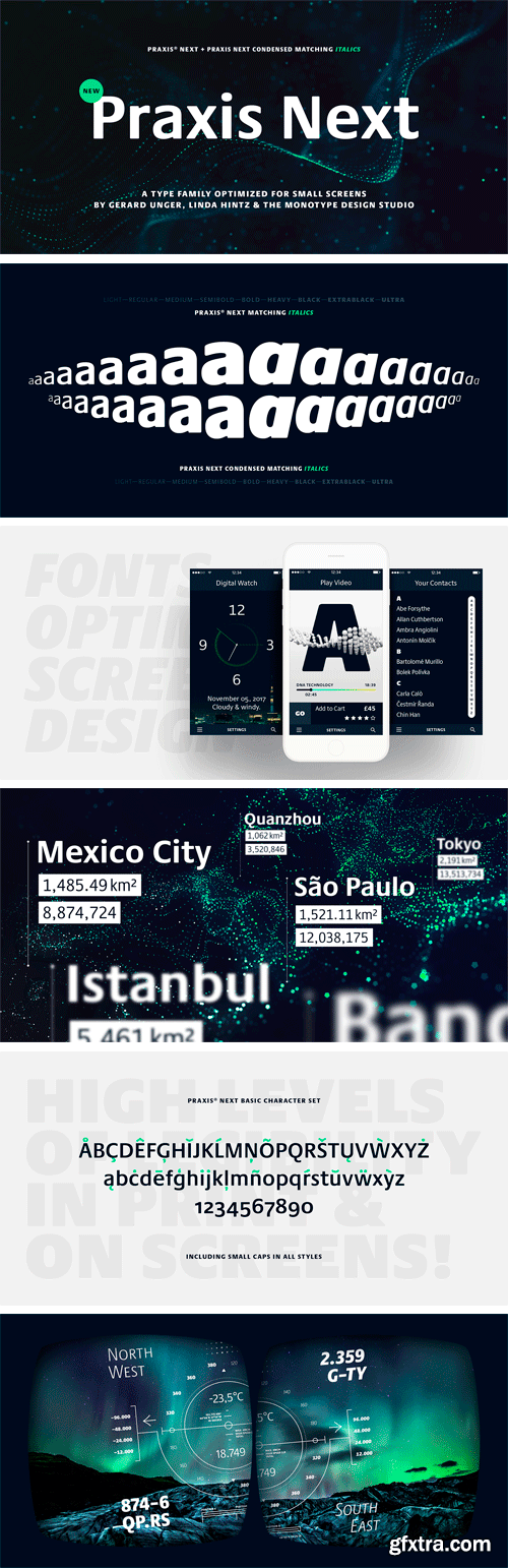
https://www.myfonts.com/fonts/linotype/praxis-next/
Praxis® Next has the same robust shapes and proportions as the original 1976 Praxis design. Its large x-height, substantial counters and open apertures guarantee high levels of legibility and reading ease in print and on screen. More weights, condensed designs and true cursive italics differentiate Praxis Next from the older design.

Borsok Font
Borsok is a bold friendly font. It contains all caps letters, numbers, symbols, multilingual accents, including Latin and Cyrillic. This font perfectly suits fot logos, branding, headlines and posters, kids design and other creatives.

Highground Typeface
Highground is a fun typeface for your punk band to make shitty posters to hang on electrical poles around town.
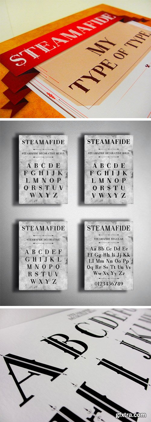
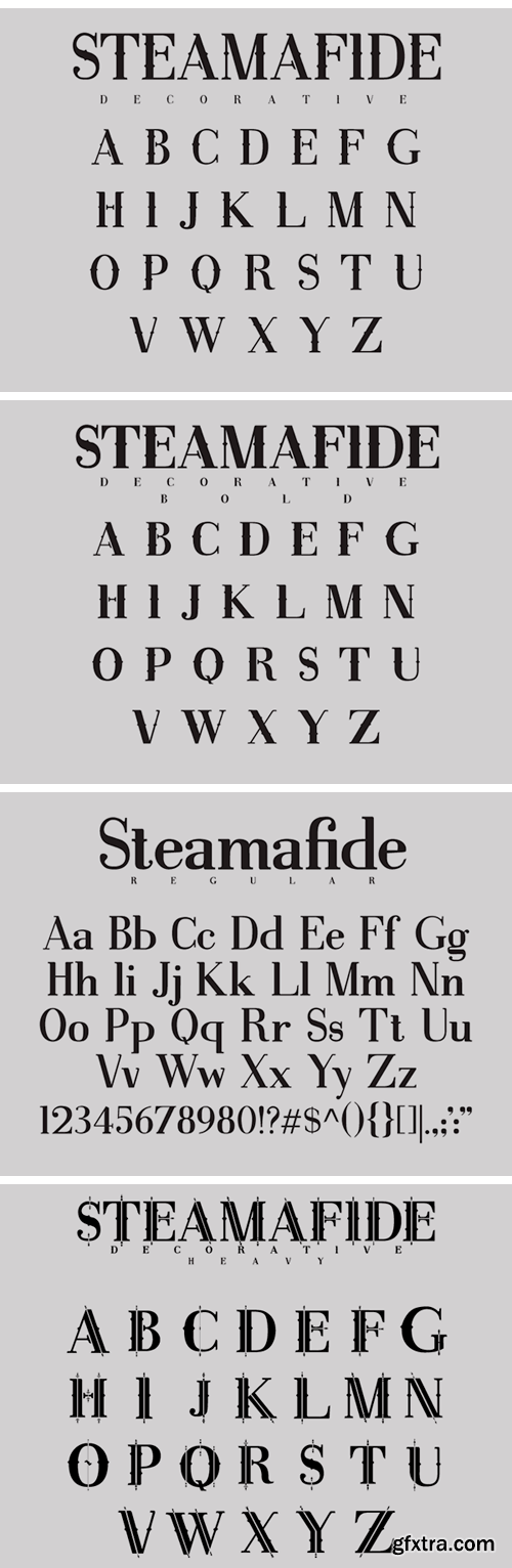
Steamafide Font Family
During my final year of University I developed a typeface design for the unit Major Project. It's designed to be used in a Steampunk or Victorian context. The genre is expressed through the serifs of the type. ? The family consist of Steamafide: Regular, Decorative, Decorative Bold and Decorative Heavy.

Honeymoon Font Family
Designed by Måns Grebäck, Honeymoon is a script font family. This typeface has four styles.

Ibarra Real Font Family
Ibarra Real is a serif typeface project focusing on and highlighting Spain’s typographic heritage. The production of this design was always aimed at the patrimonial and cultural recovery of one of the best examples of Spanish writing and Spanish printing. The typeface contains Regular, Semibold and Bold weights and their Italics, contains full set of glyphs, including uppercase and lowercase letters, numerals, symbols, ligatures, multilingual accents.

https://www.myfonts.com/fonts/device/english-grotesque/
English Grotesque is based on the proportions of an early 20th century signwriter’s sans, emphasising the characteristic idiosyncrasies of type of the period. Sharing a similar Roman circle-and-square construction as Gill Sans or Johnston Railway, it has a wide T and W, a narrow S, and a long-tailed R.

Martin Gothic Font Family
A modern and clean sans-serif originally designed by Phil Martin in 1987, works great in body and headline usage.

HWT Antique Tuscan No. 9 Font
HWT Antique Tuscan 9 is a very condensed 19th century Tuscan style wood type design with a full character set and ligatures. This design was first shown by Wm H Page Co in 1859 and is the first digital version of this font to include a lowercase and extended European character set. This is a font best used at large sizes.
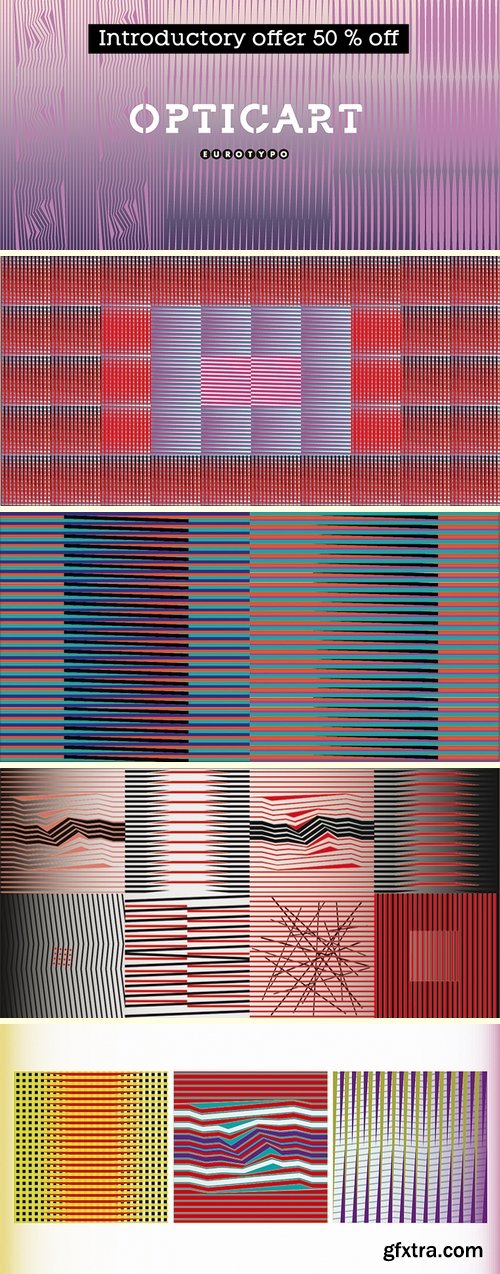
OpticArt Font
https://www.fontspring.com/fonts/eurotypo/opticart
Opticart is a family of glyphs inspired by Op Art (Optical Art). They include 133 models. Each letter is a subfamily that can combine overlapping (A, a, a.salt and A.swsh) and thus generate more than 365 glyphs, or thousands if we combine different letters or symbols.
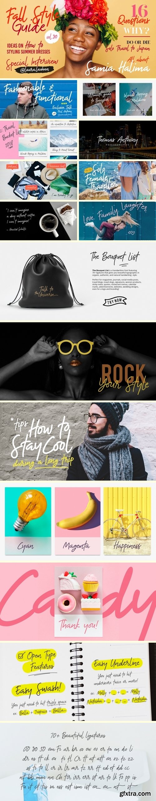
The Bouquet list Font Family - 3 Fonts
https://www.fontspring.com/fonts/desainer-males/the-bouquet-list
Introducing the Bouquet List - an ultimate handwriting script font. Inspired by the beauty of flower bouquet and the aesthetic of handwriting when you write some bucket list or itinerary on your journal while you do travel. The Bouquet List is a handwritten font featuring 70+ ligatures that gives you beautiful typographic in organic, authentic, and natural handwriting style. Perfect for magazines, social media posts, travel blog, travel vlog, signatures, sticky notes, journal, quotes, restaurant menus, websites, women products, calendar marks, book covers, advertisements, wedding designs, even for a logo and branding!
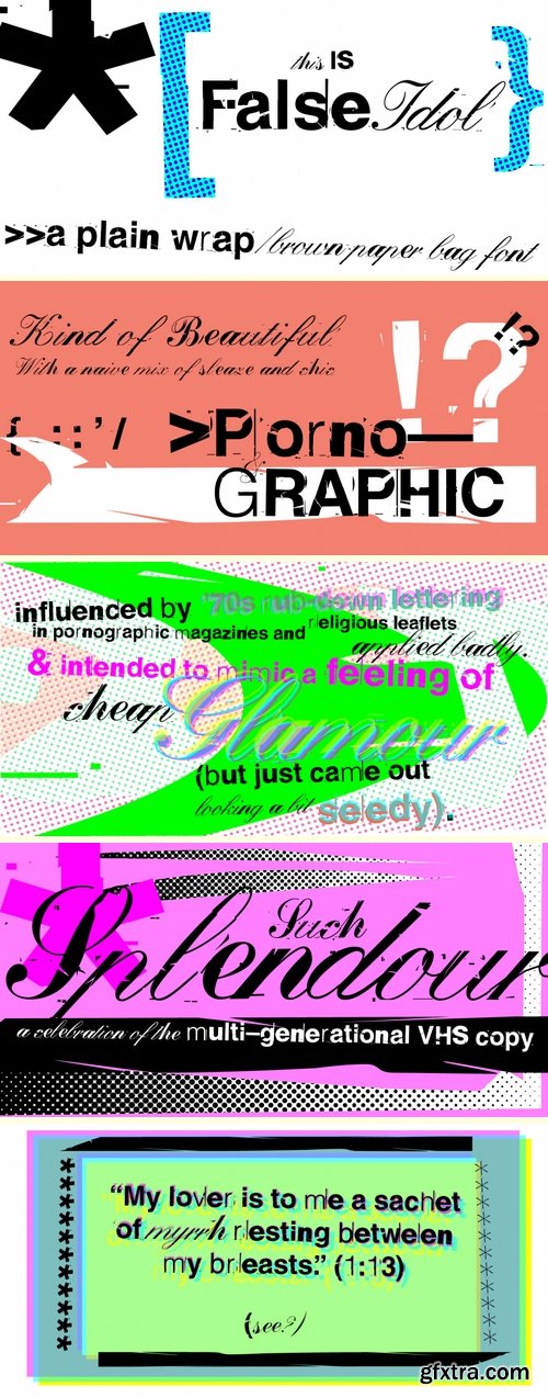
False Idol - 2 Fonts
https://www.fontspring.com/fonts/barnbrook/false-idol
Based upon bad rub-down lettering from 1970s pornographic magazines and home-made religious leaflets, False Idol’s letterforms were intended to mimic a feeling of cheap glamour but just became seedy. Somehow, an alluring beauty emerges from this naive mix of sleaze and chic which has made False Idol one of our most popular fonts.
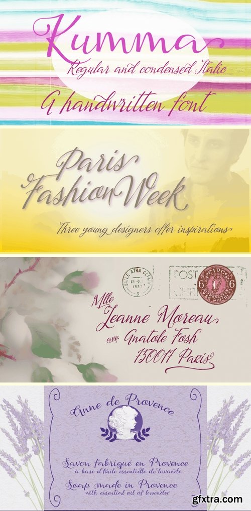
Kumma - 2 Fonts
https://www.fontspring.com/fonts/eurotypo/kumma
Kumma is a fresh and spontaneous script font, with an agile and expressive stroke. Specially designed for use in packaging, posters, brochures, greeting cards and much more.
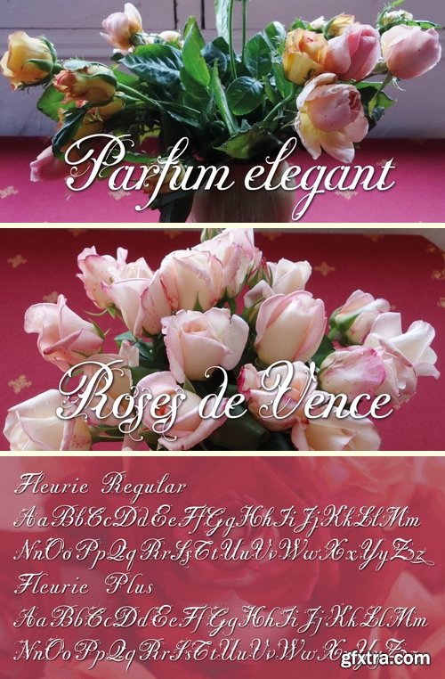
Fleurie - 2 Fonts
https://www.fontspring.com/fonts/wiescher-design/fleurie
A 1920s inspired flowering script typeface.
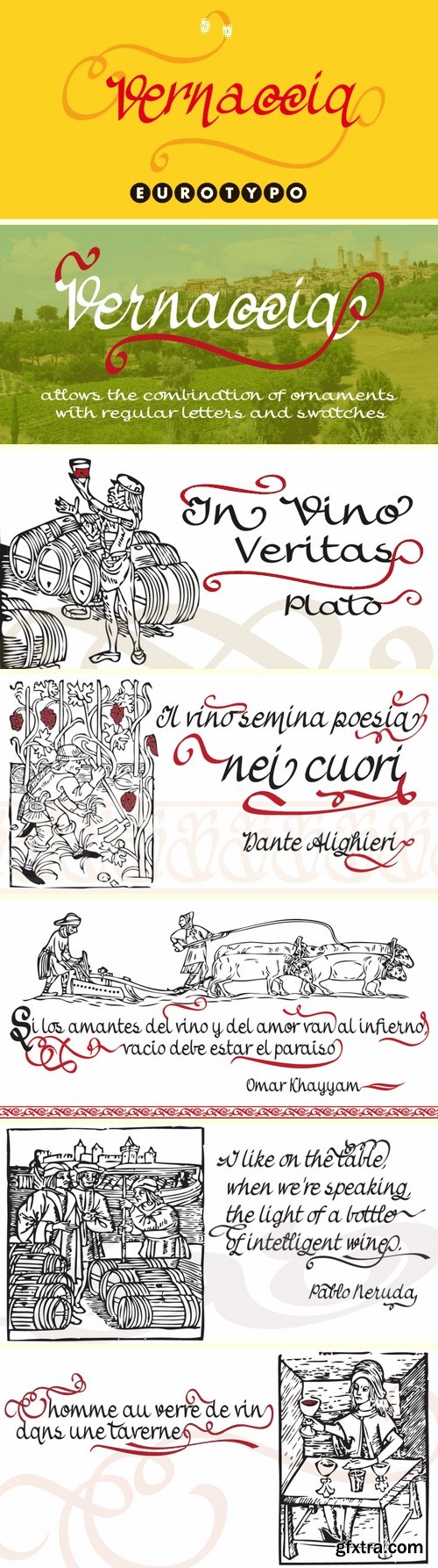
Vernaccia Font Family - 4 Fonts
https://www.fontspring.com/fonts/eurotypo/vernaccia
Vernaccia is a type family of four fonts: Regular, Bold, Condensed and Condensed Italic. Is a modern and casual calligraphy typeface. As an exclusively Open Type release, with 759 glyphs and 45 ornaments, it has several special alternatives for all letters with lots of possibility and an infinity of combinations. Most of the ornaments can be used alone, but actually they were especially designed to combine with the different glyphs. There are plenty of options to allow you to create something unique and special: standard and discretionary ligatures, several swashes and stylistics alternates for each letter, catchwords, tails that can be added to the beginning or end of each letter, ornaments, and much more. These fonts have already an extended character set to support Western European languages.


TTF
In this modern era, sometimes being bold is not enough. Sometimes you need to go BOLDER! So here comes the Liquorstore Bolder font family, the long awaited sequel to the popular Liquorstore industrial, geometric display font. This new bolder font family features multiple styles that work on their own or as overlapping layers to create stunning multi-color typography. Chromatic layering effects are created with inline, outline, bi-line, and tri-line styles can be used together to create extra impactful words in your logos and headlines.
https://www.myfonts.com/fonts/chank/liquorstore-bold-and-bolder/
TTF
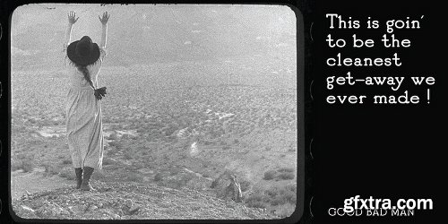
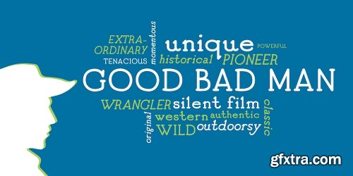
This historic revival font was created especially for use in the preservation and restoration of the 1916 silent film “The Good Bad Man,” starring Douglas Fairbanks. There is only one copy of the original film print in existence, and when the film was restored for a screening at the San Francisco Film Festival in 2014 the new font was created to best recreate the intent of the original lettering in the film. It is a smooth and pleasant vintage lettering style, originally designed for use on silver screens, now fully rendered in OpenType and ready for you to use in your designs or web pages today
https://www.myfonts.com/fonts/chank/good-bad-man/
SermonBox - Seasonal Collection

SermonBox - The Series Pack Collection

Top Rated News


Would you like to be a Author?


