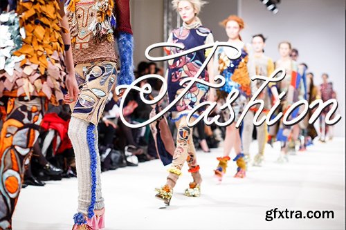
- 30 Unique Templates
- 16 Thin Line Icons
- EPS10 / JPG / PNG / PDF
- Unique Seamless Patterns
- Thin Line Illustrations
- Templates in circle, half circle and triangle, with thin line icons
- Modern vector illustrations for web page or apps
- Illustrations for banner, print media


TTF
Simple Installations
Works on PC & MAC
Clean Results


TTF
Simple Installations
Works on PC & MAC
Clean Results


TTF
Simple Installations
Works on PC & MAC
Clean Results
TTF
Simple Installations
Works on PC & MAC
Clean Results
TTF
Simple Installations
Works on PC & MAC
Clean Results
TTF
Simple Installations
Works on PC & MAC


TTF
Simple Installations
Works on PC & MAC
Clean Results


TTF
Simple Installations
Works on PC & MAC
Clean Results

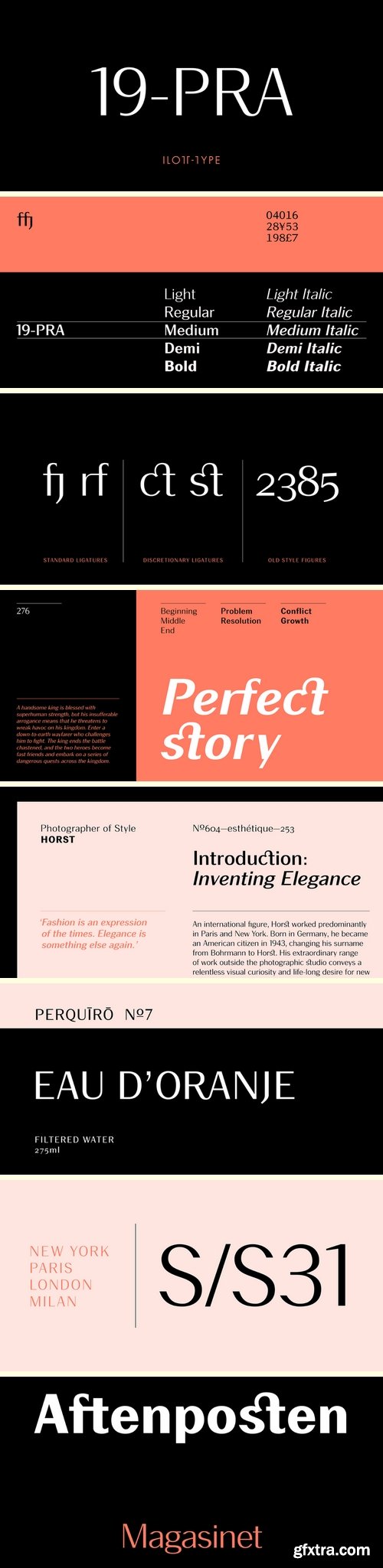
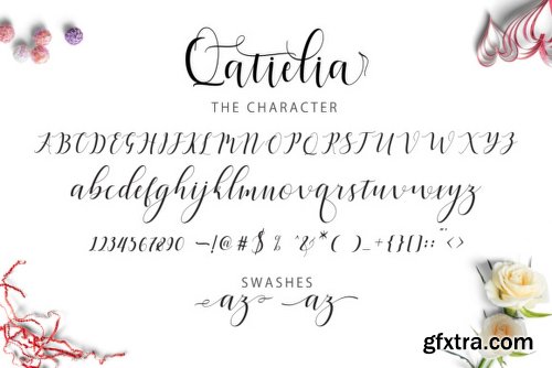
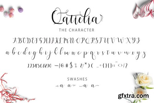
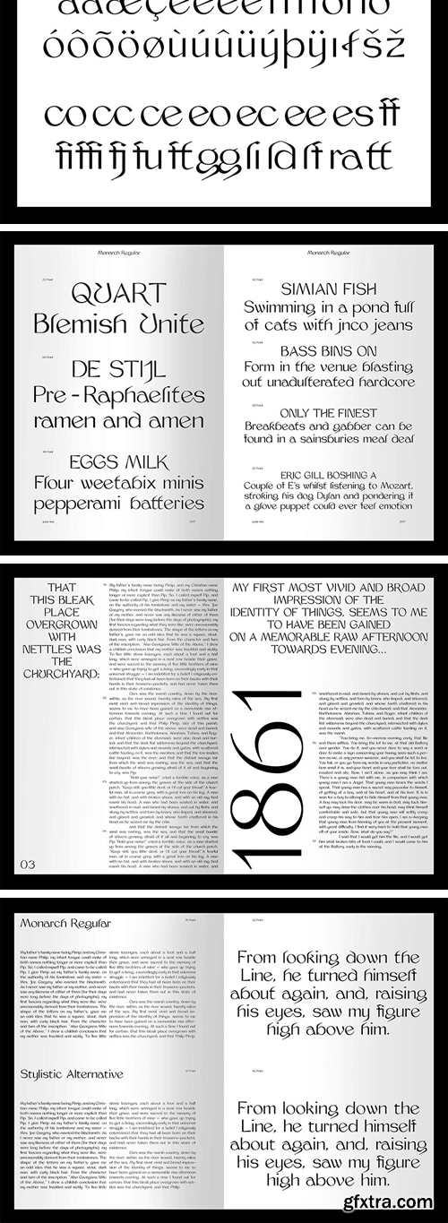
19-PRA Font Family - 10 Fonts
https://www.myfonts.com/fonts/ilott-type/19-pra/
Inspired by the elegance of Herman Zapf’s designs crossed with the readability of early 20th century Gothic fonts by Morris Fuller Benton, 19-PRA is a sans-serif with a visible stroke contrast and a humanist tone of voice. The large x-height seen in fonts like News Gothic and Palatino increases legibility and condensed proportions give excellent readability making it perfect for newspaper and magazine publishing. A typeface that can serve for both body text and titling the uppercase excels for headlines and renders beautiful brand names when tracked out. It sets well with both a serif or sans serif and has various open type features including: 12 standard ligatures, 3 discretionary ligatures, tabular figures, old stye figures as well as European accents.
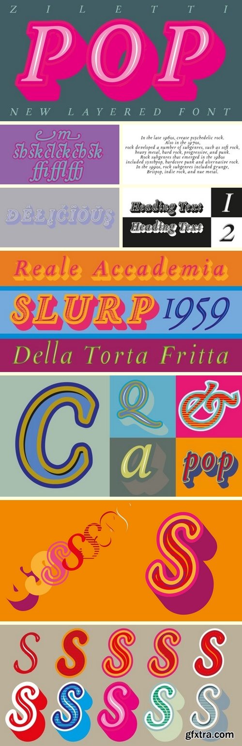
Ziletti Pop Font Family - 7 Fonts
https://www.myfonts.com/fonts/rm-wd/ziletti-pop/
ZILETTI POP is a font used by Girolamo Ziletti in Venice in mid/late 1500. A typographic caracter characterized by a Venetian style cage with slight geometrical imperfections but with a great perceptual level. This is a multilayered variant with a wide range of possibility in variations in terms of end results. With the use of the color your artworks will have news optical effects. Ideal for Covers, Posters, Logos…


OTF - TTF
Simple Installations
Works on PC & MAC
Clean Results

TTF
The Revla family just keeps expanding!
This is Revla Slab. It has the same exuberant charm as its sibling (Revla Sans and Revla Serif) with a touch more chunk. OpenType contextual alternates make for text that is lively and bouncy, without the monotony of obviously repeating letterforms.
It’s shamelessly fun, but pretty serious at the same time. The range of weights can be used to maintain an even colour across different sizes - use lighter weights for bigger sizes and vice versa. OpenType features include automatic fractions, ordinals, contextual alternates (which along with the pseudo-randomness, help maintain a nice tight fit with minimal glyph collisions), standard and discretionary ligatures (OK, only one discretionary ligature, but it’s a belter!), and case-sensitve forms.
Obviously, in sharing a common skeleton, it will work well with other members of the Revla Superfamily, particularly Revla Sans.
https://www.myfonts.com/fonts/schizotype/revla-slab/

TTF
Simple Installations
Works on PC & MAC
Clean Results


TTF
Simple Installations
Works on PC & MAC
Clean Results


TTF
Simple Installations
Works on PC & MAC
Clean Results


TTF
Simple Installations
Works on PC & MAC
Clean Results

TTF
Simple Installations
Works on PC & MAC
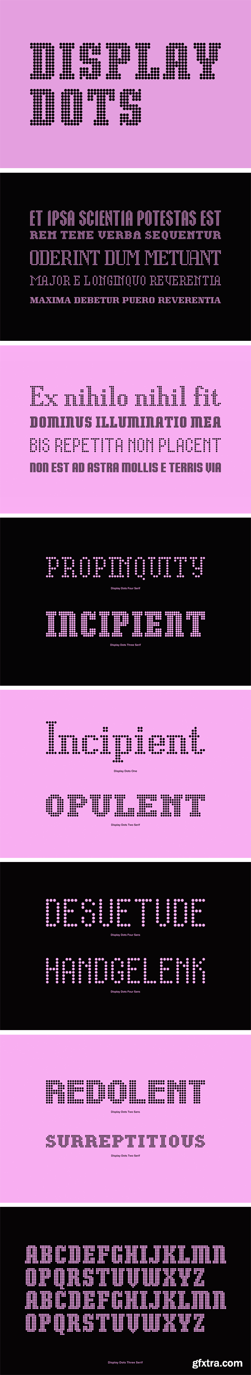
https://www.youworkforthem.com/font/T9257/display-dots/
Display Dots is a display font not intended for text use. It was designed specifically for display, headline, logotype, branding, and similar applications. Display Dots has upper and lowercase alphabets, numbers, and punctuation.

https://www.indiantypefoundry.com/fonts/akhand-gujarati
Akhand Gujarati is a family of 8 compact mono-linear typefaces. The letterforms are dynamic; typically round shapes appear more compact, as their verticals have been flattened. This ‘straightening out’ gives text set in the typefaces a streamlined look. Indeed, Akhand Gujarati is designed according to a modular system. All shapes bear a strong commonality to each other, without becoming repetitive. However, the curves in the modules have all been optically corrected, removing the mechanical nature that would otherwise become too dominant.

https://www.hellofont.com/fonts/font/1307
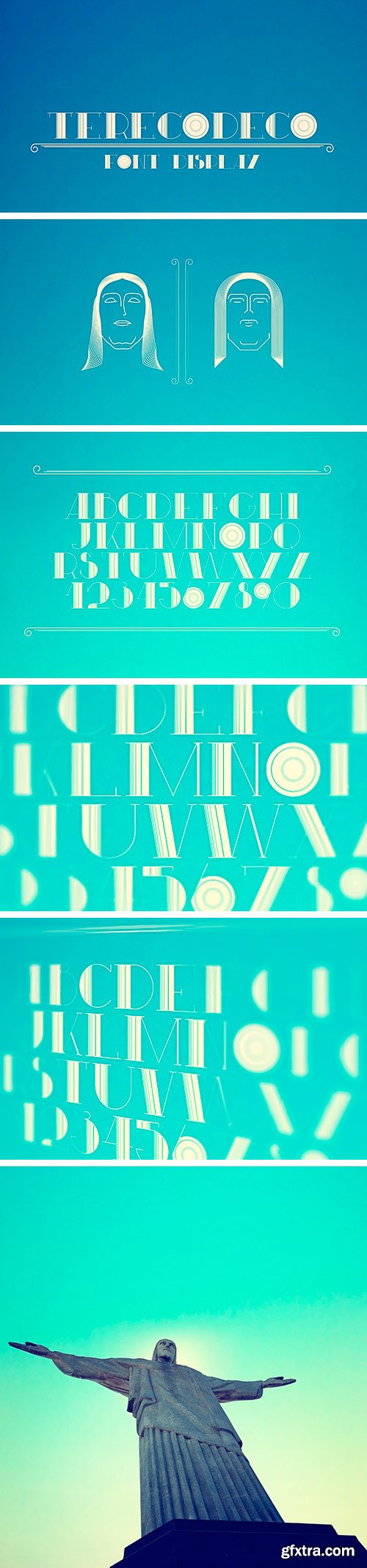
Font study with the theme Art Déco, which I identify myself because of the concept, a mix of various styles looking for innovation. This is the way I keep going with my personal projects, always trying to elaborate and take chances with new styles. The composition with the Cristo Redentor, is a sample way to show the concept behind this experience, the Christ, it's the bigger sculpture that's ever been made in this style.
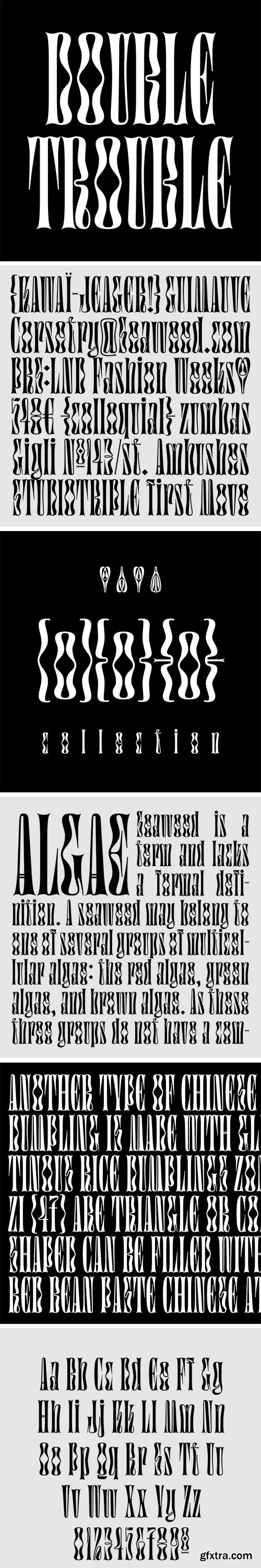
https://www.futurefonts.xyz/studiotriple/digestive
Imagine an alternate reality where Art Nouveau and Gothic architecture met and had a child. Digestive is this child.
SermonBox - Seasonal Collection

SermonBox - The Series Pack Collection

Top Rated News


Would you like to be a Author?


