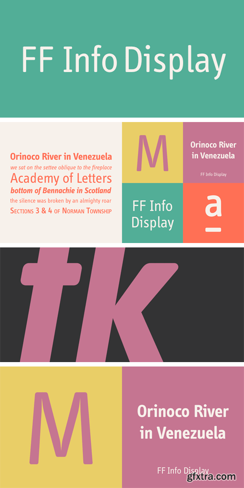
http://www.myfonts.com/fonts/fontfont/info-display/
German type designers Erik Spiekermann and Ole Schäfer, and German design agency MetaDesign created this sans FontFont between 1996 and 2000. The family has 18 weights, ranging from Regular to Bold (including italics) and is ideally suited for advertising and packaging, book text, editorial and publishing, logo, branding and creative industries, small text, wayfinding and signage as well as web and screen design. FF Info Display provides advanced typographical support with features such as ligatures, alternate characters, case-sensitive forms, fractions, super- and subscript characters, and stylistic alternates. It comes with proportional lining, proportional oldstyle, and tabular lining figures. In 1998, FF Info Display received the The Big Crit award.
OTF | 30 Fonts | + JPG Preview

http://www.myfonts.com/fonts/radomir-tinkov/qanelas-soft/
Qanelas Soft is a modern sans serif with a geometric touch. A friendlier version of the original Qanelas font family. It comes in 20 weights, 10 uprights and its matching italics. Designed with powerful opentype features in mind. Each weight includes alternate characters, fractions, extended language support (+ Cyrillic), arrows, ligatures and more. Perfectly suited for graphic design and any display use. It could easely work for web, signage, corporate as well as for editorial design.
OTF | 20 Fonts | + JPG Preview

CM 489136 - I LOVE TRAVELLING
Sloth Astronaut is glad to introduce a new hand drawn collection "I LOVE TRAVELLING". Here's What's Included:
• 25 Hand drawn objects (eps 10; Ai 5; png 300dpi, 100% transparency)
• 3 Hand lettering typography cards (eps 10; Ai 5; png 300dpi, 100% transparency)


http://www.myfonts.com/fonts/fonts-with-love/florin-sans/
A clean, symmetrical and modern typeface. The font (previously named “Heimat Grotesk”) was developed by Florian Klauer for display and body copy application. What stands out about this font is it’s large x-height and constant line-weight. Nearly all letters bend with a continuous unfaltering style, giving the impression all letters are cast from the same mold. Florin Sans comes with two weights plus matching italics with 268 glyphs each, and is available as TrueType and OpenType font.
OTF, TTF | 5 Fonts | + JPG Preview
CM 714412 - 512 Thin Line Icons
512 Thin Line Icons pack was created for use in Web Design, UI Design, Infographics, Presentations etc. Completable with Illustrator 10 and later. Completable with Photoshop CS4 and later. Main Features:
• Fully layered and fully editable
• 2 versions of colors
• Fully scalebale
• Easy to change colors
• 5 file formats including EPS, PSD, Ai, SVG, PNG (512px, 256px,128px, 64px and 32px)
• Well categorized folders and files
• Universal glyphs for multipurpose needs

Hello! Introducing vintage hippie style font "Lovebus". It has 26 automatically replaceable ligatures to make your text more original. With this font you also will get a bonus graphics. It includes girl illustration from cover and seamless pattern. I hope you'll enjoy it. Thank you!
JPG, EPS | 5 MB
https://creativemarket.com/Gleb_Guralnyk/703031-Lovebus-font-graphics


http://www.myfonts.com/fonts/fontfont/unit-rounded/
German type designer Erik Spiekermann and American type designer Christian Schwartz created this display and sans FontFont in 2008. The family has 6 weights, ranging from Light to Ultra and is ideally suited for advertising and packaging, editorial and publishing, logo, branding and creative industries, poster and billboards as well as wayfinding and signage. FF Unit Rounded provides advanced typographical support with features such as ligatures, small capitals, alternate characters, case-sensitive forms, fractions, and super- and subscript characters.
It comes with a complete range of figure set options – oldstyle and lining figures, each in tabular and proportional widths.
OTF | 12 Fonts | + JPG Preview


http://www.myfonts.com/fonts/letterheadrussia/fleursdumal/
How should an authentic baudelairean type look like? Aesthetically beautiful, that’s for sure. Intellectual, neurotic. Uptight — oh, the conventions of the time. Easily readable — still 20 years to go until the age of art nouveau with its outrage of typefaces. It may have a vibe of a Paris salon - salute to the Parnassiens. Such a modern-class (don’t mix it with the modern-styled) pharmaceutical Antiqua. Contrasts, thin serifs, the integrity of the operating theatre. But Baudelaire is not Heredia. «Une charogne» is not that much a vivid metaphor as a drawing from nature. The baudelairean typeface should have its cavern, flow, dark side. Not to demonstrate the fragile romantic profile of a cursed poet, as Baudelaire was seen 130 years ago, but to express the real pain. A true, unattractive, egoistic, suicidal passion.
OTF | 2 Fonts | + JPG Preview

Charbroil is a distressed all-caps font with alternates. Mix and match between the upper and lowercase for a custom look. Great for logos and headlines!
OTF,TTF | 400 KB
https://creativemarket.com/brittneymurphy/703296-Charbroil


CM 216653 - Chalkboard Design Elements
Collection of vector chalkboard backgrounds, textures and over 130 hand drawn ribbons, banners, flowers, dividers, flags, corners, arrows and other design elements. Don't hesitate to contact me if you have any questions! Included:
• 5 chalkboard backgrounds.
• 4 textures.
• 6 design examples with editable text paths.
• 130+ design elements. All text is editable.
• Seamless chalkboard texture swatch (requires Illustrator CS3 or later). Instructions on how to use this texture included as PDF files.
• Readme file with a list of the fonts used. All of them are free for commercial and personal use, except one that's only free for personal use. Take a look at dafont.com or fontsquirrel.com for other free fonts.

http://www.myfonts.com/fonts/garagefonts/freight-big-pro/
OTF | 12 Fonts | + JPG Preview

http://www.myfonts.com/fonts/ohtype!/modesta/
Modesta Sans is a Neo Grotesque sans serif typefamily of seven weights plus matching italics. Inspired by Didone serif fonts and the first Sans serif types from the late 19th century and early 20th century, It reduces many of the eccentricities in order to make them more suitable to modern tastes. Every weight has more than 220 characters and includes uppercase, lowercase, numbers, special characters and a powerful opentype features. Perfectly suited for graphic design, headlines, advertisements, and any display use. It could easily work for editorial design, corporate, web, signage and many other uses in print and digital media.
OTF | 14 Fonts | + JPG Preview

http://www.myfonts.com/fonts/mti/plantin/
Based on overinked proofs taken from worn types of one of Granjon’s late romans surviving at the Plantin Museum, as interpreted in 1913 by Pierpont and the Monotype Corporation drawing office.
OTF | 28 Fonts | + JPG Preview


https://www.typotheque.com/fonts/karloff_positive
https://www.typotheque.com/fonts/karloff_negative
https://www.typotheque.com/fonts/karloff_neutral
Karloff explores the idea of irreconcilable differences, how two extremes could be combined into a coherent whole. At the start we looked at the high-contrast Didone typefaces which are considered by many as some of the most beautiful in existence, and the eccentric ‘Italian’, reversed-contrast typeface was designed to deliberately attract readers’ attention by defying their expectations. No other style in the history of typography has provoked such negative reactions as the Italian. Karloff comes in three different contrast types (Positive, Negative, Neutral ). Karloff Negative then comes in three weights, each with its own italic, each style accompanied by Small Caps.
TTF | 14 Fonts | + JPG Preview

http://www.myfonts.com/fonts/deepak-dogra/bumpo/
Bumpo is a chunky and a fun display typeface. With an extra heavy but friendly personality, Bumpo works well for posters, food packaging, children’s products and books, or any communications which needs to be friendly, fun, casual or loud.
OTF, TTF | 3 Fonts | + JPG Preview
SermonBox - Seasonal Collection

SermonBox - The Series Pack Collection

Top Rated News


Would you like to be a Author?


