


http://escafina.losttype.com/
Escafina is an upright script in 3 styles, drawing from decades of inspirational lettering. Escafina is great for logotypes, headlines, posters and other uses.
OTF | 3 Fonts | + JPG Preview
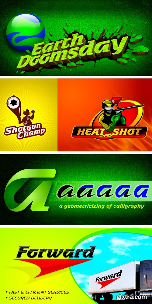
https://www.myfonts.com/fonts/layarbahtera/earth-doomsday/
OTF | 3 Fonts | + JPG Preview


https://processtypefoundry.com/fonts/anchor/
Designed for maneuvering in especially cramped quarters, Anchor is a four-weight family of round display gothics. As with many of our typefaces, Anchor’s life began as the solution to a typographic dead end: what if the narrowest style of a typeface isn’t narrow enough? That was the case when we redesigned our website and realized 48 pixels was a mighty narrow space for words like ‘download’ and ‘specimen’ to remain reasonably legible. Being type designers, we immediately ditched the CSS for BCPs and had the beginnings of a narrow display font. Initially just a single weight, Anchor is now a family of fonts ranging from Medium to Black. The plump Bold and Black weights easily lend themselves to swagger and exaggeration while the Medium and Semibold remain economic and capable of straightforward display work. We refer to them as ‘display gothics’ primarily in homage to the influence of the 19th and early 20th century types that provided the roadmap for this series.
OTF | 4 Fonts | + JPG Preview


http://www.myfonts.com/fonts/parachute/pf-isotext-pro/
This typeface is based on ISO 3098, a technical documentation issued in 1974 by ISO (International Organization for Standardization), which proposed a set of characters for use on technical drawings and associated documents. Isotext is based on the original standards but is completely redesigned to fit typographic requirements. This new ‘Pro’ version is further improved and now comes with a complete set of redesigned true-italics. Furthermore, the width of the glyphs has increased in order to establish a more balanced and readable text. The result is a contemporary font which works well in small sentences as well as long texts. Isotext Pro is loaded with all the good stuff a designer needs to create documents with attitude. It supports 19 special OpenType features like small caps, fractions, ordinals, etc. and offers multilingual support for all European languages including Greek and Cyrillic. Finally, every font in this family has been completed with 270 copyright-free symbols, some of which have been proposed by several international organizations for packaging, public areas, environment, transportation, computers, fabric care and urban life.
OTF | 6 Fonts | + JPG Preview

http://www.myfonts.com/fonts/phospho/neonoir-bold/
Neonoir is an homage to neon lettering craftsmanship of the mid 20th century. The beautiful futuristic grace of wall-sized bent-glass hand-writing is distilled into a three-weight connected script that’s on the button for headlines, logotype and branding designs. Its Slim and Bold weights are formal monoline scripts, while the medium weight mimics the rough edges of ink on paper. Neonoir is available as an Open Type font that features alternate endings and lots of ligatures.
OTF | 3 Fonts | + JPG Preview

http://www.myfonts.com/fonts/lafonts/triface/
Triface, a monospaced font, is based on a strict geometric concept that also reflects the history of writing at a significant developmental stage, the so-called uncial. Not a true minuscule form, only certain letters show the beginning of ascenders and descenders. The underlying grid evokes surprising design possibilities. By filling in the outline stems, Triface Fill heightens the three-dimensional effect, easily distinguished from busy backgrounds.
TTF | 2 Fonts | + JPG Preview

http://www.myfonts.com/fonts/canadatype/maestro/
Out of a lifelong inner struggle, Philip Bouwsma unleashes a masterpiece that reconciles classic calligraphy with type in a way never before attempted. Maestro takes its cue from the Italian chancery cursive of the early sixteenth century. By this time type ruled the publishing world, but official court documents were still presented in calligraphy, in a new formal style of the high Renaissance that was integrated with Roman letters and matched the refined order of type. The copybooks of Arrighi and others, printed from engraved wood blocks, spread the Italian cancellaresca across Europe, but the medium was too clumsy and the size too small to show what was really happening in the stroke. Arrighi and others also made metal fonts that pushed type in the direction of calligraphy, but again the medium did not support the superb artistry of these masters or sustain the vitality in their work. As the elegant sensitive moving stroke of the broad pen was reduced to a static outline, the human quality, the variety and the excitement of a living act were lost. Because the high level of skill could not be reproduced, the broad pen was largely replaced by the pointed tool. The modern italic handwriting revival is based on a simplified model and does not approach the level of this formal calligraphy with its relationship to the Roman forms. Maestro is the font that Arrighi and his colleagues would have made if they had had digital technology. Like the calligraphic system of the papal chancery on which it is modelled, it was not drawn as a single finished alphabet, but evolved from a confluence of script and Roman; the script is formalized by the Roman to stand proudly in a world of type. Maestro came together on screen over the course of several years, through many versions ranging widely in style, formality, width, slant, weight and other parameters. On one end of the spectrum, looking back to tradition it embodies the formal harmony of the Roman capitals and the minuscule which became the lower case. On the other it is a flowing script letter drawing on the spirit of later pointed pen and engravers scripts. As its original designers intended, it works with simple Roman capitals and serifs or swash capitals and baroque flourishes. The broad pen supplies weight and substance to the stroke which carries energy through tension in balanced s-curves. Above all it is meant to convey the life and motion of formal calligraphy as a worthy counterbalance to the stolid gravity of metal type. The Maestro family consists of forty fonts distributed over two weights. The OpenType version compresses the family considerably down to two fonts, regular and bold, each containing the entire character set of twenty fonts, for a total of more than 3350 characters per font. These include a wide variety of stylistic alternates, ligatures, beginning and ending letters, flourishes, borders, rules, and other extras. The Pro version also includes extended linguistic support for Latin-based scripts (Western, Central and Eastern European, Baltic, Turkish, Welsh/Celtic, Maltese) as well as Greek.

http://www.myfonts.com/fonts/gautier/alcala/
This font is based on the study of the document titled “Biblia poliglota complutense” aka "Bible polyglotte d'Alcala". It was the first edition of a complete polyglot Bible as well as the first printed version of New Testament in Greek, of the Septante and Targoum Onkelos. Conceived between 1502 and 1517, she was thought, financed and largely supervised by the cardinal Francisco Jiménez de Cisneros. The first drawings were carried out in 1995 and begun again in 2011 for the publication by a publishing house of a complete Bible based on the revised translation of J. NR. Darby, in French and Malgache.
TTF | 3 Fonts | + JPG Preview
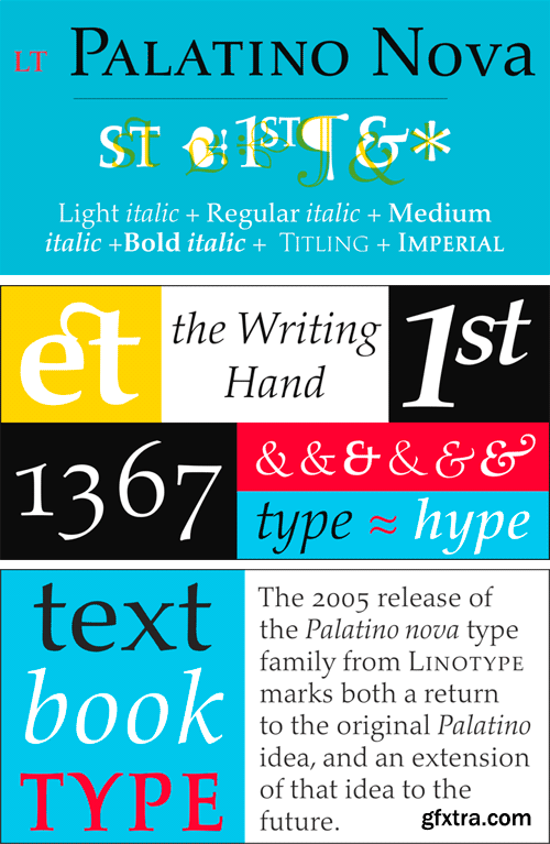
https://www.linotype.com/617238/palatino-nova-w1g-value-pack-product.html
OTF | 4 Fonts | + JPG Preview

https://www.grillitype.com/typefaces/gt-sectra
GT Sectra is a contemporary serif typeface combining the calligraphy of the broad nib pen with the sharpness of the scalpel knive. It was originally designed for use in the long-form journalism magazine “Reportagen” and now expanded to its three subfamilies: GT Sectra, GT Sectra Fine, and GT Sectra Display.
OTF, WOFF | 30 Fonts | + JPG Preview

https://processtypefoundry.com/fonts/seravek/
Clear functionality, near invisibility and a tone whose presence is felt most once-removed – this is the essence of Seravek. Fonts of loud volume and expressive detail have a rightful place – we’ve made many ourselves – but fonts of near silence are equally intriguing and consequently very useful for complex texts. Building from this, Seravek is tailored to the demanding needs of information, editorial, and identity design where the twin forces of richness and clarity must co-exist. The resulting letters are unobtrusive, refined and imbued with a sense of forward modernity – essential for a diverse range of work in today’s environment.
OTF | 10 Fonts | + JPG Preview


CM 759855 - Education Bundle Hand Drawn Icons
Hand Drawn EDUCATION BUNDLE contains:
• 267 hand drawn icons
• Each icon in 4 different graphic styles (that’s over a 1000 icons total)
• Each Icon saved separately as PNG in 3 sizes
• Each icon saved separately as SVG
• Each icon has its own name
• Source file with all icons in AI, PDF, EPS and PSD format
• CSH format for Basic (single color) version
What's special in this pack?
• Regular and Sticker graphic style (with white background and lining)
• Two Color versions: Basic single color and full color.
• Photoshop Custom Shape File (csh) (basic style version)
• Photoshop file with each icon on separate shape layer (basic style version)

CM 341053 - Rough Diamond
It's characteristic lustre pearled out and hidden by cuts nobody made. A Rough Diamond drawn whole from the earth by pain hardened hands, a surprising bit of pressure hardened carbon. Specs:
• Uppercase & lowercase
• Punctuation & numerals
• TTF file
• 200+ Glyphs
• Designed by BLKBK
SermonBox - Seasonal Collection

SermonBox - The Series Pack Collection

Top Rated News


Would you like to be a Author?


