
Scrivano Font Family $69 | 4 x TTF | Turkish Support
http://www.myfonts.com/fonts/outras/scrivano/

Force Font Family $100 | 4 x TTF | Turkish Support
http://www.myfonts.com/fonts/outras/force/


PF Baseline Pro Font Family $345 | 6 x TTF | Turkish Support
http://www.myfonts.com/fonts/parachute/pf-baseline-pro/
An ultra modern typeface which combined with the proper text font can revive any dull-looking document. The wide simple forms combined with the selective application of a few distinct characteristics has resulted a stylish typeface which shines in the top 10 of our most wanted list.The powerful new “Pro” version comes complete with Greek and Cyrillic and includes a number of stylistic alternates as well as 2 groups of stylistic alternate sets, the last group being unicase characters.


Oxbridge Font Family $81 | 2 x OTF
http://www.myfonts.com/fonts/studio-k/oxbridge/
Crisp, classic and compact, Oxbridge is a distinguished display font ideally suited to branding luxury goods or other applications which call for a combination of style and authority.
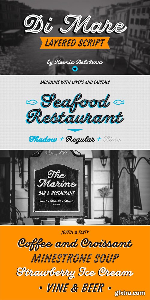
http://www.myfonts.com/fonts/ksenia-belobrova/di-mare/
Di Mare is a layered script inspired by Italian restaurant and cafe signs. It’s about delicious food and the joyful atmosphere of traveling: freedom, sea, fresh wind and warm sun. This font family has three styles: Regular, Line, Shadow. You can combine and overlay them to get different effects. Di Mare works well for menu, packaging, clothes, signs, magazines, and as a starting point for lettering and logos. Di Mare is designed with hundreds of contextual alternates and ligatures. It makes all connections look natural and harmonious. Di Mare supports most European languages, has small capitals, numbers, fractions, currency and mathematical signs. All contextual alternates are built into the “Liga” feature that is turned on by default. However, when your work with typeface, please make sure that “Liga” is turned on.
OTF | 3 Fonts | JPG Preview | 6.3 Mb RAR

http://atipo.es/en/salome/
Salomé is a type family with a unique and flavorful design. Freely inspired by the didones shapes, its pure, high contrast strokes have a glamorous sensitivity. It’s an elegant and eye-catching typeface, a little sexy, useful for editorial design, logotypes, packaging and interesting titling. This typeface family includes 4 styles and their italics with plenty of ligatures and alternates.
OTF | 6 Fonts | JPG Preview | 1.8 Mb RAR

http://www.myfonts.com/fonts/one-fonty-day/lid/
Lid is a handwritten, versatile typeface. The non-cursive script is uncomplicated, unpretentious and easy to read. The typeface comes in three different styles; Pen, Brush and Marker. Each style has a different touch, but all three styles come together perfectly. Most of the european languages are supported.
TTF | 3 Fonts | JPG Preview | 3.8 Mb RAR


http://www.myfonts.com/fonts/parachute/pf-lindemann-sans/
Lindemann Sans is an immediately-inviting typeface with a pleasing distinct visual voice grounded by geometry and golden proportions. This modern geometric san serif typeface serves the interpretive needs of modern design through its legibility. This legibility is achieved through proportional balance of each letter based on the golden ratio, open counters, high x-height and wider individual shapes. In addition, a high level of legibility is arrived through distinctive glyphs like a, e, @, and f, which are engaging and add to Lindemann Sans visual voice. Being a modern, spirited, tech-savvy typeface, Lindemann Sans has many of the features demanded by today’s designers. These features include 800 characters within each font, many ligatures, full numbers sets, small caps, alternative characters and other niceties found in opentype fonts. Due to Lindemann Sans high legibility, geometric sans tradition, and a large feature set list, it is a very versatile typeface and can be used in replacement of the more commonly used sans. Specifically, Lindemann Sans can be used by technology corporations, architectural firms in their supporting materials, in magazines as headers and key-points, as the typeface for professional keynotes, for the package design industry as a whole, in automotive concept projects, and for cosmetic branding for high class hair products. With its inviting nature it may also be used for liberal arts promotional materials. In addition, this typeface can be used by green industries because of its nature derived proportions. Each style and weight of Lindemann Sans adheres to the same geometric and golden proportions, however, each weight is innately noteworthy. For example, there is a charm that is found in the ultralight weight’s elegant geometry and lights impressive use as oversized headlines. It shines with true clarity of vision with the book weight and the versatility of the medium. One cannot overlook the power and pacing of the bold and extra bold weights with its clear counters and restrained letter forms. Within Lindemann Sans family each weight has a distinctive role to play but stays true to its purpose.
OTF | 12 Fonts | JPG Preview | 1.8 Mb RAR

25 UHQ JPG | up to ~ 9000 x 6000 | 300 dpi | 252 Mb RAR

http://www.myfonts.com/fonts/pburgiel/uranos/
Uranos is a serif type family with uncomplicated appearance and modern, geometric glyphs shapes. Available in three styles, include many stylistic alternates and automatic ligature creation. Character set contain the complete Unicode Latin 1252 (Western European; ANSI), 1250 Latin 2 (Central European), 1254 Turkish, 1257 Baltic.
TTF | 3 Fonts | JPG Preview | 6.2 Mb RAR

25 EPS | + JPG Preview | 83 Mb RAR

http://www.myfonts.com/fonts/eurotypo/globie/
OTF | 1 Font | JPG Preview | 1 Mb RAR
SermonBox - Seasonal Collection

SermonBox - The Series Pack Collection

Top Rated News


Would you like to be a Author?


