https://vllg.com/constellation/galaxie-copernicus/
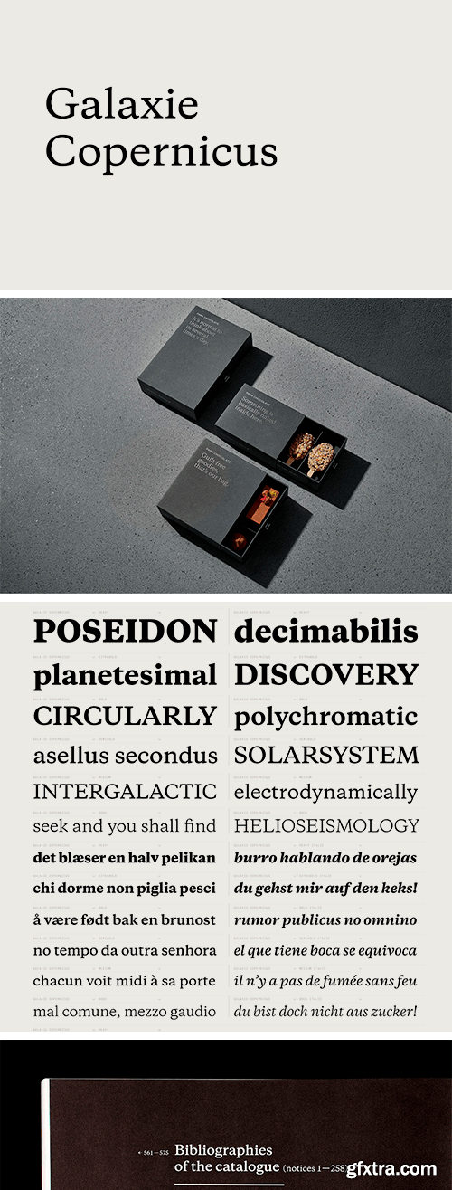
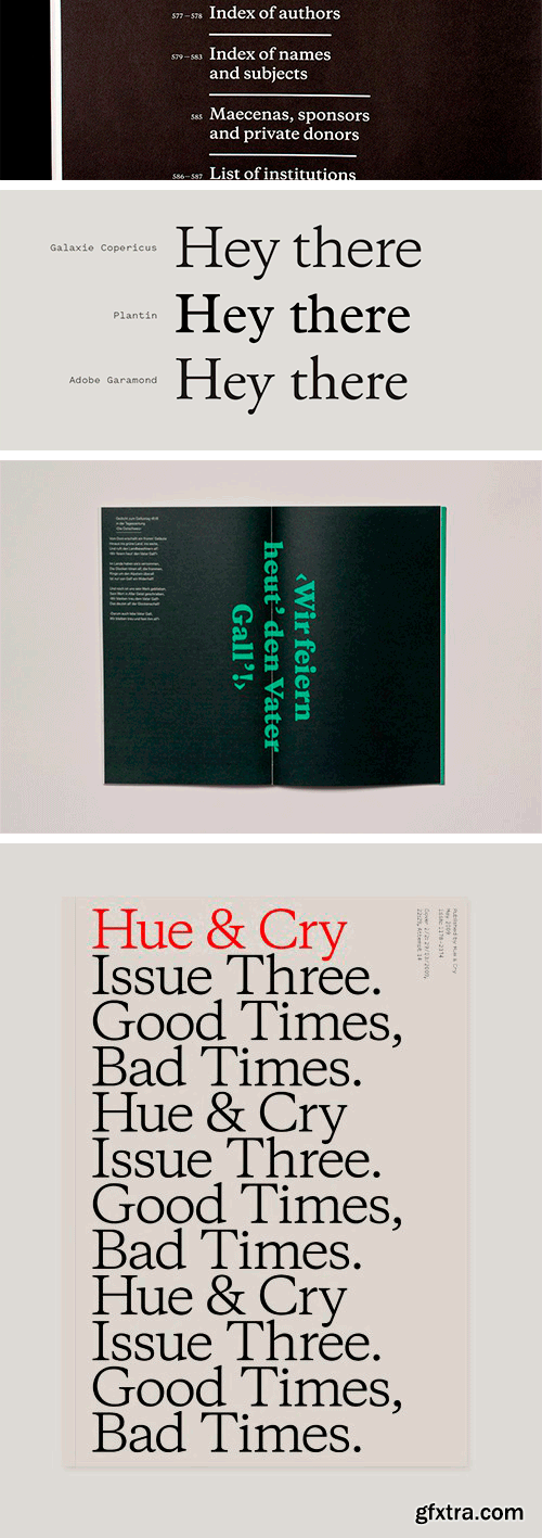
The Galaxie family-of-families concept was born with a few specific designs in mind. The grotesque Polaris was the guiding light and first family released. As Polaris was being designed, sketches were made for an egyptian, a typewriter face, and a reconsidered Plantin. Copernicus is this last face.
I had always had a fondness for Plantin; it is such a workhorse typeface, more sturdy than graceful, with a nice wide stance, and quite different from other 16th-century type. I wanted to make a Plantin for the 21st century, reflecting the technology and aesthetics of today. I would not call it a revival, but a reconsideration of Plantin. The Norwegian musician Rolf Lislevand has interesting thoughts in this vein: ‘For years people tried to play early music as closely as possible to the way it was played at its time of origin, but that’s a philosophical self-contradiction. The first question is whether it’s possible at all to replicate the performance of a musician who lived centuries ago. As far as I’m concerned, reconstruction is not really interesting at all. Do we really want to act as if we hadn’t heard any music between 1600 and the present day? I think that would be dishonest.’ So it is with Copernicus, which owes as much to the work of Gerard Unger, Matthew Carter and Christian Schwartz as it does to Robert Granjon (who cut the face for Christophe Plantin) or Frank Hinman Pierpont (who revived the design for Monotype 100 years ago). The design started with the self-imposed constraints of the Galaxie system, where all types are meant to be used together. The internal dimensions of the typeface were set, so the task was to create from inside out. The work started in 2003, with very sporadic attention paid to the face. In the summer of 2008, I shared the embryonic work with Kris Sowersby, and we decided that the project would be a perfect collaboration. We sent files back and forth from New York to Wellington for a few weeks, with Kris making the design come alive in ways I could never have predicted. Kris infused the font with his historical knowledge and unparalleled design skill and panache. This typeface is very much a collaboration, with each of us bringing our own viewpoint to the work. I could not be happier or more proud.
TO MAC USERS: If RAR password doesn't work, use this archive program:
RAR Expander 0.8.5 Beta 4 and extract password protected files without error.
TO WIN USERS: If RAR password doesn't work, use this archive program:
Latest Winrar and extract password protected files without error.


