


OTF | WOFF | 6 MB
Sale Page
The Cantoni Font family is a hand lettered font with a variety of standard and alternate characters that play together well. And with a total of 1265 glyphs, you can play for as long as you like.Now Cantoni and Cantoni Pro also come in BOLD!Additional features include: Roman numerals, Fractions, Ordinals, Ornate and Old Style numbers, Greek symbols, a set of Flourishes, Ornaments and DIY Wedding Words and Images. It also includes Western and Central European, Romanian and Turkish language support
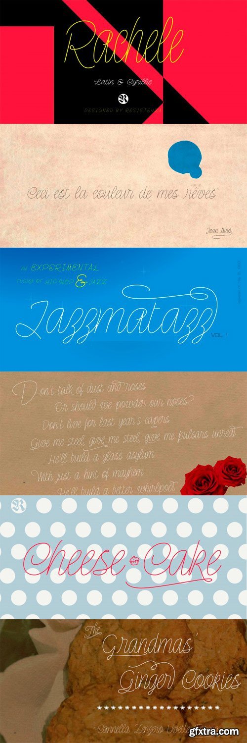
Rachele is a mono line based script thin font. Inspired on the cute “Italian Bella Scrittura” handwriting but influenced by Spencerian. Ornaments and ligatures make this hand more expressive offering round stroke endings and a flowing shape. Rachele is a big family, its stroke expand into extra light till medium and passing through a calligraphic/ribbon effect. At the same time the width varies, that’s make this script even more flexible, from Ultra Condensed to Super Extended. Enjoy it.
OTF | 40 Fonts | JPEG Preview | 18 Mb RAR

P22 Kilkenny 5xOTF $125
http://www.myfonts.com/fonts/ihof/p22-kilkenny/
- Kilkenny is a decorative, Victorian-style font based on the metal type named Nymphic that was designed by Hermann Ihlenberg. Ihlenburg was born in Germany in 1843 where he studied art and worked for several German type foundries. He emigrated to the USA in 1866 and worked for the L. Johnson & Co. foundry, later MacKellar, Smiths & Jordan. American Type Founders acquired this typeface when they took over the MacKellar, Smiths & Jordan foundry and Nymphic appears in the ATF catalog of 1896.
- For this digital version, the character set has been expanded to include accented characters, punctuation and currency symbols (and most everything you would expect to find in a digital font).
- The original metal font consisted of Swash Caps, Upper Case characters and a “morticed” lower case, which was raised off the baseline. This mortcied form was designed to nestle inside the ornate swash caps as well as to work with the upper case. The five digital versions contained in this set are basically different configurations of these different alphabet sets, they differ as follows:
- Kilkenny- The original upper case with a modified lower case that has been enlarged, shifted to align along the baseline and given taller ascenders to give it a more “regular” appearance. Kilkenny Eureka - True to the original design with the “morticed” or superior lowercase forms. Kilkenny Swash - Original swash caps with the modified lower case. Kilkenny Swash Caps - Original Swash caps with the original caps as the lower case. Kilkenny Swash Eureka- Swash caps that have been adjusted to match the weight of the original lower case forms.
- In addition to all of the above, the OpenType version contains additional Central European characters as well as Cyrillic characters for a total of almost 1000 glyphs.

Felt tip-written and full of expressive lines, Brandy BF exudes much verve and energy; and unlike many scripts, sets rather well in all caps situations.
Use Brandy BF as a superb choice for everything from upscale restaurant menus to projects requiring a personable touch.

Type Innovations - Beatnik Barbie $39
OTF OpenType and WOFF Webfont | Designer: Alex Kaczun
http://www.myfonts.com/fonts/typeinnovations/beatnik-barbie/
Beatnik Barbie truly has the heart and soul of the beat mentality. Groovin' baby.


HS Future & Future Sans Arabic Font Families 6xOTF $498
Designers: Hasan Abu Afash, Abdulsamiea Rajab Salem
http://www.myfonts.com/fonts/hibastudio/hs-future-sans/
http://www.myfonts.com/fonts/hibastudio/hs-future/
HF Future Arabic Modern Kufi
-
HS Future is the second version of the font FS Future which was designed by the type designer Abdulsamiea Rajab Salem and the fonts group of Future Soft company fonts. It is a leading company in Arabization field and producing the Arabic and Islamic programs beside the children programs. Those fonts appeared between 1998 and 2000. In this version there were a lot of adjustments to keep the font in its spirit and uniformity between the various characters. Also added were some new characters, which gave him another beautiful addition to the beauty of his modern idea. It has a serif in the shape of an arrow. Two new weights (Regular and Bold) have been created. Then the font was converted to OpenType to support Arabic, Persian and Urdu to be compatible with the various operation systems and modern software. The smoothing of this font and the combination of straight and curved parts using the serif in the shape of an arrow made it a beautiful typeface appropriate to the titles, and able to meet the desire of the user in the design of ads and modern designs of various types of audio and visual. HS Future is the beginning of the fruits of cooperation between designers and Hassan Abu Afash and Abdulsamiea Rajab Salem for the production and development of many modern fonts.
HF Future Sans Arabic Modern Kufi
- HS Future Sans is the sans serif version of HS Future. It has three weights and was converted to OpenType to support Arabic, Persian and Urdu to be compatible with the various operation systems and modern software. The smoothing of this font and the combination of straight and curved parts without the serif gave the user additional option beside HS Future family. It made it a beautiful typeface appropriate to the titles, and able to meet the desire of the user in the design of ads and modern designs of various types of audio and visual.

Prismatic is an 11 font system that can be layered in different ways to create a number of classic titling effects used commonly in signage by skilled sign painters and sign makers. Prismatic’s layer combinations give you complete control in producing styles like inline, outline, collegiate, drop shadow, 3D, convex, beveled, and detached shadow. It’s condensed base can be used alone and/or allows you to plot out titles and adjust leading, kerning, and alternates. Each font contains the same metrics, so when your title is set, copy and paste-in-place to create layers of different weights/styles to build out your desired effect. Some fonts are clearly dependent on layer stacks to create desired effects, which is why certain fonts in this family are not available for individual sale. Prismatic works great in any graphics application that allows you to utilize layers. Sign shops take note: this font system allows you to create rich sign lettering effects for vinyl cut signs without editing the font itself. Each font comes with a free companion PDF for those who would rather “handset” these layers. PDF’s will contain the fonts you purchase in an outlined vector stack. Advantages to using a handset method include: 1. Adjust kerning, leading, size, and spelling by dragging stacked layers opposed to making changes in every font layer. 2. Visualizing letter styles in a full stack. 3. Utilizing global color. 4. Vector curves. 5. Better aliasing control. 6. Font management & installation of font software is not required.
OTF | 11 Fonts | JPEG Preview | 3.7 Mb RAR
OTF | WOFF | 30 MB
Sale Page
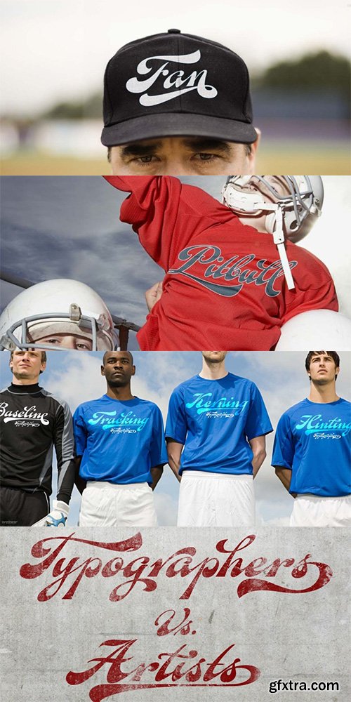
A friend of mine says that sports are the ultimate popular drug. One of his favorite things to say is, “The sun’s always shining on a game somewhere.”It’s hard to argue with that. But that perspective is now the privilege of a society where technology is so high and mighty that it all but shapes such perspectives. These days I can, if I so choose, subscribe to nothing but sports on over a hundred TV channels and a thousand browser bookmarks. But it wasn't always like that.When I was growing up, long before the super-commercialization of the sport, I and other kids spent more than every spare minute of our time memorizing the names and positions of players, collecting team shirts and paraphernalia, making up game scenarios, and just being our generation’s entirely devoted fans. Argentina is one of the nations most obsessed with sports, especially "fútbol" (or soccer to North Americans). The running American joke was that we're all born with a football. When the national team is playing a game, stores actually close their doors, and Buenos Aires looks like a ghost town. Even on the local level, River Plate, my favorite team where I grew up, didn't normally have to worry about empty seats in its home stadium, even though attendance is charged at a high premium.
OTF | WOFF | 39.2 MB
Slae Page
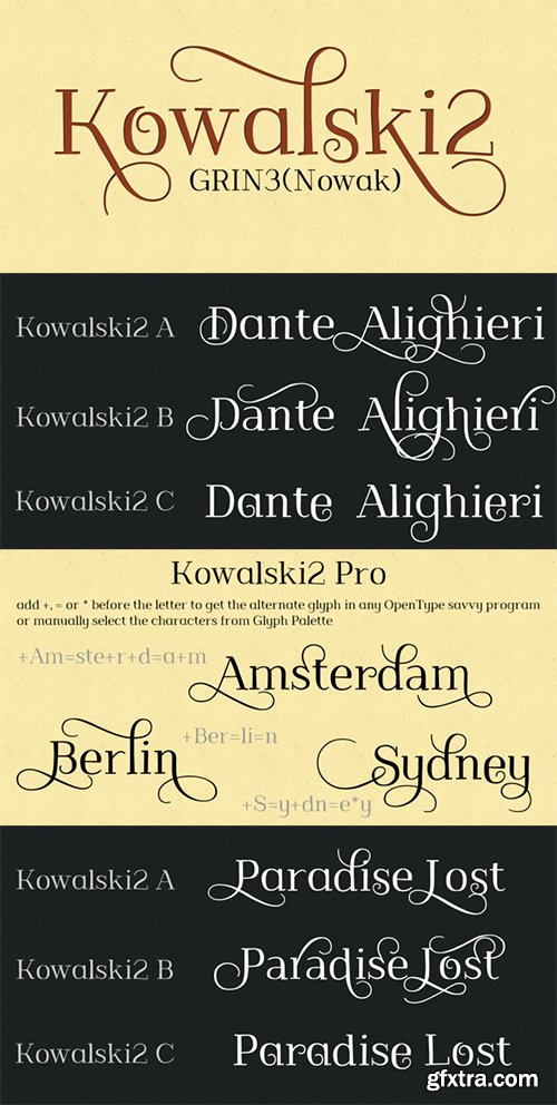
Kowalski2 is a decorative, serif, hand-drawn font. It can be used for invitations, greeting cards, posters, advertising, weddings, books, menus etc.The inspiration came from the beautiful font Desire designed by Charles Borges de Oliveira.Kowalski2 Pro is the most complete style, it contains all the alternates and ligatures. To get the alternate glyph just add "+“, ”=" or "*" before the letter in any OpenType savvy application or manually select the characters from Glyph Palette.Kowalski2 Basic has the basic character set with 345 glyphs and no alternates.Kowalski2 A, Kowalski2 B and Kowalski2 C have less glyphs than the Pro one, they only contain some selected alternates and ligatures.Language support includes Western, Central and Eastern European character sets, as well as Baltic and Turkish languages.
OTF | 50.03 MB
Slae Page
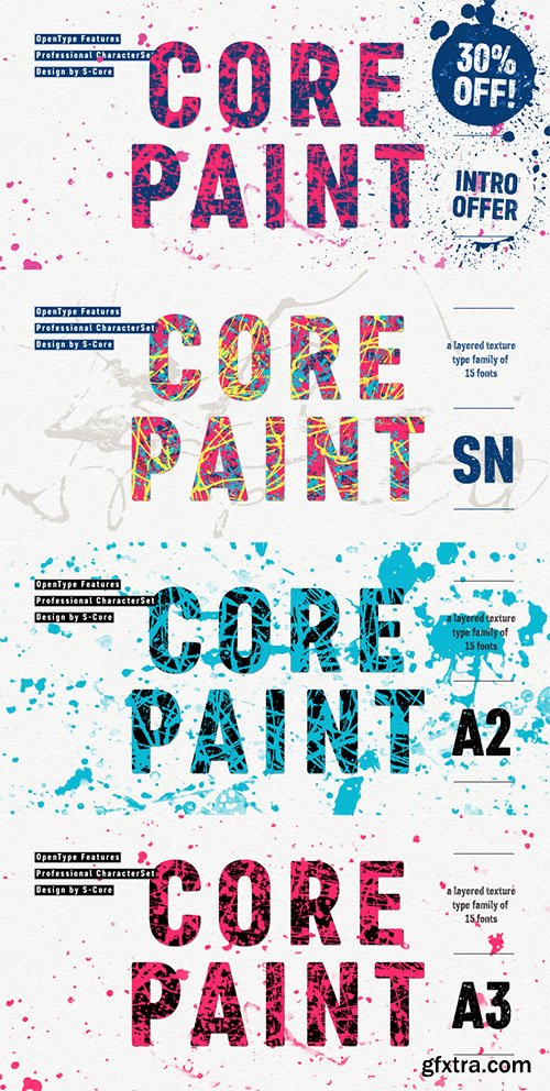
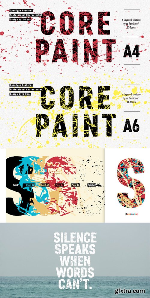
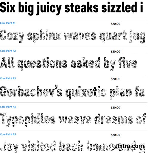
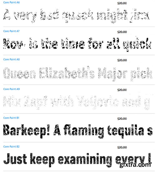
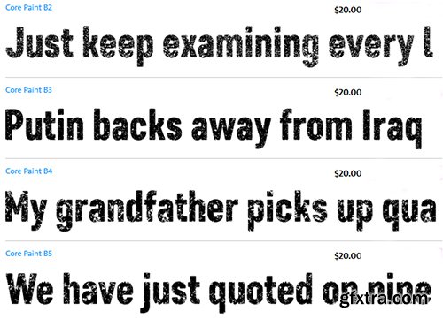
Core Paint is a texture type family inspired by the action painting created by Jackson Pollock. There are two sub-families named A and B. Core Paint A is a texture font family that has to be used together with others. Core Paint B is a textured font family that can be used solely or together with A family. With layering these different texture styles, you can create various combinations of textures. According to color variations, also you can create more complex textured typefaces and unique artworks.Core Paint Family supports complete Basic Latin, Cyrillic, Central European, Turkish, Baltic character sets.Each font includes proportional figures, tabular figures, numerators, denominators, superscript, scientific inferiors, subscript, fractions and case features.This family is really nice for book titles, headlines, logotypes and any artworks.
OTF | WOFF | 35.4 MB
Sale Page
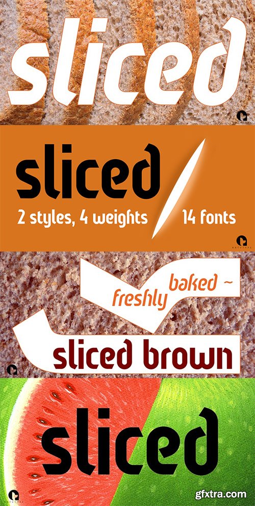
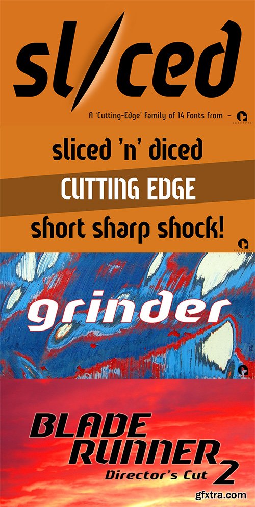
The name of this robust typeface is adopted quite literally from the slice taken out of certain characters. The same sliced angle is also applied to many of the terminals, creating a clean-cut styling throughout the family. Tilted versions emphasise the descriptive name further, with an implied cutting stance. Wider versions go even further still, taking on a more thrusting, squat dynamic compared to the condensed styles.The standard Sliced family is complemented by Sliced Open, a lighter, more open set which extends the versatility and design flexibility of the typeface and comprises a total of 14 font styles, all with extended European character sets.
TTF | OTF | 30MB
Sale Page
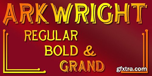
Arkwright, named for a well known fictional shopkeeper who kept his shop open all hours is inspired by traditional British (and transatlantic) shop signage. It is a spiritual companion and ideal companion to our more elaborate Granville family. Arkwright is offered in Regular and bold weights and a more decorative ‘Grand’ form. These faces are especially suitable for posters, period advertising, Chapter headings and signage. Arkwright and Granville are also offered together in a value pack.
OTF | WOFF | 30 MB
Sale Page
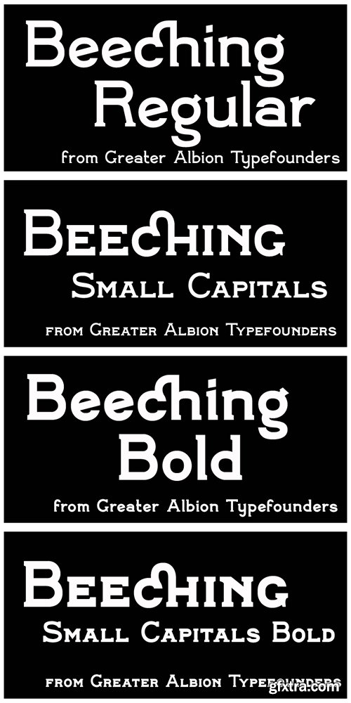
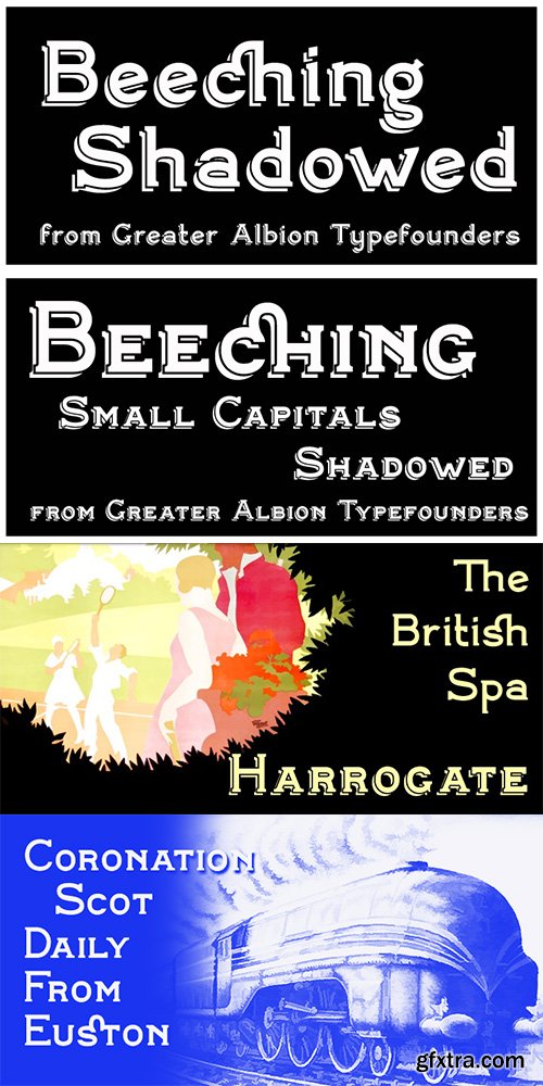
Beeching is a family of six typefaces designed to combine extreme legibility with a hint of retrospective character. It is inspired by the lettering used in the Leslie Green designed stations of the London Underground and is as up to date today as it was the day those stations opened. The Beeching faces (Regular, Bold, Small Capitals, Small Capitals Bold, Shadowed and Small Capitals Shadowed) are ideal for use in large scale signage that needs to be seen over long distances. We feel the family provides a clear demonstration that traditional details, such as serifs and ligatures serve to enhance legibility.
TTF | OTF | 30MB
Sale Page
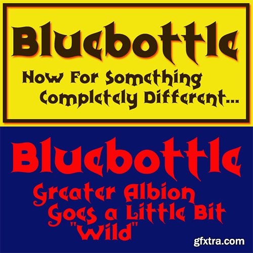
Bluebottle is a lively fun family of typefaces, a boisterous fun design, BLuebottle brings a distinctive cheerful character where ever it’s used. Use Bluebottle to bring life and fun wherever you will.
TTF | OTF | 30MB
Sale Page
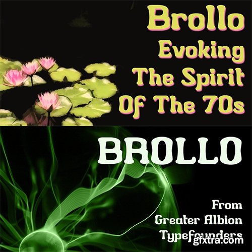
Brollo is a chunky display face full of the spirit of the 60s and 70s. Its bold character makes it ideal for poster work, and for anywhere that the point really needs to be driven home. The letter forms have been designed to work well either used conventionally or exclusively in capitals. We recommend use in combination with strong patterns, psychedelic colours and anything else outrageous you can think of.

OTF | WOFF | 30 MB
Sale Page
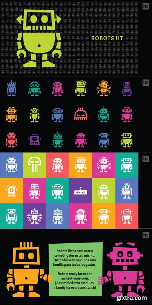
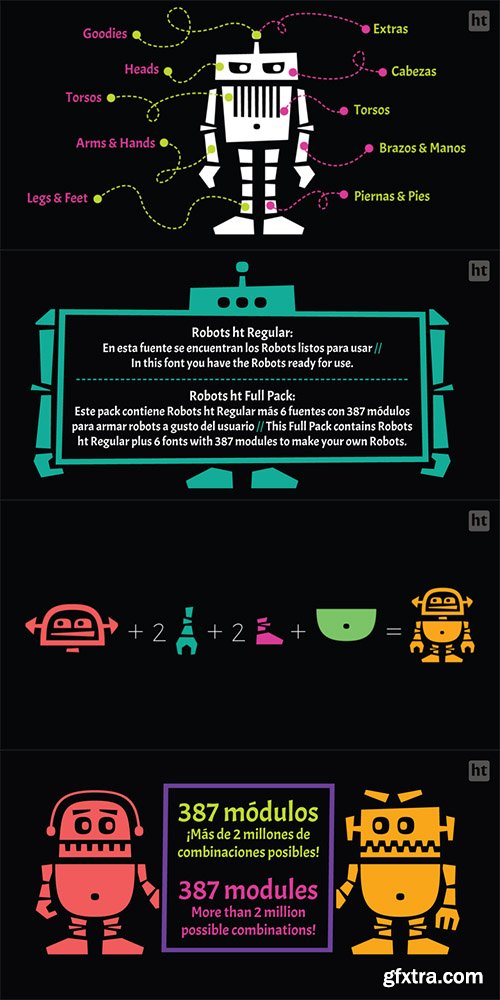
The challenge was to build a family of robots for using assembled or separated into modules. This family consists of 7 styles: the first one contains ready-to-use robots, the other styles contain 387 modules grouped into: heads, torsos, arms & hands, legs & feet, extras (eyes, accessories) and arrows.A family for everyone’s wish. Ready-to-use or make-it-your-own: more than 2 million possible combinations!
OTF | WOFF | 29 MB
Sale Page
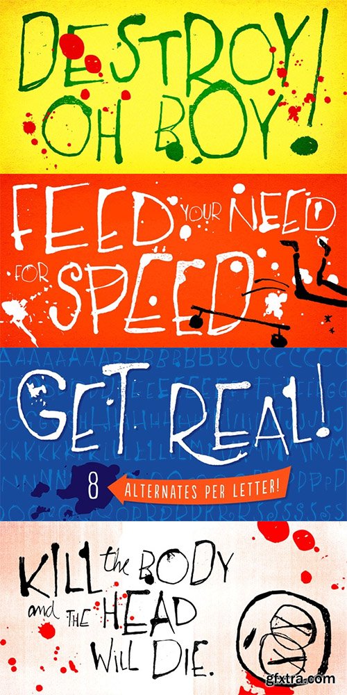
Rockinstead counts 1, 2, 3, 4, 5, 6, 7, 8... Eight variations per letter, plus alternates for numbers and even for punctuation marks! It is equipped with some clever OpenType programming to make substitutions on-the-fly: the Contextual Alternates feature, with the help of a very careful kerning table, takes care of cycling the alternates in an amazing random-like way, impressively mimicking a true handwritten text. The Discretionary Ligatures feature manages the substitution of handy cursive catchwords, adding that charming twist. To put it more bluntly, this font AUTOMATICALLY alters your typing so that it substitutes glyph variations while you do nothing but type away! No need to use PopChar here to do the substitutions manually, the font itself takes care of that for you.This typeface was originally painted on paper, drawing inspiration from Ralph Steadman’s seminal lettering style. On a first glance it may look quite wild - and it proudly is, indeed. But look again: it is stylishly wild, it is strong, unpredictable, full of attitude and good energy. This multifaceted font will certainly strike its way for free-spirited design applications.

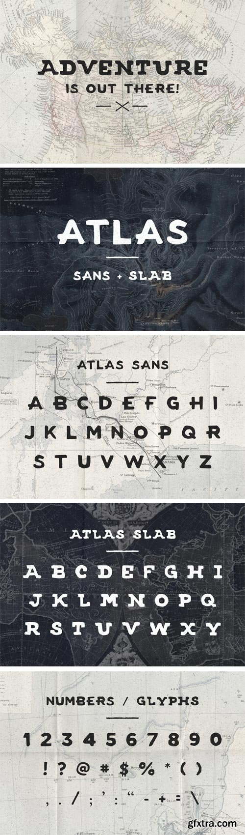
A handmade sans and serif font - inspired by both adventure and vintage travel maps. Comes with Atlas_sans and Atlas_slab // ttf and otf files. Font does include numbers and a variety of glyphs pictured in the screenshots.
OTF + TTF | JPEG Preview | 2 Fonts | 4.3 Mb RAR
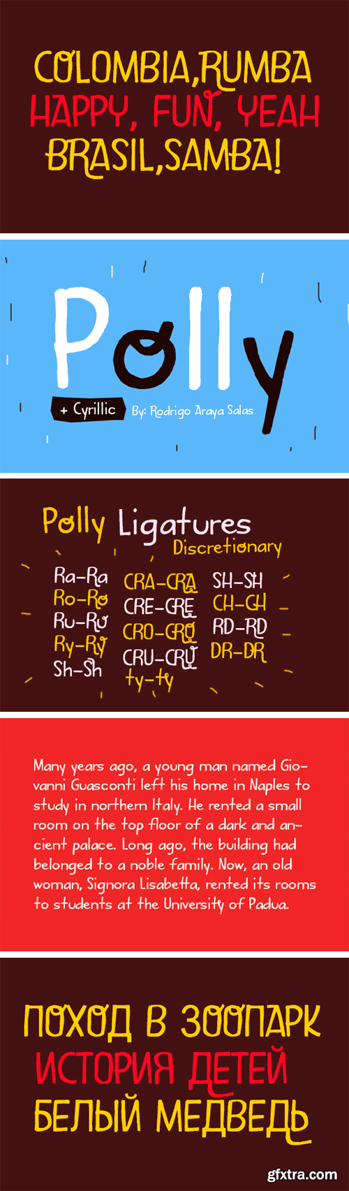
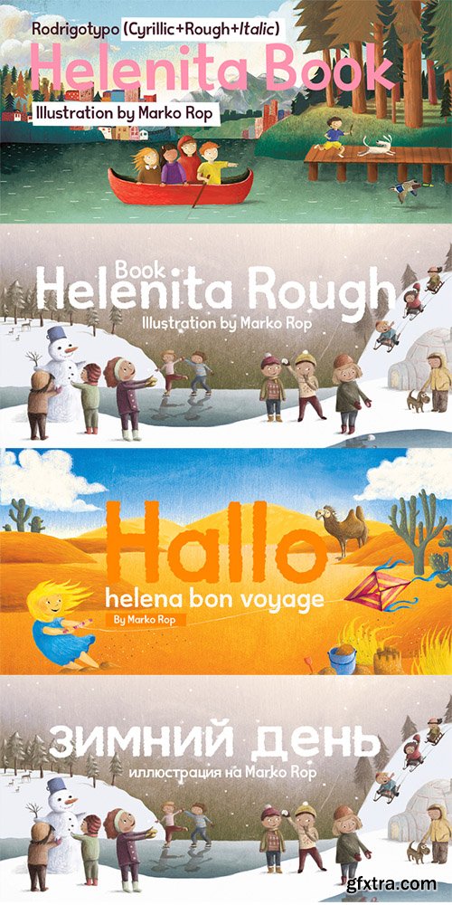
Designed especially for children's books, contains numerous language support, like Cyrillic.
OTF | 1 Font | JPEG Preview | 3.4 Mb RAR
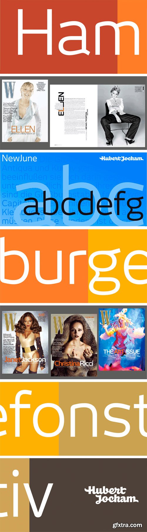
NewJune is a very strong unique character. It is already used in many magazines all over the world. Like Harvey Nichols magazine in London and later W magazine in New York. NewJune is the corporate typeface of the Academy of the Arts in Munich.
OTF | 22 Fonts | JPEG Preview | 3 Mb RAR
SermonBox - Seasonal Collection

SermonBox - The Series Pack Collection

Top Rated News


Would you like to be a Author?


