
http://www.myfonts.com/fonts/type-together/alverata/
Gerard Unger’s new typeface Alverata is a twenty-first-century type-face inspired by the shapes of romanesque capitals in inscriptions of the eleventh and twelfth centuries, without being a close imitation of them. It is additionally based on the early twentieth-century model, but tweaked so as to prevent blandness and monotony. Alverata performs beautifully in both screen and on paper, delivering excellent legibility. Its letters are open and friendly in small sizes and lively and attractive in large sizes. They are robust, and show refinement in their detail. It is an extensive type family, with versions for both formal and informal applications.Visually, some written languages, such as Czech and Maltese, differ quite strongly from languages like English and German, notably because of their many accented characters. While other typefaces will show this difference, Alverata removes it. As a result, Alverata enables harmonious convergence of languages.
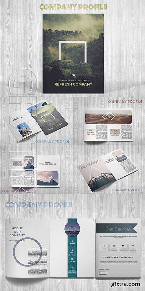
CM - Refresh Company Profile 542430
This is a modern, clean and minimal template for your business. 16 pages possibility of creating many unique spreads
InDesign INDD | 8.5 x 11 | CS4+ | RAR 4,9 MB

https://avondaletypeco.com/atc-duel/
Bold and bolder, ATC Duel is an extended grotesque sans-serif font family comprised of over 500 glyphs in 5 weights and 10 styles. Duel is an ultra wide display font whose rounded shapes and sharp edges are inspired by the letterforms and lines of 1960s cars, the Golden Age of automotive design. ATC Duel is well-suited for high DPI screen resolutions and printed display copy. Duel introduces Cyrillic letterforms in an ATC typeface for the first time. Ligatures, accents, and alternate glyphs are included and can be activated as OpenType features. ATC Duel was designed in 2015, by Alex Sheyn.
OTF, WOFF | 10 Fonts | JPG Preview | 1.56 Mb RAR

Lynda - Excel 2016: Advanced Formatting Techniques
Genre: eLearning | Language: English

Lynda - GoPro HERO and Session Fundamentals
Genre: eLearning | Language: English

Excel for Mac 2016 Essential Training
Genre: eLearning | Language: English


After Effects Apprentice 01: CC Pre-Roll
Genre: eLearning | Language: English
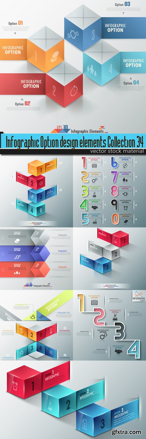
9 eps, ai + 9 jpeg / prew / 87 mb

10 eps, ai + 10 jpeg, tif / prew / 82,9 mb

10 eps, ai + 10 jpeg, tif / prew /112,6 mb

Lipa Agate Font Family $799 | 24 x TTF | Turkish Support
http://www.myfonts.com/fonts/type-together/lipa-agate/
Lipa is the name of the Slovenian national tree ‘Linden’. The typeface Lipa Agate by Croatian designer Ermin Me?edovi?, is part of a bigger type collection, comprising various type groups into one coherent system which Ermin developed over the past 10 years. Lipa Agate is the first to be released; a sans serif designed and engineered to be used in the smallest text sizes, best under 10pt, and in very bad printing conditions. It is perfect for phone books, classified ads, directories or any other job requiring economy without jeopardising legibility. To achieve this, Lipa Agate employs a range of tools, such as deep ink-traps, narrow proportions and a tall x-height. Contemporary editorial design requires a high amount of flexibility to respond to various design situations in a consistent fashion. Lipa Agate — with its 3 levels of condensation, 4 weights and 2 sets of different x-heights, ‘High’ and ‘Low’, which share the same width — fulfils these requirements wonderfully. That’s a total of 24 fonts! To make this clean and honest workhorse face complete, its large character set also includes small caps, arrows, info-numerals and much more.

Anisette Petite Font Family $281 | 7 x TTF
http://www.myfonts.com/fonts/typofonderie/anisette-petite/
Following Anisette designed in 1996, Anisette Petite is the young sister featuring capitals of an intermediate width together with lowercases. Subtle imperfections in the r, l, and the particular g, help to create a unique typeface. The weights of the “Petite” family match exactly Anisette and provide a wider diversity of use. Designed in 2001, Anisette Petite’s lowercases shares the sobriety of geometrical typefaces and the dynamics of the tension in the curves. This geometrical sans offer strong identity to any branding and editorial projects.


Alize Font Family $145 | 3 x TTF | Turkish Support
http://www.myfonts.com/fonts/type-together/alize/
The family does not contain a roman, and instead promotes the italic as a primary style, a common printing convention in the 16th and 17th centuries. The italic lowercase predates inclined capitals by about twenty years, and as a nod to this typographic evolution, Alizé’s capitals, small capitals, and figures are very slightly inclined to match the energy of the lowercase. The low x-height and long ascenders and descenders, features associated with finesse and luxury, are reminiscent of the Venetian-style italic, but are further emphasised.Each font of Alizé has a character set count of exceeding 700, and contains an abundance of ligatures, dynamic fractions, ornaments, and pan-European language support. They have also been manually hinted for the highest-quality display on both print and screen.

Essay Text Font Family $125 | 2 x TTF | Turkish Support
http://www.myfonts.com/fonts/type-together/essay-text/
It is a highly legible text face with a natural flow of reading. This is enhanced by a slight slant of the roman, the combination of open and closed apertures and the amalgamation of organic strokes and counters with a static, fully straight baseline.Essay Text Regular looks back to the spirit of the french Renaissance, when the roman typographic letterforms came to full emancipation. Departing from that historical reference, Essay Text gets rid of all sentimental antiquity and becomes a contemporary interpretation of the “archetypes” of that period.Essay Text Italic refers to that more vaguely, resulting in a formalised look with fairly upright and open shapes and little cursiveness. As in the Renaissance, before the mating of roman and italic, Essay Text Italic works as a separate text face and a perfect secondary type.
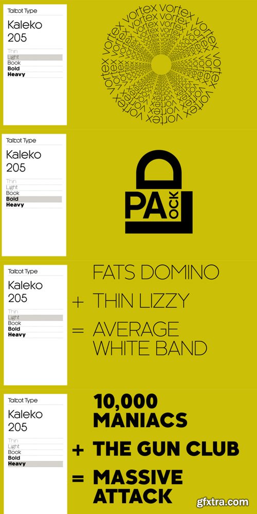
Kaleko 205 Font Family $99 | 10 x TTF
http://www.myfonts.com/fonts/talbot/kaleko-205/
Kaleko 205 is inspired by the classic, geometric sans-serifs such as Gill Sans, but has shallower ascenders and descenders for a more compact look. It’s a well-balanced, versatile, modern sans, highly legible as a text font and with a clean, elegant look as a display font at larger sizes. The Kaleko 205 family comprises of five weights, and is closely related to Kaleko 105. The most notable differences between the two variations, are the two-storey lower case a and g in Kaleko 205, where they are single-storey in Kaleko 105.

Korbin Font Family $99 | 10 x TTF
http://www.myfonts.com/fonts/talbot/korbin/
Inspired by the sans-serifs of the late 19th and early 20th century, Korbin is a legible and versatile text and display face available in five weights. It mixes geometric and humanist traits to achieve a modern, clean, friendly appearance. The italic variations include bespoke characters for a more flowing look.

SermonBox - Seasonal Collection

SermonBox - The Series Pack Collection

Top Rated News


Would you like to be a Author?


