
25 EPS | + HQ JPEG Preview | 214 Mb RAR

Neacademia is a Latin and Cyrillic type family inspired by the types cut by 15th century Italian punch-cutter Francesco Griffo da Bologna for the famous Venetian printer and publisher Aldus Pius Manutius. The family is designed for lengthy texts of an appropriate nature such as classical literature and art. Different versions of the typeface are optimized for specific point sizes as was traditional in metal type. Recent history of digital type left us surrounded by regularity and perfection in text fonts-- a trend that will only intensify with a switch to digital media. Contemporary luddites with their love for letterpress and hand-made materials are running out of suitable fonts. For that reason, the typeface was designed with specific allowances for letterpress photopolymer printing. When printed digitally, it can tolerate and even benefit from low resolution, rough paper, and low-grade presswork. Neacademia also has a more traditional approach to kerning and caps spacing. Instead of a multitude of kerning pairs, it makes use of alternative contextual letterforms to improve letter spacing. In many ways, it feels like using metal type again! This carefully crafted family already proved its qualities in the Modern Cyrillic 2009 competition where it was awarded in a the “type system” category. Rosetta will introduce the rest of the optical sizes in the course of the following year.
OTF | 4 Fonts | JPEG Preview | 4.3 Mb RAR
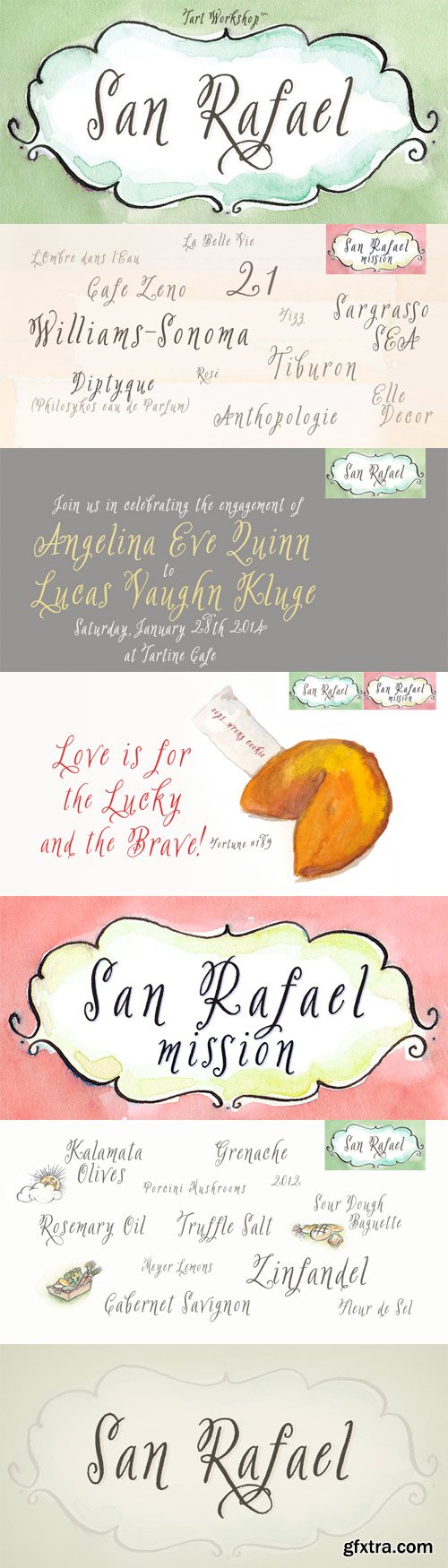
Clear skies. Crisp air. Ripe organic produce. Artisan bread at the farmer’s market. Olives. Fragrant bouquets. Guernseys in the meadow. Glimpses of the Golden Gate and the city on the bay. Afternoons in the forest, foraging mushrooms. Day trips to wine country. Toasting to love, peace & hope with good friends. Dungeness crab fresh off the boat. Walks to the Mission with fair-trade coffee in hand. Sharing buttery homemade cupcakes. San Rafael lives the good life! A flirty, sweet hand lettered font, San Rafael strikes just the right balance between sophisticated and casual. San Rafael Mission is perfect when you desire a more generous open breezy feel. San Rafael and San Rafael Mission have a lovely collection of alternative glyphs & ligatures accessible in any OpenType aware application. They are perfect for labels, packaging, logotypes, book titles, gifts & stationery goods. San Rafael pairs beautifully with other Tart Workshop fonts, especially Carrotflower and Sugarplum.
OTF | 2 Fonts | JPEG Preview | 4.4 Mb RAR
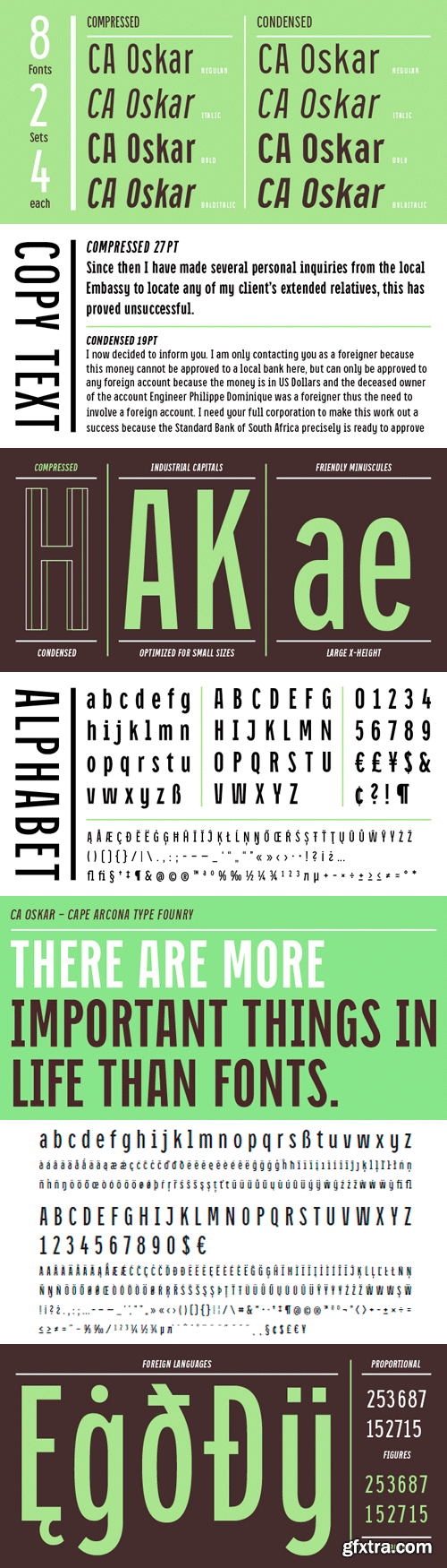
CA Oskar came into being as a custom typeface for the international Traumzeit music festival. As a substantial part of the new corporate identity, it had to be characteristic, but also flexible in use. Starting with the design of compressed caps for headlines, the typeface was soon expanded by a condensed weight for setting of text and further developed into a fully functional font with two widths and two weights. Both weights are very space-efficient, which was -- apart from aesthetic considerations -- an important issue in the process of the design. CA Oskar is a mixture of industrial harshness and friendly round forms, reflecting the spirit of fusion, which is basically what the whole festival is about. Its very slim proportions in two widths make it an attractive alternative to fonts like Alternate Gothic, but CA Oskar adds an extra portion of personality and a coherent choice of weights.
OTF | 8 Fonts | JPEG Preview | 3.3 Mb RAR
25 UHQ JPEG | up to ~ 7800 x 7500 | 300 dpi | 319 Mb RAR

Corda – an elegant serif family with an easygoing, flowing ductus. It is semi-contrasted and even in the heavier styles appears light and breezy. Pleasant for reading and in display sizes very attractive. Corda comes in ten styles, in OpenType format and with extended language support for more than 40 languages. All weights contain standard and discretionary ligatures, proportional lining figures, tabular lining figures, proportional old style figures, lining old style figures, matching currency symbols, fraction- and scientific numerals.
OTF | 10 Fonts | JPEG Preview | 3.8 Mb RAR
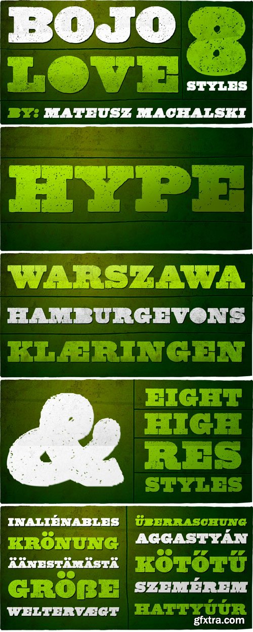
BOJO is heavy serif typeface, based on originally woodtype print. This family contains 8 styles in regular and italics.
OTF | 8 Fonts | JPEG Preview | 7.7 Mb RAR
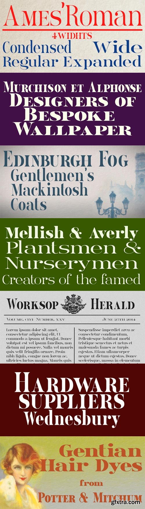
Ames’ Roman is a stylish ‘New-Style’ Didone Roman family offered in divers weights and widths. It is designed to embody clarity combined with dramatic contrast between horizontal and vertical strokes. All typefaces include small capital forms, new and old style numerals (and indeed ‘small capital’ numerals for consistency). Ames’ is a Roman with the charm of the past and the spirit of the future! It’s ideal for headings and titles and anywhere else you need text of distinction.
OTF + TTF | 16 Fonts | JPEG Preview | 23.2 Mb RAR
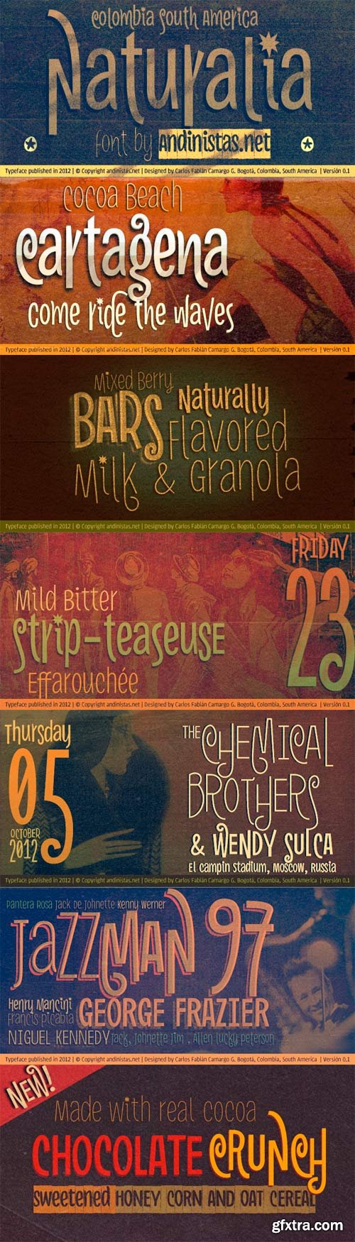
Naturalia font was designed by Carlos Fabián Camargo in 2012 and suggests an ultra-narrow, spontaneous and winding handwriting lettering, it is great for composing short and striking sentences. His idea behind not only alludes asymmetrical shapes but simple glyphs that compact vertical and tight proportions between lower case and upper case letters. Indeed, lower case letters have ascendant and descendant strokes shorter than the “x” height and width is generally condensed, saving horizontal space and supporting monolinear amount of contrast between thick and thin strokes accompanied by their sans serif endings. Most importantly, its full and empty arrhythmic areas consolidated variety of thicknesses simulating strokes that seem naive letters freehand draw.This lack of homogeneity is very useful for ranking words and phrases in eye-catching graphic design advertising events, culture, fun and entertainment. In that sense, his spontaneity is enhanced by OpenType features, “Swash” and “Titling” with decorated letters that move your baseline up and down as carousel. Finally, typographical and naif fusion holding Naturalia concept generates galloping reading useful for ranking short and folk sentences with calibers: Light, Book, Bold and Black. Thus, each “Pro” version has 350 glyphs with some features OpenType Swash, titling and Standard Ligatures. Naturalia also works in software without full OpenType functionality, for that it is recommended to use the remaining options. In order to emphasize the degree of hierarchy and as a special and distinctive feature, the variable Naturalia Black was designed with roundness and slight deterioration contours and also coated frames with zigzag edges that give the impression of black paper cutouts with white letters.
OTF | 13 Fonts | JPEG Preview | 4.9 Mb RAR
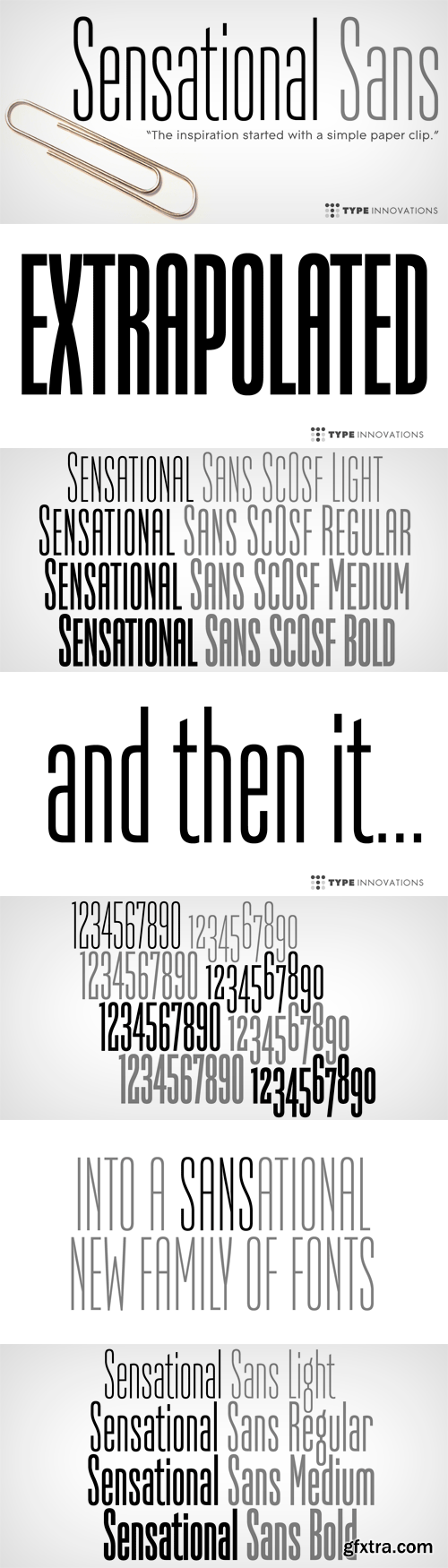
Sensational Sans is an original design by Alex Kaczun. The inspiration started with the shape of a paper clip. Simple and elegant. A condensed sans serif that’s, well... just sensational! It’s a delight to use and view. Great for advertising, large headlines, web applications, and well... just about anything. Works equally well in a broad range of text point sizes. Comes in 4 delightful flavors—Light, Regular, Medium and Bold.
OTF | 8 Fonts | JPEG Preview | 4.5 Mb RAR
25 UHQ JPEG | up to ~ 9000 x 9000 | 300 dpi | 373 Mb RAR
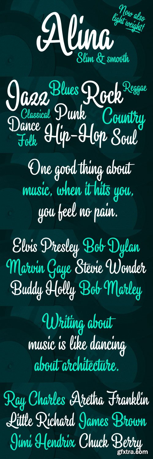
Alina is a laid-back condensed script font. Alina includes OpenType ligatures to all lowercase double letters to make them subtly differ from each other. So Alina feels a little bit more hand lettered and lively.
OTF | 2 Fonts | JPEG Preview | 4.5 Mb RAR
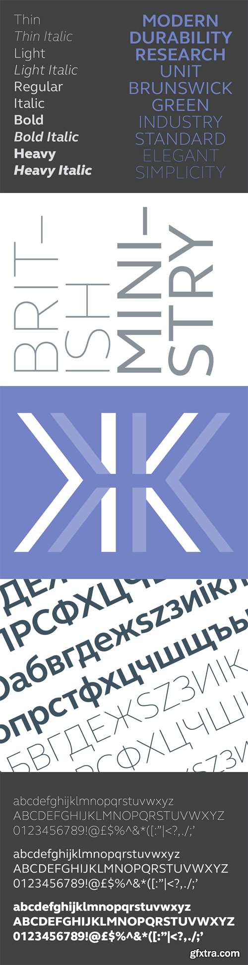
Rooted in 1960s Brit modernism and infused with a fresh, contemporary spirit, FS Elliot is a future-proof, workhorse sans serif, well-suited to any assignment. Open and harmonious, its clear, fluid shapes lend words a distinctive and optimistic bounce.
OTF | 10 Fonts | JPEG Preview | 4.9 Mb RAR
24 EPS | + HQ JPEG Preview | 213 Mb RAR

Ultima is a rounded geometric monoline typeface family, built in ten styles. The typeface is ideal for use in display sizes, though is quite legible in text. Ultima is released as OpenType single master with a Western CP1252 character set.
OTF | 10 Fonts | JPEG Preview | 4.6 Mb RAR
25 EPS | + HQ JPEG Preview | 213 Mb RAR
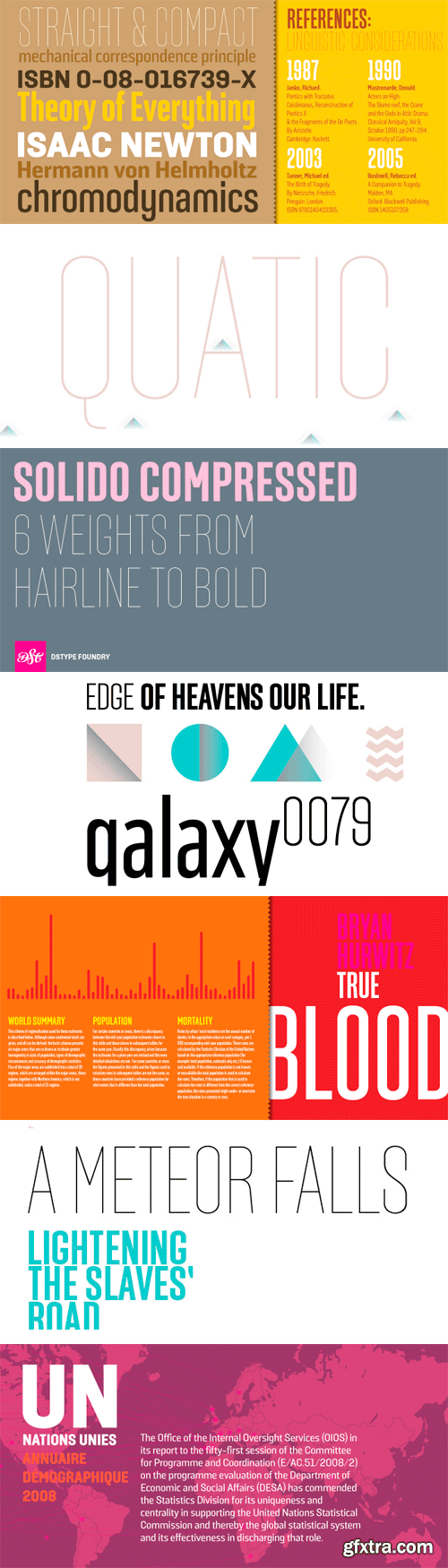
Solido is a very versatile and usable type system with five widths: Solido, Solido Constricted, Solido Condensed, Solido Compressed and Solido Compact, in a total of 35 fonts with many of alternate characters.
OTF | 6 Fonts | JPEG Preview | 4.1 Mb RAR
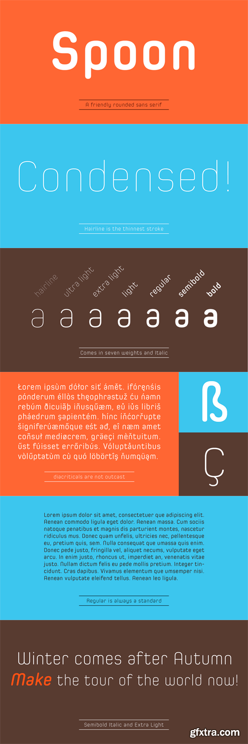
Spoon is a fresh and contemporary sans-serif that can be used in wide range of project. Its skeleton of letterform is geometrically-based and minimal but the body was designed with a touch of humanistic outlines as though they were handwritten. This not only make the font clean, legible and functional, but also make it possible to give natural, friendly and soft impressions. Spoon comes in seven weights with matching italics and includes diacritics for most European in each weight.
OTF + TTF | 14 Fonts | JPEG Preview | 4.4 Mb RAR
25 EPS | + HQ JPEG Preview | 213 Mb RAR

25 UHQ JPEG | up to ~ 8200 x 6100 | 300 dpi | 261 Mb RAR

Spacelord is inspired by vintage toys from the 1950s and 1960s. It refers to the box art of robots, spaceships, x-ray-guns and other cosmic trash treasures of this golden science fiction age. Aboard the lord: four, three, two, one, zero!
OTF | 5 Fonts | JPEG Preview | 7.1 Mb RAR
Giorgio Sans takes Giorgio’s elegance in new and unexpected directions, again being designed for Chris Martinez at T, the New York Times Style Magazine. With more style than the typical condensed sans, it features an alternate set of round titling capitals for a truly unique look. The Heavy and Black weights were added by Vincent Chan in 2012.
OTF | 12 Fonts | JPEG Preview | 8.6 Mb RAR
SermonBox - Seasonal Collection

SermonBox - The Series Pack Collection

Top Rated News


Would you like to be a Author?


