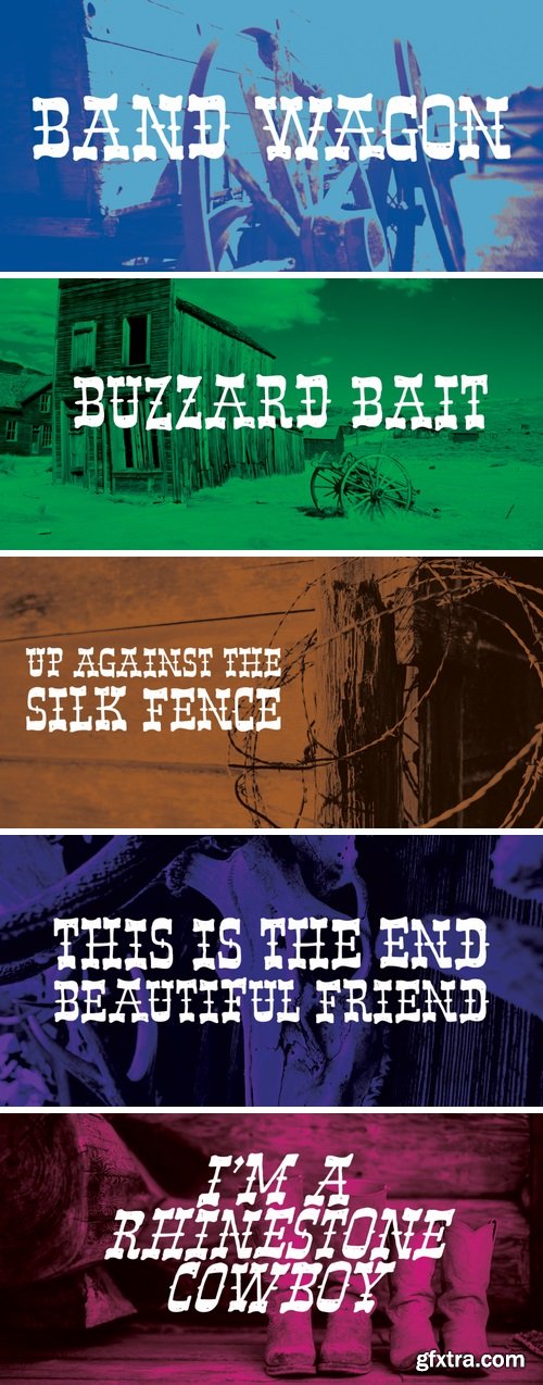
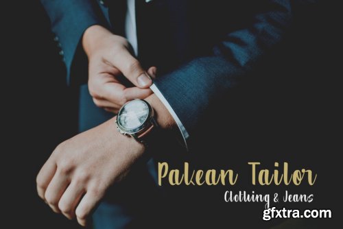
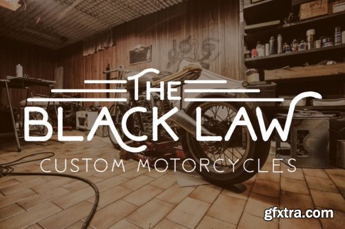
Band Wagon - 2 Fonts
https://www.fontspring.com/fonts/hanoded/band-wagon
I don’t know why exactly, but I felt the need to create a Western font. Band Wagon is a handcrafted cowboy font. It comes with curly slabs, spurs and ye olde outlaw spirit.

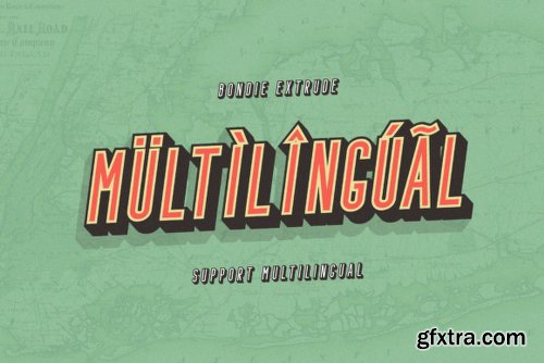
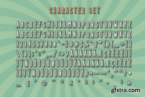
CM - Mount 1120770
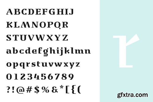
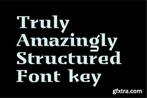
https://creativemarket.com/MansGreback/1120770-Mount
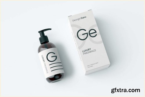
High quality serif font with multilingual support and a large number of special characters. Designed by Måns Grebäck, this hand-crafted typeface works great in logotypes and for titles and slogans.

TTF
Simple Installations
Works on PC & MAC
TTF
Simple Installations
Works on PC & MAC

TTF
Simple Installations
Works on PC & MAC
Clean Results
TTF
Simple Installations
Works on PC & MAC
Clean Results
TTF
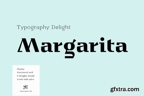
https://www.youworkforthem.com/font/T9725/ye-margarita/[CENTER]
TTF
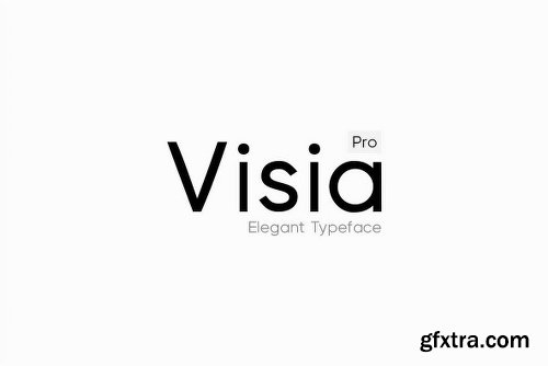
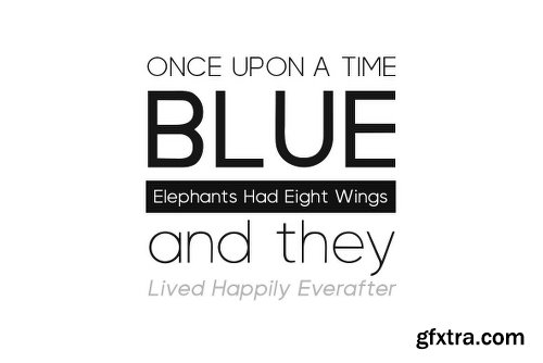
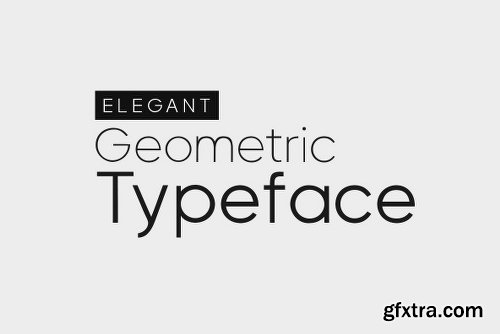
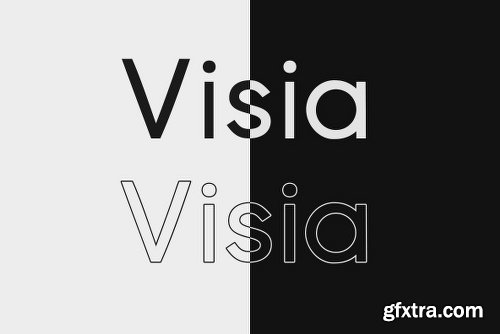
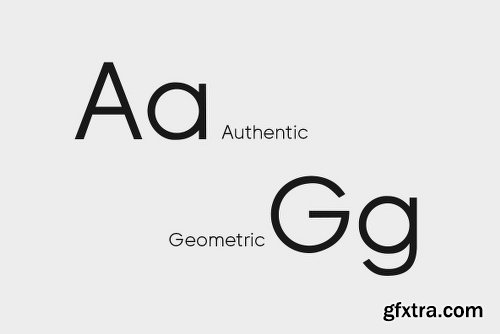
https://www.youworkforthem.com/font/T9726/visia-pro[CENTER]
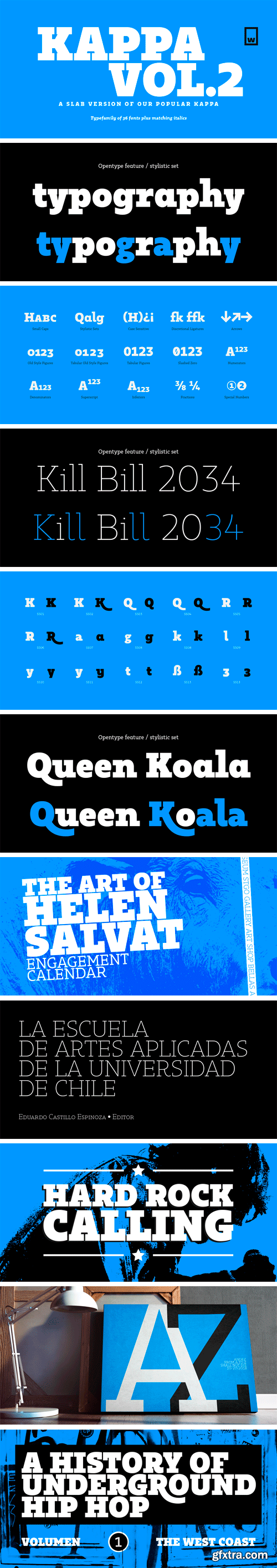
https://www.myfonts.com/fonts/without-foundry/kappa-vol2/
Kappa Vol.2 is the serif version of our popular Kappa. Just as Kappa sans, this font has a slight narrowed structure and a prominent ascender height, therefore this font is suitable for a large range of platforms. Moreover, due to its serif Kappa Vol.2’s level of legibility is more accurate, so when you use it alongside Kappa sans the results will be extremely effective.
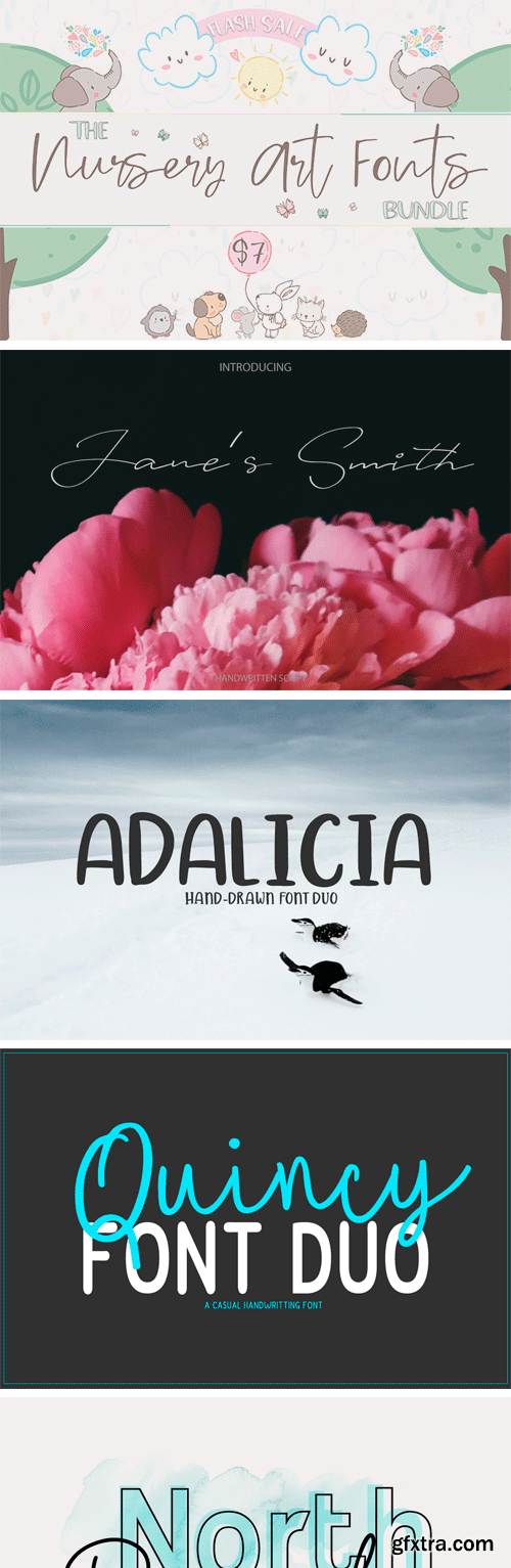
https://thehungryjpeg.com/bundle/3465638-the-nursery-art-fonts-bundle/
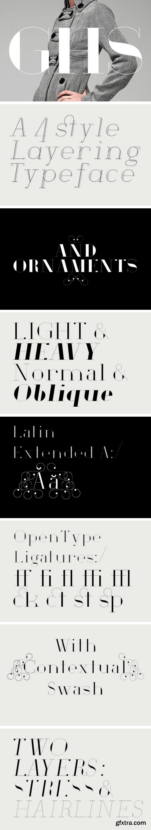
https://www.myfonts.com/fonts/houseofburvo/ghs/
GHS is an original font from HouseOfBurvo, designed and made by Matthew Burvill. GHS stands for Geometric Hairline Serif, it is a serif typeface that is geometric in structure, it has strong vertical stress and its stroke is hairline thin. This gives it a fashionable, stylish appearance for headlines and display.
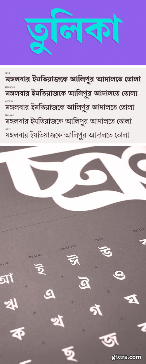
Tulika Bengali Font Family
Tulika is a text typeface inspired by traditional Bengali calligraphy. It features distinctive, sinuous shapes and a high contrast between thick and thin strokes. Tulika is a set of Unicode fonts suitable for setting books, magazines, newspapers and any other material which can benefit from its five weights and high legibility at small point sizes.
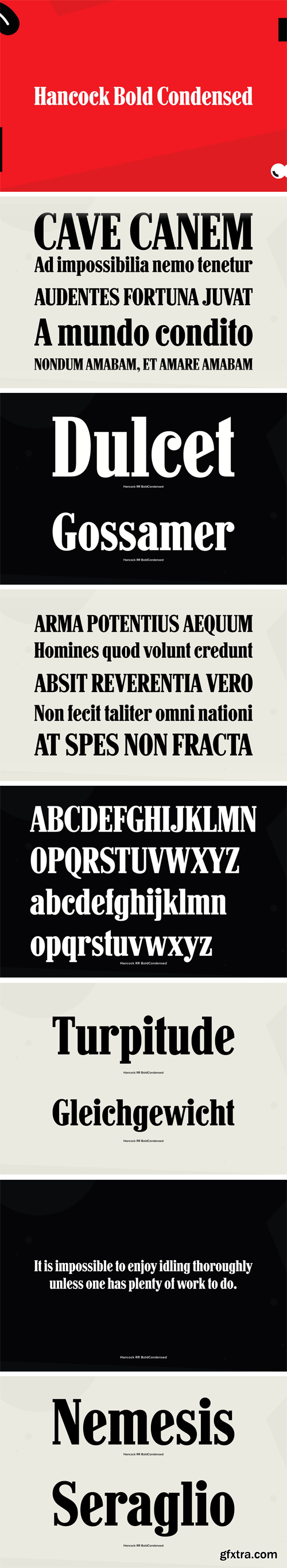
https://www.youworkforthem.com/font/T2066/hancock-bold-condensed/
Designed by Steve Jackaman. The Original design was produced by the Keystone Type Foundry, circa 1903; this condensed version was added circa 1917 by Lanston Monotype.
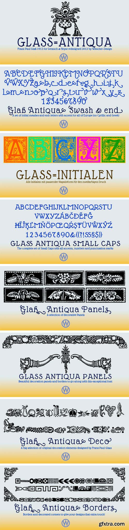
https://www.myfonts.com/fonts/wiescherdesign/glass-light/
Glass Light was designed in 1912 by Franz Paul Glass for the Genzsch & Heyse foundry. The font is stylewise related to the “Lo types” of the same period. Glass designed a lot of decorative elements to go along with the font. I added Swashes, endletters and smallcaps to the set to make it complete. Since this type of font will probably not be used by many professionals, I did not put all the letters into one big OTF-version since most people don't have OTF-savy software. These fonts can and should be mixed for optimal results.
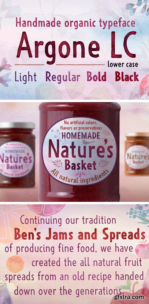
https://www.myfonts.com/fonts/deepak-dogra/Argone-LC/
Argone LC is a handmade organic typeface family. It is a variant of Argone typeface, but has lower case letters. It comes in four weights– light, regular, bold and black, which is a feature not seen much in handmade typefaces. This makes Argone LC a versatile and flexible type family. There is also a version of Argone LC which only has upper case letters – Argone.
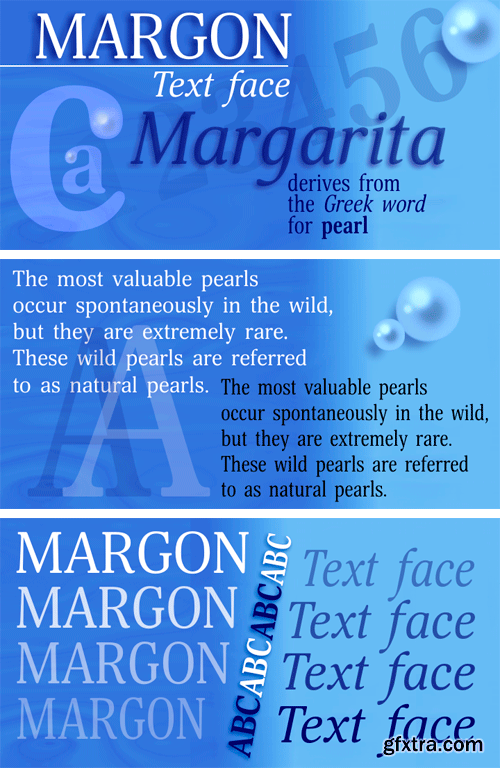
https://www.myfonts.com/fonts/paratype/margon/
Margon is a serif font family with a temperate design -- small serifs, moderate contrast, tiny roundings on the corners make it calm and serene.
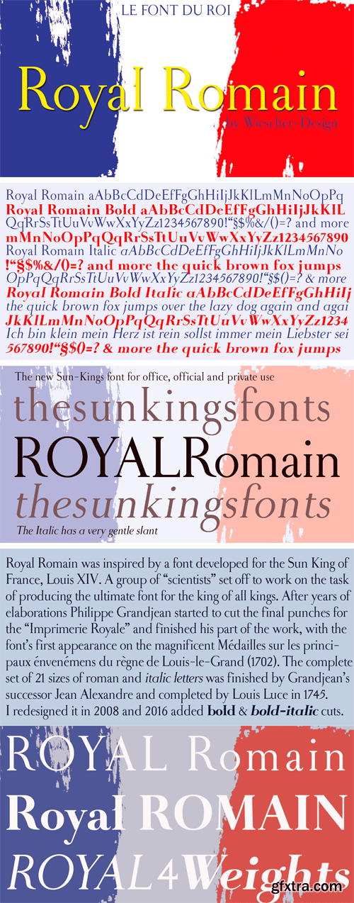
https://www.myfonts.com/fonts/wiescherdesign/royal-romain/
Royal Romain was inspired by a font developed for the Sun King of France, Louis XIV. A group of “scientists” set off to work on the task of producing the ultimate font for the king of all kings. After years of elaborations Philippe Grandjean then started to cut the final punches for the “Imprimerie Royale” and finished his part of the work, with the font’s first appearance in the magnificent Médailles sur les principaux énvenémens du règne de Louis-le-Grand (1702). The complete set of 21 sizes of roman and italic letters was finished by Grandjean’s successor Jean Alexandre and completed by Louis Luce in 1745.
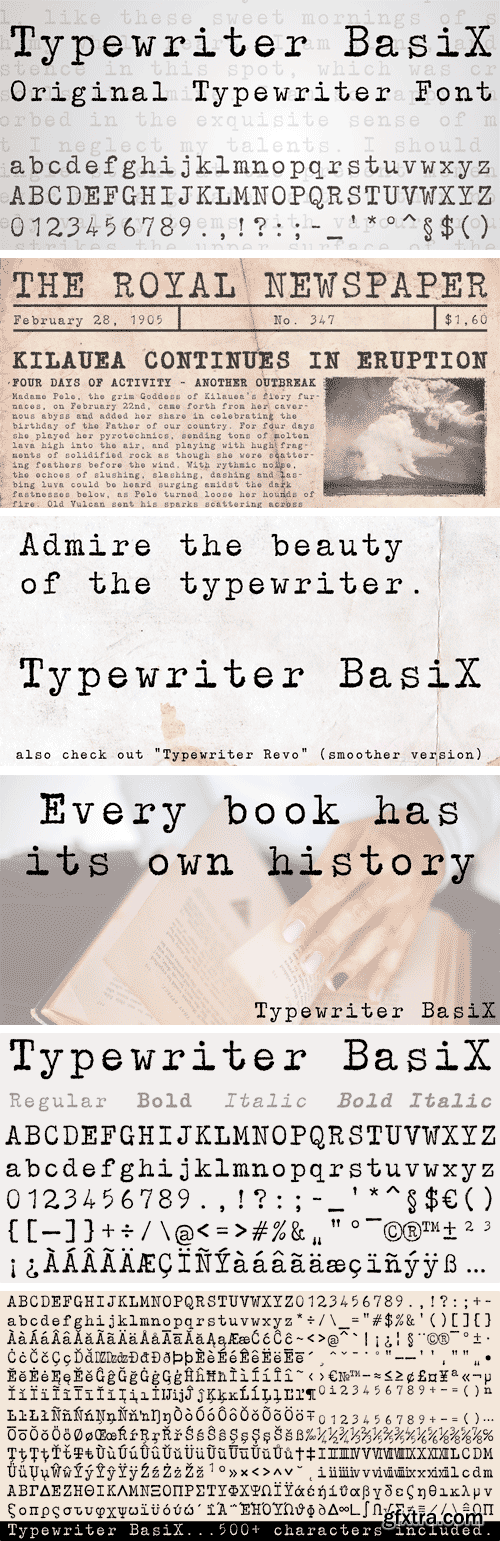
https://www.myfonts.com/fonts/matthias-luh/typewriter-basix/
I found an old typewriter and well... Typewriter BasiX is the result. Enjoy this rough retro looking design to use for your digital or print project and also check out Typewriter Revo, the clean version of Typewriter BasiX.


TTF
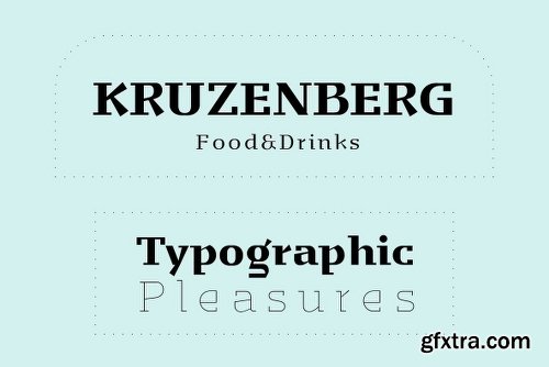
https://www.myfonts.com/fonts/canadatype/dominion/


OTF | TTF
Simple Installations
Works on PC & MAC
Clean Results
OTF | TTF
Simple Installations
Works on PC & MAC
Clean Results
TTF
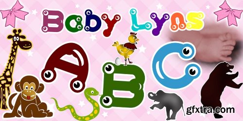
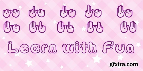
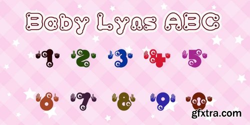
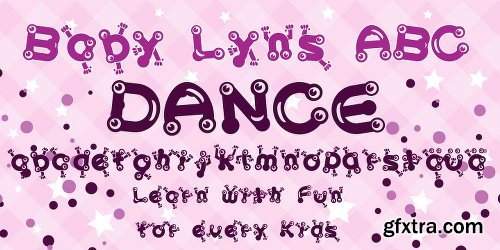
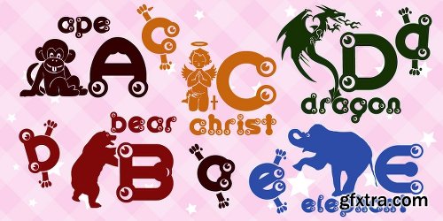
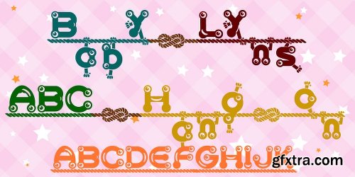
https://www.myfonts.com/fonts/otto-maurer/baby-lyns-abc/

OTF | TTF
Simple Installations
Works on PC & MAC
Clean Results

OTF | TTF
Simple Installations
Works on PC & MAC
Clean Results
SermonBox - Seasonal Collection

SermonBox - The Series Pack Collection

Top Rated News


Would you like to be a Author?


