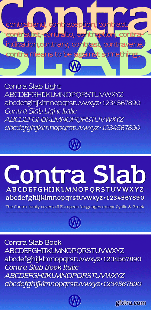
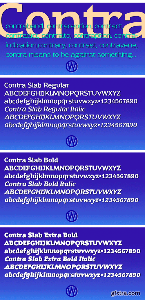
https://www.myfonts.com/fonts/wiescherdesign/contra-slab/

https://www.myfonts.com/fonts/redrooster/hauser-script-rr/
Hauser Script is a freely drawn brush script typeface, which was designed in 1936 by George Hauser for Ludlow. Hauser took advantage of the slanting matrices of the Ludlow machine to create what is possibly the most informal of American brush scripts. Steve Jackaman of International TypeFounders, Inc. (ITF) digitally engineered the typeface in 1998. Hauser Script has a graceful, calligraphic look that brings class to any project at display and subhead sizes.

https://www.myfonts.com/fonts/andrey-kudryavtsev/sommelier/

https://www.myfonts.com/fonts/northernblock/arctic-patrol/
ArcticPatrol is a modern angular font influenced by military related computer games. Examples include: Ghost Recon and Medal of Honor.

https://www.myfonts.com/fonts/polenimschaufenster/pis-creatinin-pro/
PiS Creatinin pro is based on a vintage ABC learning game for kids found in my grandparents attic. The narrow and high hand-drawn letters combine delicacy and chunkyness in a wonderful way, so it can be used both in huge display sizes and in small text sizes. PiS Creatinin pro - Makes you want to go back to school and learn the alphabet all over again!


TTF
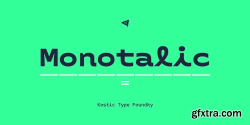
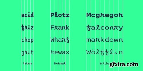
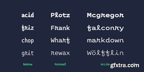
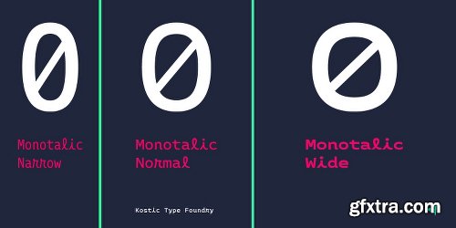
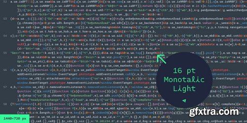
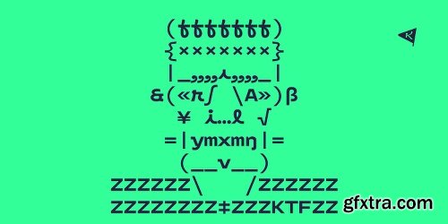
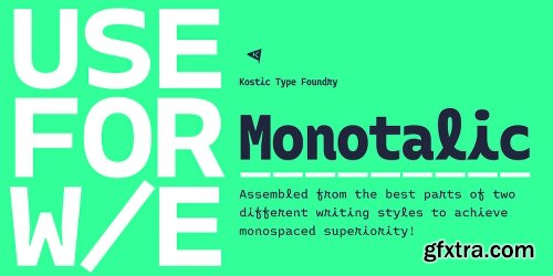
Monotalic was created as a fun experiment, exploring better solutions for the monospaced type design.
Most monospaced (fixed-width) typefaces have the same main design problem regarding the lowercase – filling the empty space around l, f, i, j and r. That usually brings the addition of slab serifs to those narrow characters, causing many monospaced fonts to look and feel alike. Monotalic solves that problem by adopting the handwritten (or cursive) form for those problematic characters, which allows them to be defined in more strokes, thus getting a better distribution of form in that fixed-width space. On the other hand, cursive writing usually lacks the legibility of a Roman (Regular upright) style, so Monotalic was created to be a hybrid, taking the best of both worlds.
Monospaced fonts today are mostly used for coding. Modern code editors use colored text in order to differentiate between different kinds of code. So, in that environment there’s actually no need for traditional text styling by adding Italics, Bold or other styles, because the code lines are overstated as it is. That is why Monotalic focuses on one style only, in three widths and four weights. The weights allow users to choose the perfect contrast of text on screen, depending on their monitor resolution and background color in the editor.
Movie scripts are almost exclusively set in 12pt Courier. It became the industry standard because when set in the specific “screenplay format" it helps with the breakdown of the schedule and budgeting process of the film production. Although it looks completely different, text set in Monotalic (Normal width) will take the same amount of space as Courier.
https://www.myfonts.com/fonts/kostic/monotalic/


TTF
Costanera is a neohumanist typeface with both soft strokes and endings, which is inspired by 90s typefaces. It has an organic aspect and curved finials associated to the early calligraphy, while its straight angles give Costanera a technological and futuristic impression.
Costanera weights go from thin to black, thus it can be used in short-impact phrases ideally using Black or Thin weight and extensive texts selecting the Book version.
On the other hand, due to its calligraphic-futuristic features Costanera is perfectly suitable for different fields, such as vanguard technology, architecture, and signage topics.
This typeface is composed of a Normal and Alternative version, adding 32 weights in total. Stylistic sets, small caps, ligatures, lining and old style numbers, fractions, circle numbers and arrows are part of the Opentype features. Moreover, this project comes with 790 glyphs that allows to write in 219 languages.
https://www.myfonts.com/fonts/without-foundry/costanera/


OTF | TTF
To celebrate one year since Lili Lieber-Lovei is on the market, they release this amazing handcrafted font bundle!
This beautiful collection contains 18 typeface families with a total of 31 fonts! it's a dream bundle for bloggers, YouTubers and the other content creators who want to enhance their content with absolutely unique fonts.
https://webmaster-deals.com/858-get-18-handcrafted-fonts-for-only-18.html
OTF | TTF
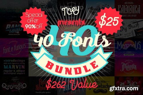
https://webmaster-deals.com/866--font-bundle-40-typefaces-from-22-font-families.html
TTF
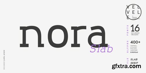
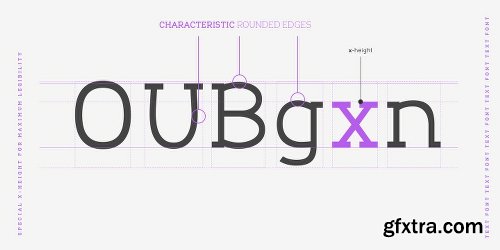
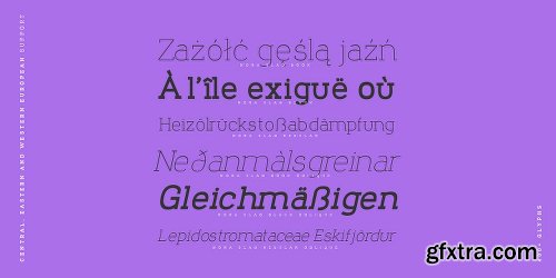
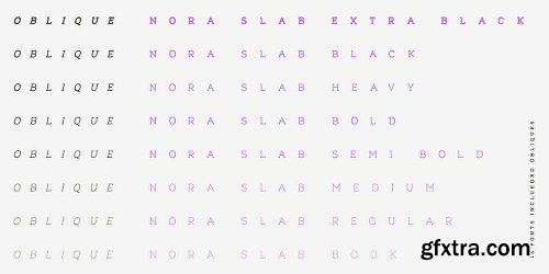
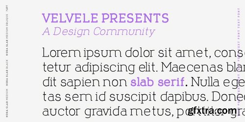
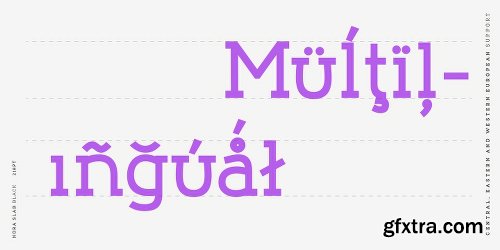
Nora Slab blends a geometric inspiration with warm humanist elements, making it the perfect choice for when you need a fresh, contemporary slab serif typeface. The companion Nora Grotesque makes the Nora family a real workhorse for any use, including web, digital, print, branding and signage.
Nora Slab has a large x-height and open counterforms, making it easily readable. It supports multiple languages: Central and Eastern European as well as Western European languages. It has eight weights with related obliques.
https://www.myfonts.com/fonts/velveledesigncommunity/nora-slab/

Associate Sans Font Family
Associate Sans is a large family of ten sans serif fonts. The typeface is perfect for use in Editorial Design. Its letters have a strong ‘American gothic’ look. This genre has been used since the early 20th-century for the design of publications, corporate identities, and even the small print in newspapers and magazines.

Associate Sans Stencil Font Family
Associate Sans Stencil is a family of ten sans serif fonts with a stencil optic. Part of FontStore’s larger ‘Associate’ type system, Associate Sans Stencil is an extension of the Associate Sans design for use in headlines and logos. The letterforms in both Associate Sans and Associate Sans Stencil have a strong ‘American gothic’ look. That genre of typefaces has been popular since the early 20th-century, especially for designing publications and corporate identities.
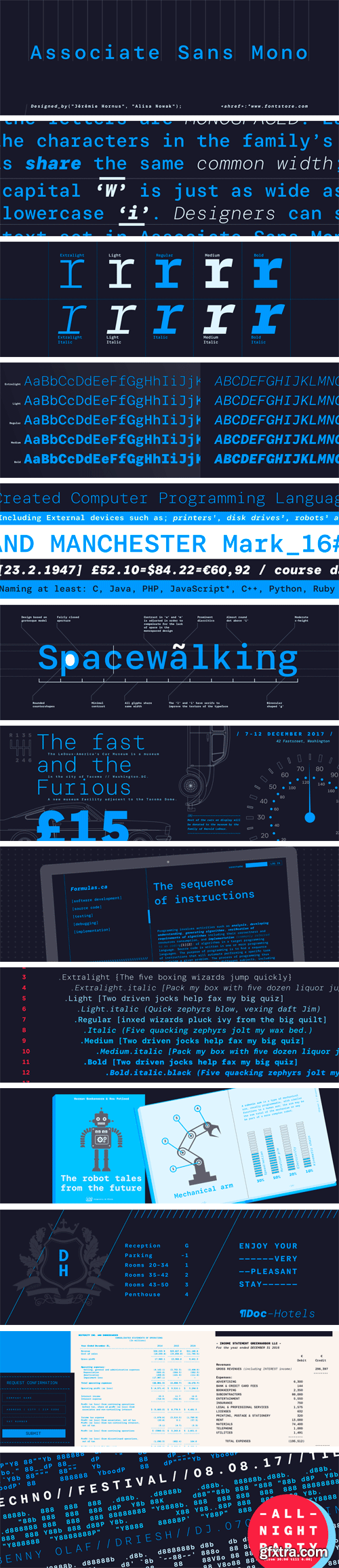
Associate Sans Mono Font Family
Associate Sans Mono is a family of ten sans serif fonts, in which all of the letters are monospaced. Each of the characters in the family’s fonts share the same common width; the capital ‘W’ is just as wide as the lowercase ‘i’. Indeed, the same character width is used for all of the glyphs in each of the family’s ten fonts. Designer can swap out text set in Associate Sans Mono’s ExtraLight weight for letters from the Bold Italic font, without text-length or line-wrap being affected at all.

Associate Slab Font Family
Associate Slab is a large family of ten sans serif fonts. Part of FontStore’s larger ‘Associate’ type system, Associate Slab was developed as the slab serif counterpart for Associate Sans. Nevertheless, its fonts could be used entirely on their own, too. Like its relatives in the overarching Associate type system, Associate Slab is a typeface intended for Editorial designers.
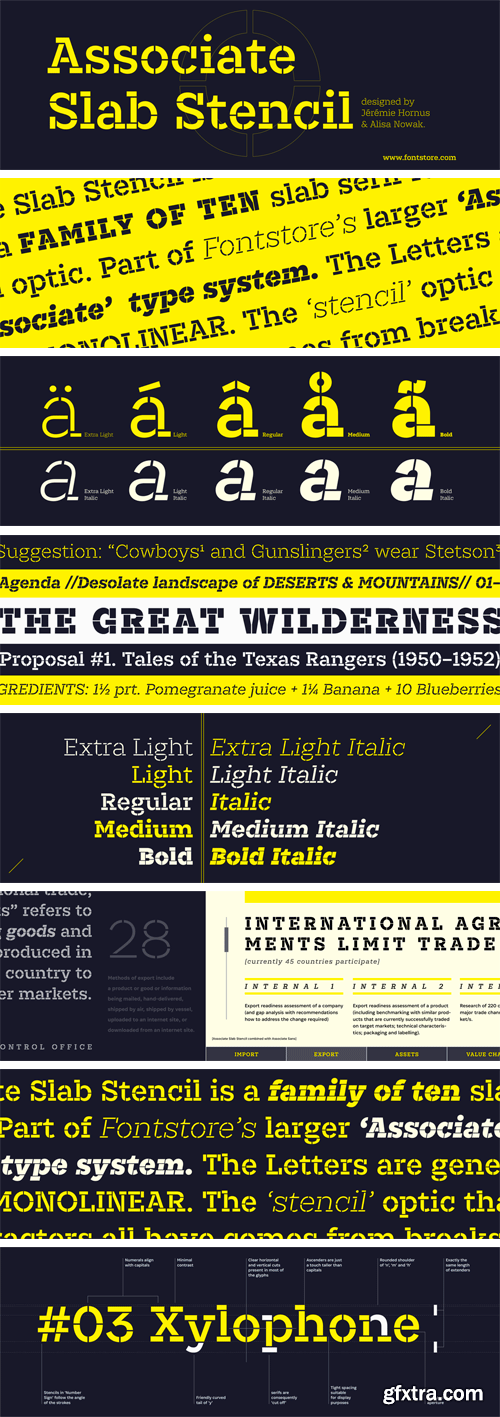
Associate Slab Stencil Font Family
Associate Slab Stencil is a family of ten slab serif fonts with a stencil optic. Part of FontStore’s larger ‘Associate’ type system, Associate Slab Stencil is an extension of the Associate Slab design for use in headlines and logos. The Associate Slab Stencil letters are generally monolinear. The ‘stencil’ optic that the characters all have comes from breaks, or ‘bridges,’ applied to parts of each letter.

Matteo Font Family
Matteo is a family of geometric sans serif fonts. Designer Diana Ovezea has given the family an Italian name so that users might call fast cars to mind when they see it. The family includes 14 styles; there are seven weights, ranging from Thin to Bold. Each of these includes a companion italic. Matteo’s italics have an extreme angle (15º), which is quite unusual for a sans serif design. These italics are oblique in form, with a single-storey ‘a’ in place of the upright’s double-storey ‘a’.

Clash Grotesk Font Family
Clash Grotesk is a family of sans serif fonts, with a twist. While the design of the family’s six styles is generally neo-grotesk in style, one feature immediately sets it from other typefaces in that genre: Its letterforms have very small ‘apertures’. These are the openings at the edges of the counterforms; if you look at the letter ‘c’, for instance, the space between ends of the two arms on the right-hand side of the letter is very small. It almost looks as if that aperture is about to close shut. Clash Grotesk is eye catching, but its ‘design trick’ does not go overboard.

Pramukh Font Family
Pramukh is a very condensed sans serif typeface. As a family of fonts, it is particularly large; its 16 styles include a range of eight weights: ExtraLight, Light, SemiLight, Regular, SemiBold, Bold, ExtraBold, and Black. Each weight has a companion italic font, which is oblique in style. Pramukh makes use of a very modernist typographic vocabulary. As a result, the typeface is in an excellent choice for corporate identity and editorial design projects where a formal sans serif is needed, especially one whose narrow letters can pack a lot of text into a tight space.

Pramukh Rounded Font Family
Pramukh Rounded is a very condensed sans serif typeface in which all strokes end in round semicircular curves. As a family of fonts, it is particularly large; its 16 styles include a range of eight weights: ExtraLight, Light, SemiLight, Regular, SemiBold, Bold, ExtraBold, and Black. Each weight has a companion italic font, which is oblique in style. On Fontstore, you’ll find a matching font family for this design: Pramukh (a non-rounded version of this design). Both Pramukh and Pramukh Rounded are designed by Aarya Purohit and ITF.

Griff Font Family
Griff is a family of sans serif typefaces with unusual stroke contrast. The ‘middle’ parts of many of the fonts’ letterforms are drawn with much thinner strokes than those found in the rest of typeface. The Griff family includes 10 styles; these are five weights that range from Light through Bold, each with an upright and italic font. The typeface is a bit humanist in style; its strokes end in horizontal or vertical cuts, rather than in diagonals. The letterforms’ counters are also mostly open. The fonts’ x-height is tall, and the lowercase letters’ ascenders rise slightly above the height of the capitals.
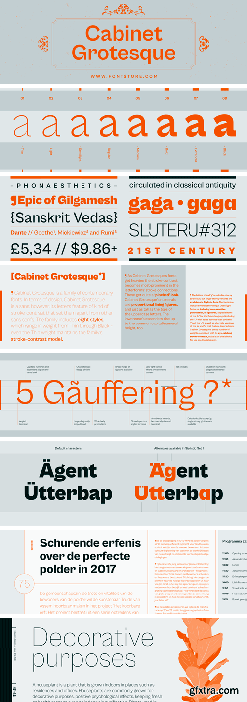
Cabinet Grotesque Font Family
Cabinet Grotesque is a family of contemporary fonts. In terms of design, Cabinet Grotesque is a sans; however, its letters feature of kind of stroke-contrast that set them apart from other sans serifs. The family includes eight styles, which range in weight from Thin through Extrabold – even the Thin weight maintains the family’s stroke-contrast model. As Cabinet Grotesque’s fonts get heavier, the stroke-contrast becomes most-prominent in the letterforms’ stroke connections. These get quite a ‘pinched’ look.

JH Lea Font
https://www.myfonts.com/fonts/jh-fonts/jh-lea/
JH Lea cursive is a school kids typeface; it is designed based on cursive handwriting , typical for children books, first hand calligraphy experience.

Locomo Font Family - 7 Fonts
Locomo is a seven-weight family of constructed sans serif fonts. The sides of each letter in Locomo are flat. Many of the typeface’s characters have rounded tops and bottoms; however, in the case of letters where these are traditionally flat – like in ‘E’, ‘F’, ‘I’, ‘L’, and ‘T’ – Locomo keeps these flat, too. The family’s range of weights begins with Extralight and expands to Black. In all of the fonts, characters are drawn with monolinear strokes. In each of the weights, the fonts’ inter-character spacing is very tight. Locomo is a little wide, especially in the lowercase. The lowercase letters also have a tall x-height. For their design, simple forms have been favored. The ‘a’ and the ‘g’ are both single-storey, for instance. Jean-Baptiste Morizot designed Locomo for display applications; the larger the size, the better. This will give Locomo’s unique design language enough space to make the intended statement.
SermonBox - Seasonal Collection

SermonBox - The Series Pack Collection

Top Rated News


Would you like to be a Author?


