Sharpie Font Family - 5 Fonts
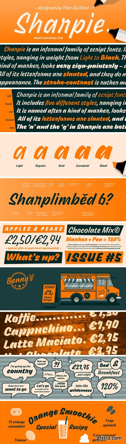
Sharpie is an informal family of script fonts. It includes five different styles, ranging in weight from Light to Black. The typeface, named after a kind of marker, looks very sign-painterly – almost as if its letters had been written out quickly with a flat brush. All of its letterforms are slanted, and they do not connect with the characters that come before or after them. Sharpie’s strokes are very angular in their appearance. The stroke-contrast is rather modest in the Light weight, but by the Black, it is very strong (really quite awesomely so). Sharpie’s lowercase letters don’t have a very tall x-height. The tops of the ascending-lowercase letters, the capitals, and the numerals all rise to about the same point. The ‘a’ and the ‘g’ in Sharpie are both single-storey in their forms. The typeface is designed by Théo Guillard.

Monorama Font Family - 4 Fonts
Monorama is a family of caps-only display fonts. Its letterforms are sans serif and quite industrial-looking. While text set in the four Monorama fonts appears at first glance to be monospaced, that is just a strong look ; in actuality, the letters have proportional widths. Monorama contains a number of constructed-design hallmarks. The fonts’ ‘M’ and ‘W’ share a nearly-identical form, rotated 180°. Letters that are traditionally rounded, like the ‘C’ or the ‘O’, are all straight-sided. In fact, the Monorama fonts do not include any curves in at all. Stroke-endings are mostly modulated, looking a bit like the ends of strokes in ‘rounded’ fonts (but also like ‘college’ or sports fonts). The ‘Q’ doesn’t descend below the baseline, but still has a tail. The ‘J’ has a non-descending tail of its own, too. The zero features a slash inside of its counter to distinguish it from the ‘O’. Monorama includes a full range of numerators and denominators for typesetting fractions, as well as ten directional arrow glyphs per font. Each font also has two different ampersands to choose from. Monorama is an excellent choice for headline-typesetting and logo design, but will certainly be used for concert and event flyers, too. It would even be great for branding a sports team. Monorama was developed by Deni Anggara, a type designer based in Bandung/Indonesia.

RAY Font Family - 5 Fonts
Ray is a light-hearted family of display fonts. Its letterforms were inspired by the kind of typefaces used on digital displays. The family includes five variants, each of which shares the same character width, inter-character spacing, and OpenType features. They are each derived from a strict grid. Ray One’s letterforms make use of a series of dots overlayed on top of a background grid. The capital letters, lining figures, and lowercase ascenders are nine dots tall. The x-height is seven dots. The descenders have two dots worth of space available below the baseline. The Ray Two fonts uses squares instead of dots. These all run into each other, but still present a pixelated effect to the texts they set. Those squares are rounded off in Ray Three, making this style appear like a combination of the Ray One with the Ray Two font. Ray Four adds bridges between many of the gaps found between the grid units visible in Ray Three. These rounded elements from Ray Four are in turn re-squared in Ray Five, making that font look like a cross between Ray Two and Ray Four. The fonts in the Ray family include both lining and oldstyle figures, as well as several alternates for letters like the ‘Q’, ‘R’, ‘S’, and ‘g’. Ray come from Satya Rajpurohit, the Ahmedabad-based type designer who co-founded the Indian Type Foundry.

Cosmetic Font Family
Cosmetic is a very high-contrast family of sans serif fonts. As its name implies, it has been developed for exquisite applications, like the corporate identity of fashion or beauty product firms, or for cosmetic product packaging design. For centuries, the fashion world has looked to France for inspiration.

Tanker Font
Tanker is a single-weight, uppercase-only, condensed sans serif. The ‘caps’ saved onto the font’s lowercase keys are of a different design that those you’ll get when you press the uppercase keys. So the font has two different versions of each letter for users to choose from, really.

Gambarino Font
Gambarino is a condensed, single-weight serif face for headlines. The font is designed by Théo Guillard. Stylistically, you could call it a post-modern interpretation of the Garalde genre.
Claire Font Family - 12 Fonts
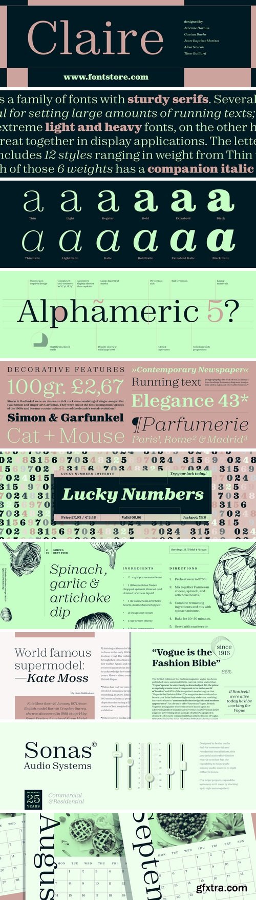
Claire is a family of fonts with sturdy serifs. Several of the weights in the family are optimal for setting large amounts of running texts; the extreme light and heavy fonts, on the other hand, work great together in display applications. The letterforms in Clair have a vertical axis, and their design is reminiscent of contemporary newspaper fonts, as well as late-nineteenth century typefaces along the Century model. Claire includes 12 styles ranging in weight from Thin to Black. Each of those six weights has a companion italic font, too. Claire’s letterforms feature thick slab-like serifs that are bracketed onto their stems. Since the proportions of its uppercase letters are nineteenth-century, they optically feel like they are all almost the same width. The same is true for the numerals, which share the same height as the capitals. The numerals include nice, decorative features, such as flag-like strokes on the bottom of the ‘2’ and the top of the ‘7’. The ascenders of Claire’s lowercase letters rise slightly above the tops of the uppercase letters and numerals. Claire}s x-height is also rather tall. The lowercase ‘g’ in the upright fonts, which is double-storey, has a lovely ear that ascends above the x-height. In the italic fonts, both the ‘a’ and the ‘g’ are single-storey. The italic letterforms also feature especially-prominent ball terminals. Claire is the work of a team of Paris-based type designers including Jérémie Hornus, Gaetan Baehr, Jean-Baptiste Morizot, Alisa Nowak and Théo Guillard.

Boeing 24 Font
Boeing 24 is a caps-only display font. Its letterforms are sans serif, and they look like they come from a monospaced font. However, Boeing 24’s monospaced-appearance is just a strong look ; in actuality, its letters have proportional widths. These appear quite industrial and constructed, too – almost as if they had been made by a machine, rather than by Deni Anggara, the Bandung/Indonesia-based type designer behind Boeing 24.

Prachar Font
The word ‘Prachar’ means publicity in Hindi. This informal-looking all-caps, slanted script face is exactly the kind of font you could use to create shop or grocery store signs that need to look hand-painted. Each letter in the font has visible stroke contrast and rough edges. Prachar was designed by Black Foundry in Paris/France, and includes a character set large enough to be able to set all European languages written with the Latin script.

Bookmark Font Family
Bookmark is a family of display serif fonts for use in editorial design. The typeface includes four weights: Light, Regular, Medium, and Bold. Each weight features a high degree of stroke contrast. The letters’ angle of stress is vertical, and they are all drawn so that they are slightly condensed.
Boxing Font
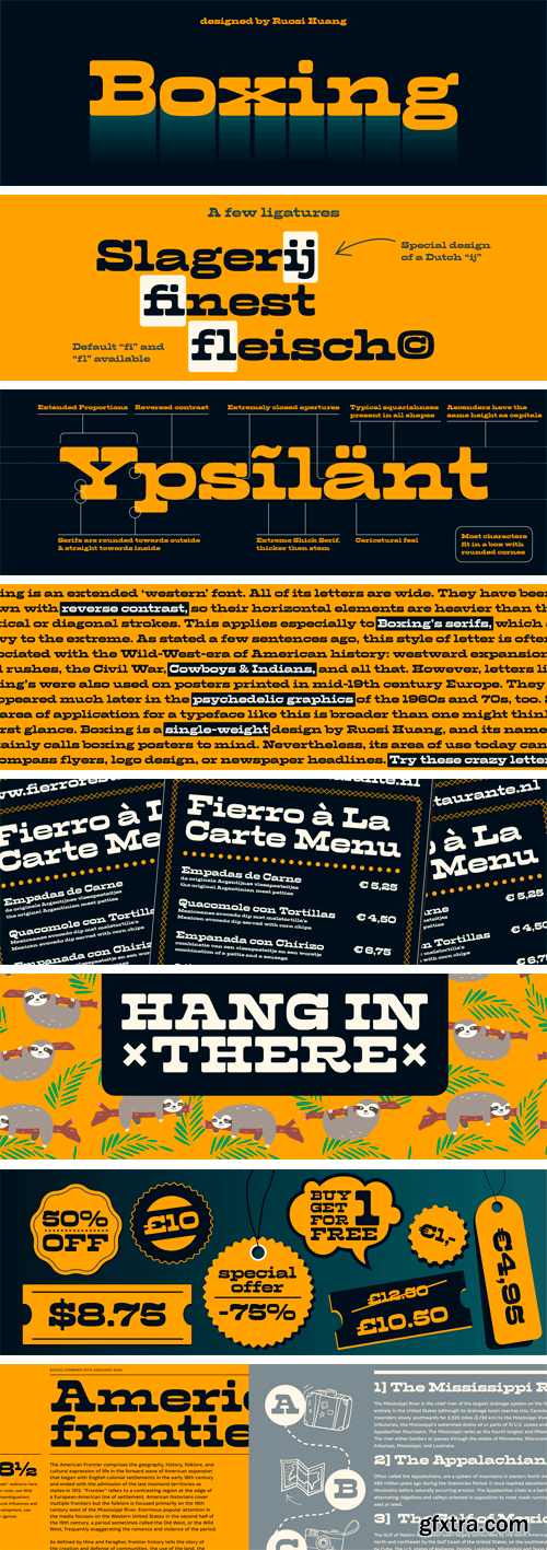
Boxing is an extended ‘western’ font. All of its letters are wide. They have been drawn with reverse contrast, so their horizontal elements are heavier than the vertical or diagonal strokes. This applies especially to Boxing’s serifs, which are heavy to the extreme. As stated a few sentences ago, this style of letter is often associated with the Wild-West-era of American history: westward expansion, gold rushes, the Civil War, Cowboys & Indians, and all that.

Excon Font Family
Alisa Nowak’s Excon is a versatile six-weight family of sans serif fonts; it is also a tribute to the work of the master French designer Roger Excoffon (1910–1983). Excon’s letters are top-heavy, a rarely-explored idea in type design Excoffon himself experimented with decades ago. He was followed in this later by a few colleagues in The Netherlands. By referencing Excoffon’s style, Excon’s design drinks from the fountain of French-style sans serifs from the 1950s and 60s.

Hoover Font Family
Hoover is a family of five monolinear slab serif fonts. Their most striking feature is that their letterforms do not included any curved or rounded parts at all. Elements of the roman alphabet that are usually round have instead been built-up here out of a combination of horizontal, vertical, and diagonal strokes. This style immediately calls Anglo-American ‘collegiate’ graphics to mind. Letters like those in the Hoover fonts have also been used, generally speaking, to promote many kinds of athletics for over a century.
Erika Hand Font Family
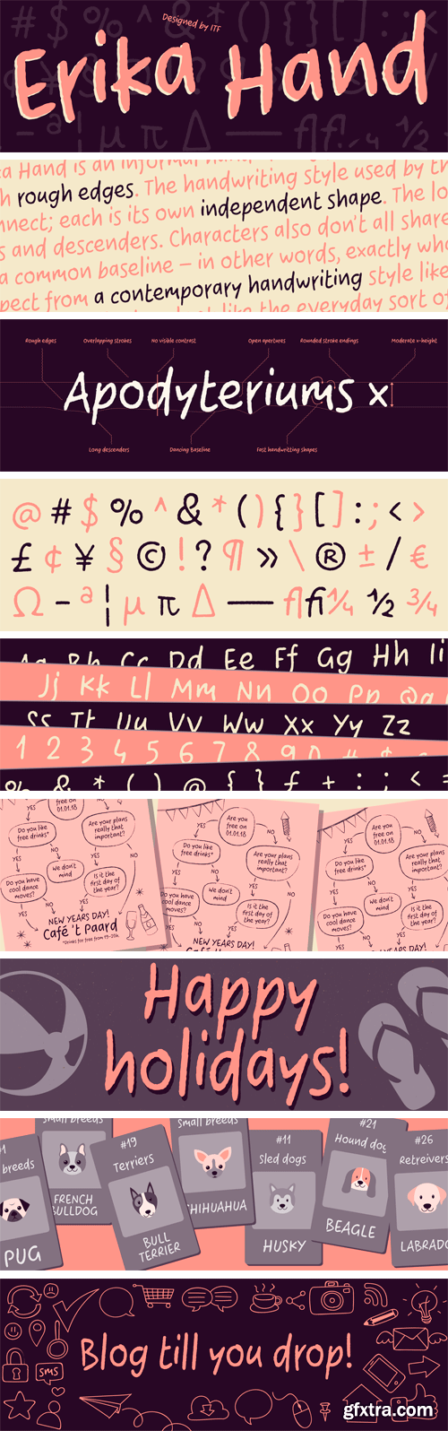
Erika Hand is an informal handwriting font with rough edges. The handwriting style used by the Indian Type Foundry to design the font was very casual. The letters do not connect; each is its own independent shape. The lowercase has a tall x-height, and the capitals are rather short, looking almost like small caps.

Comico Font
Comico is an informal handwriting font. Its letterforms are all-caps, and these appear as if they had been written with a slight left-lean. The design has the name Comico, of course, because its letters look very much like the style of lettering used in comic books. Comico’s character set is quite large, and it includes almost 1,000 special glyphs – these are ligatures and alternate versions of letters. Comico’s significant variety of extras will be automatically substituted into any text where the OpenType ‘contextual alternates’ feature has been applied. Indeed, the use of this feature is especially recommended for Comico (it is is for all glyph-rich fonts like it), since having multiple versions of each letter in a text make it more likely to appear handwritten. Most of the counterforms in Comico’s letters are large, and all of the letters’ minute details is drawn with straight lines. While the font is intended for use at natural handwriting sizes, if it is used very big, text set with Comico will actually appear pixelated. Comico is the work of Frode Helland, a type designer from Norway.
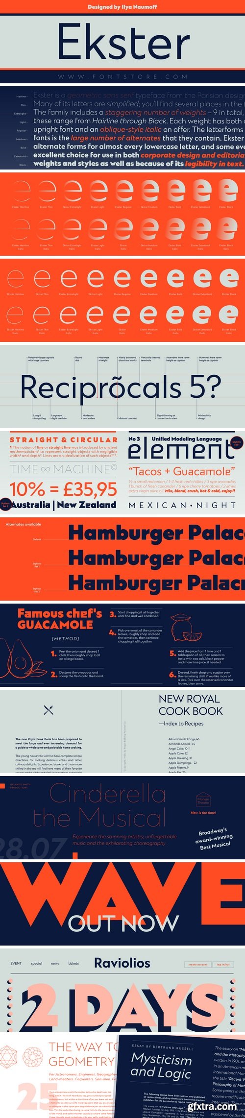
Ekster Font Family - 18 Fonts
Ekster is a geometric sans serif typeface from the Parisian designer Ilya Naumoff. Many of its letters are simplified; you’ll find several places in the typeface where the connection of bowls to stems isn’t fussy, for example, and horizontal strokes – like those in the ‘f’ and the ’t’ along the x-height – don’t bisect their letters’ main vertical stems (but populate the left-hand side only instead). Ekster’s lowercase ‘u’ is also symmetrical. The family includes a staggering number of weights – eight in total, and these range from Thin through Black. Each weight has both an upright font and an oblique-style italic on offer. The letterforms in all of the Ekster weights are drawn with virtually monolinear strokes. Ekster’s x-height is moderate, and the lowercase’s ascenders rise up to the same height as the capital letters and the numerals. However, the best feature of Ekster’s fonts is the large number of alternates that they contain. Ekster includes alternate forms for almost every lowercase letter, and some even have more than one alternate available – like the ‘a’, ‘e’, and ‘r’. Ekster is an excellent choice for use in both corporate design and editorial design projects, both because of its range of font weights and styles as well as because of its legibility in text.


TTF
Simple Installations
Works on PC & MAC


TTF
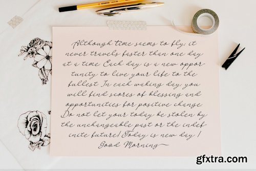
Ramkoers means ‘Collision Course’ in Dutch. I made this font with a bit of salvaged plastic and thick black paint. I carved a wedge out of the plastic and used it as a spatula to apply the paint to the paper. Ramkoers is a bit of a rough & ready grunge font with some jagged edges and wobbly stems. Comes with an abundance of diacritics.
https://www.myfonts.com/fonts/hanoded/Ramkoers/
TTF
https://thehungryjpeg.com/product/3476784-pierson-an-essential-serif-typeface/

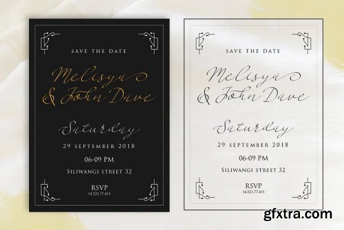
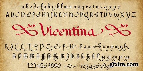
Karty Font Family - 5 Fonts
https://www.fontspring.com/fonts/eurotypo/karty
Karty is an outline freehand typeface that was inspired by John Baskerville’s designs. Karty comes in two version: Outline and Shadow fonts, including a large set of swashes, ligatures and stylistic alternatives, which bring the chance to create logotypes, originals headlines for fashion magazines, children books, advertising and much more.


TTF
httpswww.myfonts.comfontsparatypeserp-and-molot[CENTER]


TTF
Simple Installations
Works on PC & MAC
OTF | TTF
Simple Installations
Works on PC & MAC
Clean Results
TTF
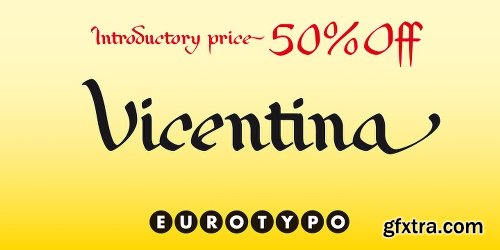
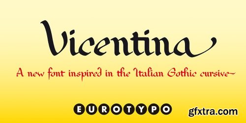
https://www.fontspring.com/fonts/eurotypo/vicentina
SermonBox - Seasonal Collection

SermonBox - The Series Pack Collection

Top Rated News


Would you like to be a Author?


