https://www.optimo.ch/typefaces_Stanley.html
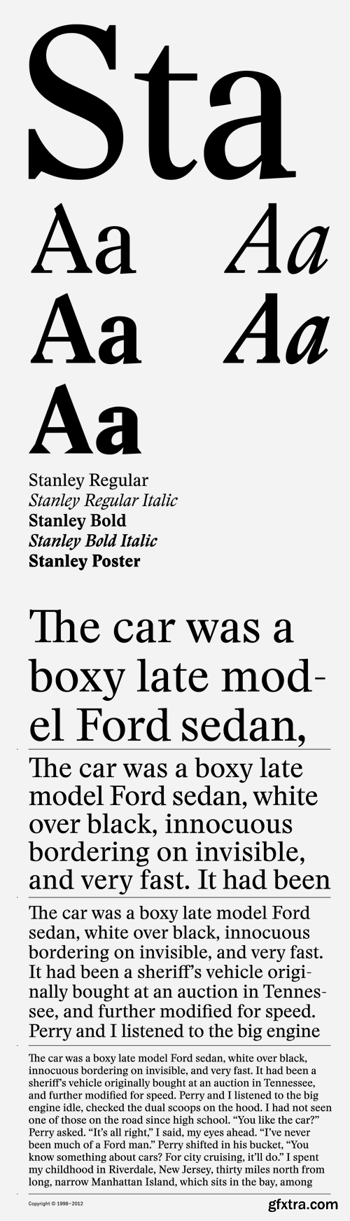
‘Stanley’ is a new typeface from Ludovic Balland, inspired by ‘Times New Roman’, one of the most classic typefaces of the 20th century. Stanley Morison, after criticizing the British newspaper ‘The Times’ of being typographically outdated was then commissioned to create a new font. In 1932 the typeface was released under the name ‘Times New Roman’ and would become a superlative typeface due to its refined aesthetic and legibility qualities. Sharing comparable qualities with its inspirational precursor, ‘Stanley’ offers excellent legibility and incredible sharpness at very small sizes. The drawing of the typeface is characterized by wide and sharp counter forms as well as short ascenders and descenders, generating neat text arrangements. The very graphic shape of the serifs benefit from a maximum of contrast. With five cuts, ‘Stanley’ fulfills versatile needs from footnotes to headlines. The particular drawing of the capitals gives a unique tone to text and can be used to create an additional typographic hierarchy. Freilager Zeitung by Ludovic Balland displaying a beta version of Stanley for the body text.

https://www.stormtype.com/families/mediaeval/
Mediæval has a robust skeleton covered in soft flesh and its italics still show the Renaissance dynamics. It is suitable for the setting of long texts, since it does not contain any sharp points, hairstrokes or other disruptive elements. Its moderate weight encompasses elements of variety and its shading seems to follow a half-moon rolling in the direction of reading. This rhythm considerably speeds up the perception of the text.

https://www.stormtype.com/families/pentagraf/
The five-pointed star gave vertical proportions to this typeface. The cap-height, x-height, ascenders and angles of all important diagonals have been taken from the pentagram. Other elements and details are geometrically constructed, too. This typeface is especially suited for any kind of hermetic and occult literature and poetry, where symbols play an important role. Its appearance is surprisingly clean and neutral enough to be comfortable for long reading, naturally of any kind of text. Pentagraf is already proven as a workhorse in art catalogues, where its humble letterforms don't disturb art reproductions.

https://www.stormtype.com/families/lido-stf/
Lido is suitable for all periodicals wishing to abandon inconspicuously the hideous system typefaces with their even more hideous accents and to change over to the contemporary level of graphic design. It is also most convenient for everyday work in text editors and office applications. It has a fairly large x-height of lower case letters, shortened serifs and simplified endings of rounded strokes. This is typical of the typefaces designed for use in small sizes. Our typeface, however, can sustain enlargement even to the size appropriate for a poster, an information table or a billboard, as it is not trite and at the same time is moderate in expression.

https://www.stormtype.com/families/libcziowes/
The spectacular Libceves gravestone dating from 1591 is completely – from top to bottom, from one side to the other – covered with lettering. It attests to the fact that in Bohemia, thirty years after Garamond's death, inscriptions were cut in popular type faces which were quite different from the Renaissance Roman type face. I was interested in the type face and I tried to digitalize it, expecting similarly poor results as if I had tried to cut a computer font. In spite of the fact that I did not succeed in capturing the vivacity of the model, an interesting display type face arose which, hopefully, may distract and please its users.


https://www.stormtype.com/families/ozdoby/
Symbol fonts useful for magazines, invitations, posters or guidebooks. The set includes heraldic figures, leaves, decorative endings, various skull forms, weather signs, borders and many more.

https://www.myfonts.com/fonts/branding-with-type/bw-gradual/
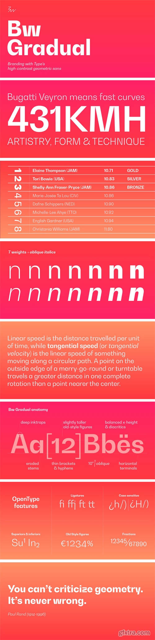
Bw Gradual brings together the pragmatic feel of the geometric grotesque genre with the visual appeal of its very deep joins. Pure shapes and fast curves coexist on this versatile font family that claims for attention when used large, but also delivers a very confortable reading experience when used as body copy, thanks to the deep joins acting as ink traps. Designed by Alberto Romanos, Bw Gradual is available in 7 weights from the delicate Thin to the robust Black with accompanying oblique italics. It supports all European Latin languages and it includes OpenType features like ligatures, old style figures or case sensitive forms among others.


CM 1519658 - Jazzling Script & Sans - Font Duo
Jazzling is a script font, originally made with a brush pen, then digitized. It comes in both slanted and upright versions. I've also included a complimentary sans serif font, in regular and demibold weights. The Jazzling Duo has a vintage yet modern calligraphy feel to it. Its casual, friendly elegance is perfect for branding, logo design, packaging, merchandise, t-shirt, quotes, social media, editorial and much more! Jazzling Script, both slanted and upright, comes packed with opentype features like ligatures and stylistic alternates. Browse through the preview images to see some design examples. Multilingual support covers the following languages: Afrikaans, Basque, Breton, Danish, Dutch, English, Faroese, Finnish, French, Gaelic, German, Icelandic, Indonesian, Irish, Italian, Javanese (Latin), Malay (Latin), Norwegian, Portuguese, Sami (Southern), Spanish, Swahili, Swedish and Walloon.

https://www.myfonts.com/fonts/alias/ano/
A simple geometric, monoline framework allowed for a stylistic consistency over three variations. Regular - a ‘standard’ alphabet; Upper Lower - where upper case characters are replaced with oversized lower case; Wide - where upper case characters are the width of a square, and lower case the same style half the width of a square. Each style drawn in italic and back-italic versions. The resulting nine variations in six weights made 54 fonts in total. For weights Regular through to Eighth the character weights divide in half. So the Half weight is half that of Regular, Quarter weight is quarter that of Regular and so on. This means for example that when Ano Half is set at twice the size of Ano Regular the weight of line is the same between the different character sizes. This proportion was used whenever typefaces were used in combination, so that headline and standfirst typography always had a consistent weight of line. The different styles and mathematically defined weights allowed for a variety of layout options. For example by using different sizes and mixing up upper and lower case letters in Upper Lower, and by stacking letters into block shaped words in Wide. The two bolder weights were drawn without this mathematical weight increase, as doubling the Regular weight would have filled in its counters and look clumsy. These Bold and Black weights allowed for a different and separate set of ideas for headline and impact typography and was a good balance against the stick-like constructions of the lighter weights. Black weights allowed for a different and separate set of ideas for headline and impact typography and was a good balance against the stick-like constructions of the lighter weights.

CM 1501769 - Alice Blue
Alice Blue is quite lovely font that you can use in many projects / designs. Please check “great for” section below to find out more.

https://sellfy.com/p/XS0L/
Geometric Sans Serif font family with 6 weights including a thin, light, book, semibold, bold and extra bold. Includes uppercase and lowercase characters, numerals and most common other characters.
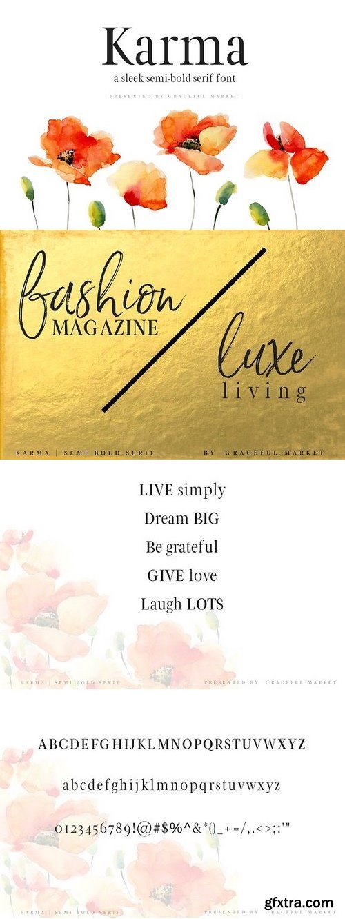
a sleek semi-bold serif font. perfect for any project. full commercial license included. Uppercase and lowercase letters + all numerals and punctuation is included.
https://creativemarket.com/gracefulmarket/1244019-Karma-Semi-Bold-Sans-Serif-Font
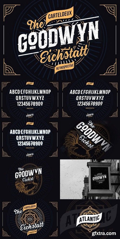
GOODWYN is a brand new typeface by Cartel Deux™. This font sets inspired by the Retro & Vintage Era. It’s the combinations fonts include a script and Display with a super vintage style, also have a different style for each functionalities. To complete the set of fonts, GOODWYN offers 7 style in the family. To make you project look more retro, we are providing you with a Drop Shadow style in the family. Simply type your words/brands text and ‘BAM!’ you now have a shadow. It's typeface set is perfect for your retro label, logotype, T-shirt etc.
https://creativemarket.com/TyfoMono/1241514-Goodwyn-Retro-Fonts-Family
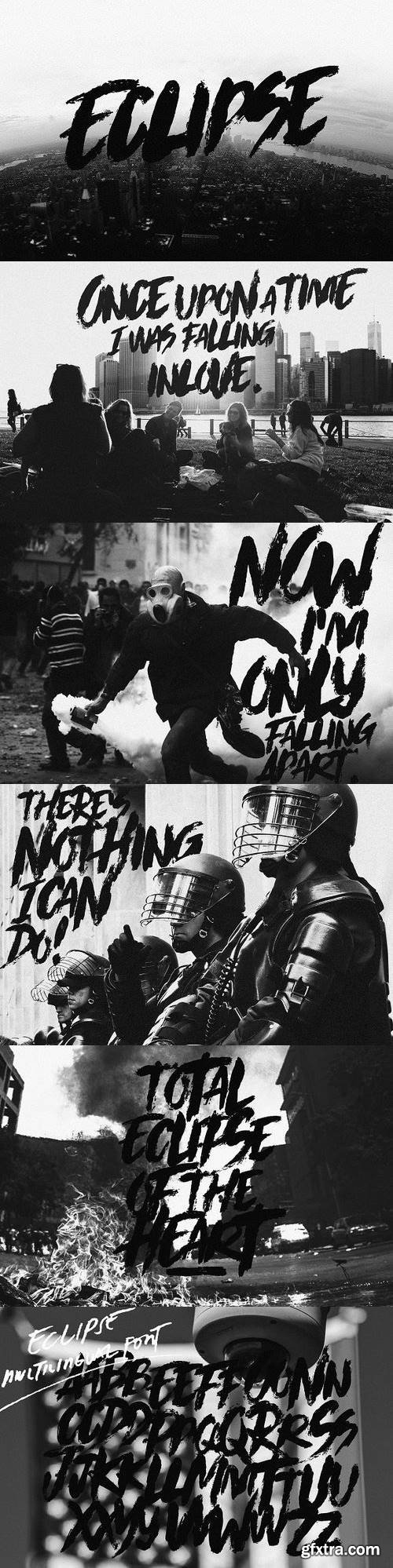
This is messy and chaotic. A font of disorder. Eclipse! With the use of an old round brush and textile ink, we produced a detailed look of another raging font.
https://creativemarket.com/thebrandedquotes/1232754-Eclipse
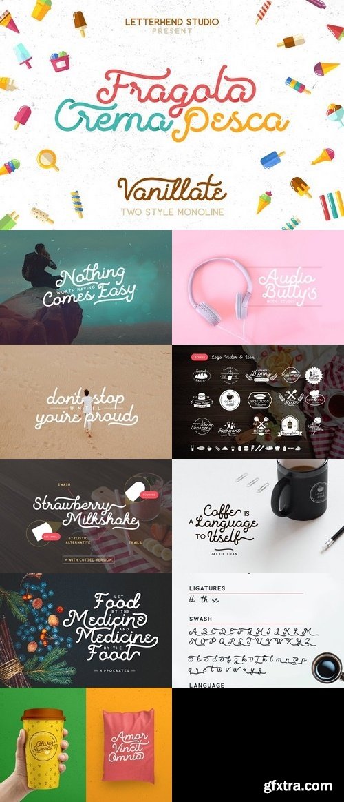
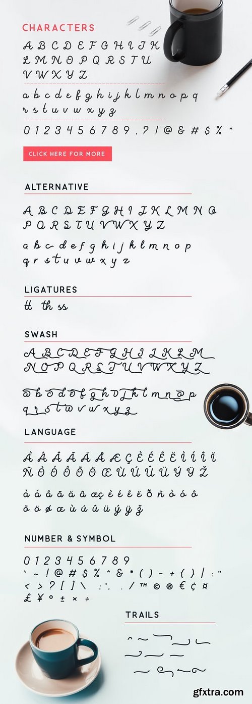
Introducing, Vanilatte Font Duo, unique monoline script typeface with two styles of monoline. This font is comes in uppercase, lowercase, punctuations, symbols & numerals, stylistic set alternate, ligatures, etc. We also included the sans font as complementary, and also 15 bonus ready made logo templates with food theme!
https://creativemarket.com/letterhend/1253600-Vanilatte-Font-Duo-60-OFF

- EPS10 files with all graphics stuff from screenshots.
- OTF and WOFF font files.
- 6 styles of font, named RockStar2 Aged, RockStar2 Regular, RockStar2 ShadowFX, RockStar2 TextureAndShadow, RockStar2 TextureAndShadowFX, RockStar2 TextureFX.
- You can mix these styles how do you like. Because in complect are included additional fonts - RockStar2 ShadowFX, RockStar2 TextureAndShadowFX, RockStar2 TextureFX. For example: type your phrase in Regular, copy and past at same position and change font to TextureFX. Copy and paste at the same position and change font to ShadowFX. You will get RockStar font with shadow and texture effect! And you can change color of each element!


CreativeMarket Sports font vector 1324274
JPG,EPS
Please, this is not .otf or .ttf file, this is VECTOR file FONT.
You can use it where ever you want in size you create.
Font are rasterized and scalable.
https://creativemarket.com/TeaGraphicDesign/1324274-Sports-font-vector

CM 1527667 - Malifisenta
Malifisenta - a new fresh handmade calligraphy font. Very suitable for greeting cards, branding materials, business cards, quotes, posters, and more! This font are perfect for wedding postcard. Or you can create perfect and unique design of your logo, blog, stationery, marketing, magazines and more :)

CM 1446498 - Lebakre Font Duo
Lebakre font duo, a double clean bold and monoline script plus and a casual sans serif typeface that never get any wrong for your vintage branding, logo, adventure, fashion things, hipster generator, quotes, posters, and many more. Lebakre Script - A monoline round script with various style with implementation of hand lettering things. Uppercase, Lowercase, Numbers and Puncts, Stylistic Alternates, and Ligature are available in this type. So many variation and possibilities for your design projects. Lebakre Sans - A round bold sans serif font to make a good pairs for Lebakre Script. its an All Caps style, the lowercase are a lil' bit smaller than the uppercase, bring another vibe to your design by combining them for the various style.
SermonBox - Seasonal Collection

SermonBox - The Series Pack Collection

Top Rated News


Would you like to be a Author?


