
- EPS10 files with all graphics stuff from screenshots.
- OTF and WOFF font files.
- 6 styles of font, named RockStar2 Aged, RockStar2 Regular, RockStar2 ShadowFX, RockStar2 TextureAndShadow, RockStar2 TextureAndShadowFX, RockStar2 TextureFX.
- You can mix these styles how do you like. Because in complect are included additional fonts - RockStar2 ShadowFX, RockStar2 TextureAndShadowFX, RockStar2 TextureFX. For example: type your phrase in Regular, copy and past at same position and change font to TextureFX. Copy and paste at the same position and change font to ShadowFX. You will get RockStar font with shadow and texture effect! And you can change color of each element!


CreativeMarket Sports font vector 1324274
JPG,EPS
Please, this is not .otf or .ttf file, this is VECTOR file FONT.
You can use it where ever you want in size you create.
Font are rasterized and scalable.
https://creativemarket.com/TeaGraphicDesign/1324274-Sports-font-vector

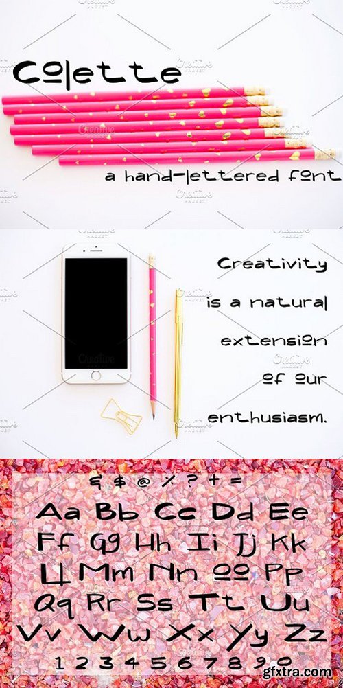
CM 1527667 - Malifisenta
Malifisenta - a new fresh handmade calligraphy font. Very suitable for greeting cards, branding materials, business cards, quotes, posters, and more! This font are perfect for wedding postcard. Or you can create perfect and unique design of your logo, blog, stationery, marketing, magazines and more :)

CM 1446498 - Lebakre Font Duo
Lebakre font duo, a double clean bold and monoline script plus and a casual sans serif typeface that never get any wrong for your vintage branding, logo, adventure, fashion things, hipster generator, quotes, posters, and many more. Lebakre Script - A monoline round script with various style with implementation of hand lettering things. Uppercase, Lowercase, Numbers and Puncts, Stylistic Alternates, and Ligature are available in this type. So many variation and possibilities for your design projects. Lebakre Sans - A round bold sans serif font to make a good pairs for Lebakre Script. its an All Caps style, the lowercase are a lil' bit smaller than the uppercase, bring another vibe to your design by combining them for the various style.

CM 1501952 - Marsha Typeface
Marsha Script is a handwriting script font which good looks, trendy and charmed feeling. Create with concern and add your project with jazzy feeling too. Marsha Script is just what you've been looking for! Use Marsha Script on all of your projects to give delicacy and sophisticated taste. In particular would look great on, branding projects, logos, product packaging, posters, invitations, greeting cards, titles, blogs, everything that includes particular charm and you name it. ;) Marsha Script lettering script comes with upper and lowercase characters, punctuation glyphs, numerals and a TTF of web font.Feel free to use it for commercial/ extended license purposes. The Open Type features can be accessed by using Open Type savvy programs such as Adobe Illustrator, Adobe InDesign, Adobe Photoshop, Corel Draw X version, and Microsoft Word. And this Font has given PUA unicode (specially coded fonts). So that all the alternate characters can easily be accessed in full by a craftsman or designer. Thanks for looking and we look forward to you take pleasure in it as much as we did creating it!

https://www.stormtype.com/families/preissig-antikva/
This vintage, iconic typeface of original Czech letter-founding has been faithfully revised, extended and newly rendered in 2012. The majority of Vojt?ch Preissig’s type faces have been, from their very creation, subject to controversial evaluations which might perhaps fill more pages than have been set in these type faces so far. The considerable technological backwardness of Czech typography between the world wars intensified the author's creative effort even more. He had been devoting thought to his Antikva type face from 1912 onwards and dozens of hardly perceptible nuances of the same design have been preserved in his drawings. It was his only book type face, but it shows no signs of any hard struggle in creating it. Its extraordinary vividness and elegance are really surprising. It may be still indebted to the forms of Art Nouveau, which was withering away at that time, but its proportions, colour and expression inspire other Czech type designers. Preissig’s Antikva, Menhart’s Figural (and also R??i?ka’s Fairfield) and Týfa’s Antikva represent a clear line of development, very far away from the soft aesthetics of Tusar, Dyrynk or Brunner. The co-author of the modification for computer composition is Otakar Karlas. Without his experience the work would remain only a shadow of Preissig’s design. Our aim was to produce a large family of type faces for the setting of both books and jobbing works. The digital transcription of Preissig’s Antikva came into existence from summer till winter 1998. The direct model for this type face is the most successful, two-cicero (24 pt.) design dating from 1925. The designs of other sizes (12 pt., 14 pt., 16 pt. and then 36 pt. and 49 pt.) lack vividness and are the source of the widespread mistaken belief that Preissig’s Antikva consists of straight lines. That is, unfortunately, how even Muzika and Menhart describe it. Neither is it a Cubist type face as many of the semi-educated think today. Special attention had to be paid to italics. It is apparent that their design is not as perfect as that of Preissig’s Antikva. In contradistinction to the original we have deleted almost all lower serifs in the lower-case letters, enlarged the angle of inclination and completely redesigned the letters a, e, g, s, k, x, ... All crotches have been lightened by marked incisions. In other words, none of the italic letters corresponds to Preissig’s model. The signs which were missing have been supplemented with regard to the overall character of the alphabet. Preissig did not deal with bold designs, but the crystal-clear logic of his “chopping-off” of the round strokes enabled us to complete the type face family without any greater doubts. An excessively fragile type face, however, cannot be used for setting in smaller sizes; that is why we have prepared a separate family of text designs which has shortened ascenders, normal accents, slightly thickened strokes, and is, in general, optically more quiet and robust. We recommend it for sizes under 12 points. By contrast, the elegance of the basic design will be appreciated most in the sizes used for headlines and posters. Preissig’s Antikva is suitable not only for art books and festive prints, but also for poetry and shorter texts.


https://www.stormtype.com/families/plagwitz/
Plagwitz is the name of the part of Leipzig where the Werkstätten and Museum für Buchkunst are to be found, which, in September 2000, hosted the ATypI Congress. During the lecture on Black Letter type faces, a lovely quotation from Bismarck could be heard: ?I never read German books set in Roman type.? These circumstances gave me the idea that it would be nice to create some distinctive Black Letter type face. The best Black Letter type faces we know date from the Gothic period, when books were copied by hand, with the use of a bevelled quill. Our alphabet still takes into account Neo-Classical influences when decorative ascenders of upper case letters were added. In 19th-century typography, such Black Letter type faces were frequently complemented with Didot-type Roman faces and steel-engraver’s scripts. I, too, would recommend to combine Plagwitz-Gotisch with type faces like, for example, Hercules, Genre, Excelsor Script and Splendid Quartett.

- EPS10 files with all graphics stuff from screenshots.
- OTF and WOFF font files.
- 6 styles of font, named Stockport Aged, Stockport LightFX, Stockport Regular, Stockport ShadowAndLight, Stockport ShadowAndLightFX, Stockport ShadowFX.
- You can mix these styles how do you like. Because in complect are included additional fonts - Stockport LightFX, Stockport ShadowAndLightFX, Stockport ShadowFX. For example: type your phrase in Regular, copy and past at same position and change font to Shadow FX. Copy and paste at the same position and change font to Light FX. You will get Stockport font with shadow and light effect! And you can change color of each element!

Introducing NEON Neon is a colour OTF font. Each letter has been created in 3D then turned into a simple to use font. Just download and start typing in beautiful yellow neon lettering.
https://creativemarket.com/inkdrop/1274409-Neon-OTF-colour-font
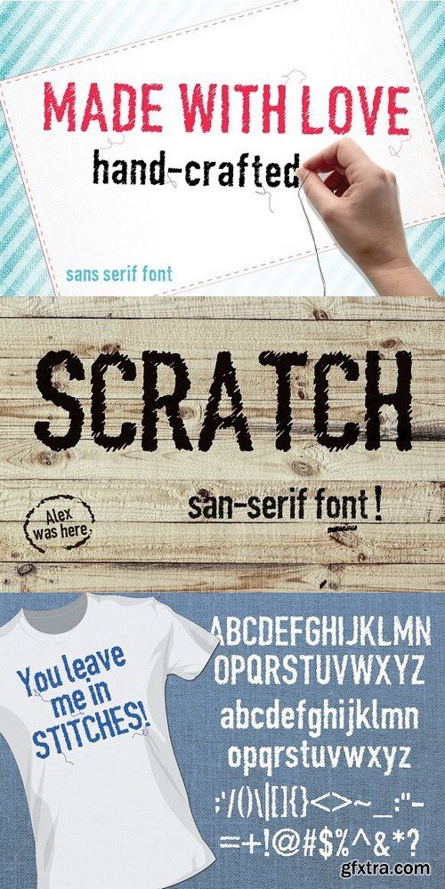
Made with love is a sans serif font that has a hand-stitched or scratched appearance. Use it to market your hand-made products, packaging, web design, clothing or in other design projects. Includes all characters, upper and lower case, as well as symbols, punctuation marks etc. Download includes OTF file.
https://creativemarket.com/morninglight/1262577-Made-with-love-font

Introducing: Rosita Script Rosita Script ?A fantastically elegant connected script, making it possible for you to trigger beautiful hand-made calligraphy in an immediate. With much more bouncy curves & loops, Rosita Script is guaranteed to make your textual content stand out - best for emblems, revealed costs, invitations, cards, product packaging, headers and also anything your creativeness holds.
https://creativemarket.com/masketer/1263275-Rosita-Light

Vertical Brushy is a dry brush script font with modern grunge script, with handletter dry brush authenthic style. Suitable for design, element design, wedding, event, t-shirt, logo, badges, sticker, and awesome work, etc...
https://creativemarket.com/feydesign/1551271-Vertical-Brushy-%2830-Off%29

https://www.optimo.ch/typefaces_Apax.html
This new typeface by François Rappo explores the visual grammar of constructivism through a modernist lense. Thanks to a rigorous and systematic design, Apax reveals a strong constructivist identity. Its geometric architecture develops radical shapes through many distinctive letters. Still, this uncompromising approach is combined with the tradition of modern grotesques based on functionalism. Therefore Apax is drawn with the unique optical balance that characterizes François Rappo’s typefaces. The fluidity of the typesetting surface allows Apax to be used in a wide range of contexts, from body text to visual identities. Each style proposes alternate glyphs that allow to adapt the typeface to its application context. The family is designed with an optimized contrast gradient available in six styles and their matching italics.

https://commercialtype.com/catalog/styrene/
Styrene, a new sans serif by Berton Hasebe, is his latest exploration of proportion and simplicity in type design. The initial inspiration for the family was a charmingly awkward sans serif called Breede Schreeflooze shown in an early 20th century type specimen published by the Enschedé Typefoundry in the Netherlands. However, Styrene has an ahistorical attitude. Its name was inspired by the purposefully synthetic feeling to its curves and geometry. Styrene is characterized by its proportions: typically narrow characters like f j r and t are hyperextended and flattened, adding openness in unexpected places. Styrene’s two widths offer different textures in text: version A is dogmatically geometric, with a stronger overall personality, while version B is narrower for more reasonable copyfit, though not truly condensed.

https://commercialtype.com/catalog/chiswick_serif/chiswick_headline
Chiswick follows the path taken by John Baskerville (1706–1775) in taking the handmade letter and fixing it in type. The single surviving example of Baskerville’s lettering, cut in the 1730s, shows the vernacular letter that would be the model for his later adventure in printing. As a modern serif design, Chiswick has high contrast between thick and thin, yet its freewheeling shapes make it quite distinct from other members of the genre, such as Didot, Bodoni or a Scotch Roman. At the same time, its crisp contrast makes it different from a transitional design such as Baskerville or the types cut by Richard Austin for John Bell, which are more formal in style. Chiswick Headline is designed for situations where Chiswick Poster is too delicate and Chiswick Deck too heavy in its thins and serifs; perfect for sizes from 30 point to 60 point.

http://www.fontsmith.com/fonts/fs-millbank
When designer Stuart de Rozario surveyed the fonts used in signage on London’s public transport systems, he reached a dead end. They seemed staid, sterile, lacking in personality, and ill-suited to use by modern brands. He was pointed in another direction entirely. ‘The driving force behind my thoughts was to design something more current and fresh without compromising legibility and clarity. A font with both personality and function, that’s versatile and large and small sizes, and effortless to read, but which also says something new.’

https://www.stormtype.com/families/tyfa-antikva/
This Antikva and Italic are well-known perhaps to all Czech graphic artists and typographers ever since their release. Although this type face in some details is under the sway of the period of its rise, its importance is timeless, in contradistinction to other famous types dating from the turn of the sixties which were found, after some time, to be trite. The italics live their own life, only their upper-case letters have the same expression as the basic design. Thin and fragile, they work excellently, emphasizing certain parts in the text by their perfect contrast of expression. When seen from a distance they are a little bit darker than the Roman face. Tyfa Roman was released in 1960 by Grafotechna in Prague for hot setting. Later on, Berthold produced letter matrices for Staromat devices, used for manual photosetting of display alphabets. In the eighties it was available on dry transfers of Transotype and today it is offered also by ITC. The meticulously executed original designs dating from late 50s are arranged into a set of signs on a cardboard of about B2 in size. The yellowed paper reveals retouches by white paint on the ink. Blue lines mark the baseline, the capital line, the ascender and descender lines and the central verticals of the letters. With regard to the format of the flat scanner, the designs had to be reduced, with the use of a camera, to the format A4, i.e. to the upper-case letter height of about 30 mm. These were then scanned and read as a bitmap template to the FontStudio program. The newly created bold weights derive from Tyfa's only drawings of the bold letters "a", "n", "p", the darkness of which was increased further, to enhance their emphasizing function. We have used electronic interpolation to produce the medium weights. Josef Tyfa himself recommends to choose a somewhat darker design than the basic one for printing of books. The text designs have hairstrokes thickened by one third; the contrast between thin and thick strokes has been modified, in order to improve legibility, in sizes under 12 points.

https://www.stormtype.com/families/rondka/
Rondka is a sentimental reminder for those who have forgotten what is a pen with a rounded, flat nib. Inspired by a brochure of letter patterns for teachers and clerks, published between the world wars. It is most appropriate for books of folk songs. Swashed upper-case elements are deliberately mixed among plain shapes to resemble certain amateurish feel. When adding lines to your page, have the ends rounded.

https://www.stormtype.com/families/splendid-quartett/
The traditional division of a type-face family into four designs pertains to every body type. However, jobbing typography calls for a richer tonal scale. Its purpose is to decorate, to represent and to please. Splendid Quartet is an example of a combination of heterogeneous sources of inspiration into a single harmonious formation. An American-style script is accompanied by a subtle English-type Roman type face with a bold design. The whole is reinforced with a Germanic Grotesk. The designs as such do not surpass the significance of their models, but the real charm of this family consists in the sensitive interplay of perfect, even though antagonistic shapes. Pure elegance, refinement and gracefulness radiate from this quartet of type faces. The basic design is a paraphrase of Didot, but it is also inspired by Modern, a type face of English provenance. The details of the serifs, however, are not rounded, but left in a coarser, more interesting engraved form. Splendid Script functions in this case as italics, having the same x-height of lower-case letters as the basic design. The script was freely transcribed from the pattern-book of the New York Type Foundry from 1882, paying regard to numerous other sources of that period. This resulted in a blend of balanced typographical flavours, as if a connoisseur smoker had blended together some fine tobacco. It is by far the most fitting material for graphic design of festive printed materials and an ideal supplement to engravings and etchings.

https://www.stormtype.com/families/tenebra/
Tenebra is an example of a combination of the Baroque inscriptional majuscule with decorative calligraphic elements and alchemistic symbols. The widespread forms of the letters allows for the use of the old Germän manner öf writing öf the „ümläüt“ when, in place of two dots above the letter, there is a reduced E. In our case it is inserted in the open letters. This concerns only the decorative upper-case letters in the position of the lower case. The upper-case letters of the basic design are a monumental alphabet without any embellishments, having a classic, two-dotted „Umlaut“. Tenebra Shaded and Old Face decorate, but do not refine.

https://www.stormtype.com/families/lexon/
Is a typical newspaper, dictionary and magazine type face. It is also very suitable for children's books and posters. The large x-height, condensed shapes and darker colour of the basic design guarantee its legibility already in small sizes and even in morning twilight. The line is bitten into the surface by the marked "slippers"of the letters. The lower- case letters have flattened upper and lower limbs, just like in letterpress. Their bellies are quite round and their knees are lightened by slight incisions. The type face is rather archaic in expression and its italics are dynamically flamboyant. The "juicy" design of the alphabet is achieved by strengthening the elements of variety, sometimes even in exaggerated form. When reading newspapers, we are interested in the surface of things, in their, as far as possible, unbiased description. We forage for arid facts which do not require our spiritual or emotional participation. That is why the type face must be neither dull nor expressive, but absolutely huckstering. For – seen from the other side – if we are publishers, we sell information, or else merchandise just like any other. The type face is its packaging, its outer form which here has all manner of functions except for the aesthetic one. The apparent proportional disharmony between the upper-case and lower-case letters is a question of habit. The view that the upper-case and lower-case letters must have the same width proportions is prejudice. On the contrary – the history of type faces enlightens us on the fact that the two alphabets did not have much in common. To prove this it is sufficient to look briefly at their forms – we will find out that only 8 out of 26 pairs of letters resemble each other and, moreover, the ones which do are less frequent in the text. The bold design does not need serifs, because the upright finial of the wide stroke already sits well on the surface. Moreover, the sans-serif bold design better sets off the basic, more picturesque design. Both sets of italics have non-aligning figures, so that in a small number of designs we have everything that is required of a dependable type face which is not exactly intended for the setting of poetry. The design called "Headline" has sharp edges in place of hidden serifs and is darker, which predetermines it for use in headlines. The complementary SC & OSF will be welcomed when we design headings, by-lines and captions to illustrations. An original newspaper type face must also create an impression of uninterchangeability of the typographical appearance of the periodical, but not to the detriment of legibility and technical reliability, even when printing on bad quality paper. Under such conditions there is nothing worse than a banal type face of fragile strokes. A newspaper type face should be original and uninterchangeable in order that the subscribers might feel a certain "snugness" in the pages. An original type face also extricates the printed matter from the omnipresent graphic anonymity and endows it with a more intimate character.

https://www.stormtype.com/families/stencilul/
In Bucharest in 2007 I've seen an unusual stencil typeface which stands out by his horizontal double strikethrough. The sprayed paint then makes rounded and blurred edges. Stencil can be used on posters and fancy occasions.
SermonBox - Seasonal Collection

SermonBox - The Series Pack Collection

Top Rated News


Would you like to be a Author?


