
11 Liquid Textures – These liquid backgrounds and textures can be used for marketing stunning visuals, iphone / android backgrounds, design textures, poster / flyers ,websites development and other design products
https://graphicriver.net/item/13-liquid-backgrounds/19598615

Behemoth is a tall and blockly display typeface in 2 styles. It’s great for posters, titles and any location where you need a large text but have a tight space. It includes uppercase letters, numbers and some punctuation.
https://graphicriver.net/item/behemoth-typeface/11495256

There’s a very old cemetery in Castine, Maine—a lovely coastal town with a surviving crop of stately old American elms. Dating back into the 1700s, the cemetery’s headstones have the familiar old domed-tablet shape, some topped by winged skulls. Thanks to the Castine Historical Society, I got my hands on a couple of epitaph rubbings and modeled a typeface after the lost stone carving style peculiar to the time and place. Castine (the font) has a melancholy, wistful, nostalgic air—and is frankly just a little bit spooky. Its long, sharp serifs and slight uneveness recall simpler times when character meant more than precision. Spaced loosely in display situations, it has a broken-in feel—like comfortable shoes.
http://www.3ipfonts.com/Castine

In an old handbook on bonsai—the Japanese art of dwarfed potted trees—I noticed the type was bad. Old worn lead type, I suspect, spread wide at the tops of characters and nearly disappearing at the bottoms. But far from being a distraction, I found this top-heavy text somehow warm, familiar, and easy on the eyes. Inspired, I made a typeface. (Didn’t take me long to decide on a name for it either: a name with a double-meaning, based both on its look and its inspiration.) Bonsai’s roman and true italic styles work well at small point sizes or in display situations. Use to evoke a curiously retro feel—like déjà vu.
http://www.3ipfonts.com/Bonsai
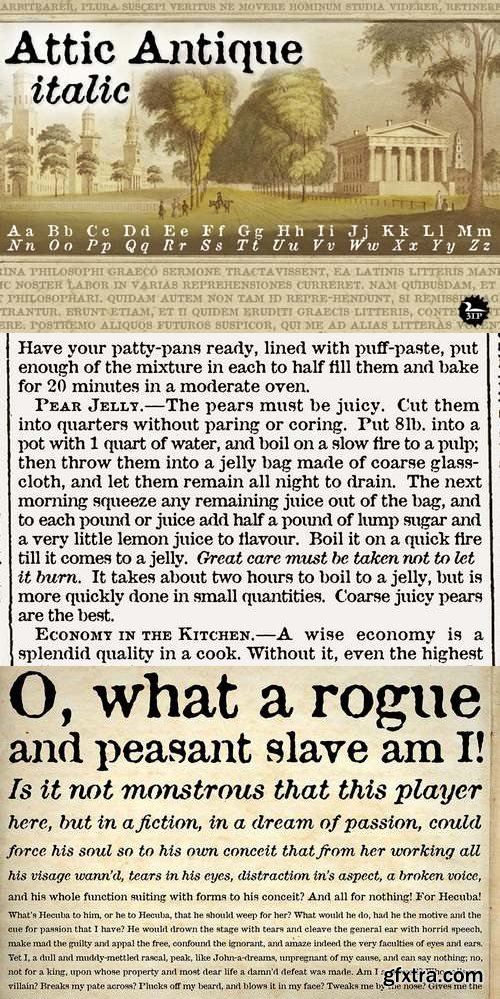
Flipping through a friend’s old book of John Burroughs nature essays many years ago, I thought it’d be fun to see if I could create a typeface with the same uneven, imperfect look to it. I picked and chose among various printed characters, enlarged them somewhat with an old photocopier, then hand-rendered each digitized glyph into roman and italic styles. The result: a surprisingly legible “grunge” serif that’s become one of our most-used fonts. Attic Antique shares the wide spacing and ample serifs of the Century faces, but with the worn, decayed look of the text in an-old library book. Use it to represent age, to suggest photocopied archives, or to convey a general feeling of old-bookishness.
http://www.signumart.com/en/fonts/family/attic_antique_

Desktop, Webfont, Extended | 2 MB
https://www.hypefortype.com/bangbang.html

CreativeMarket Ace of Spades • Win-Win Typeface 1374928
OTF,WOFF
https://creativemarket.com/VintageVoyage/1374928-Ace-of-Spades-%E2%80%A2-Win-Win-Typeface
Ace of Spades - Combo font with serif uppercase and sans lowercase letters. Made from 100% Real Letterpress process. Win-Win Combination to your Lucky Vintage Result!
Really cool for vintage t-shirt prints, packaging, posters or just double expo pics.
OTF, TTF & WEB Fonts.
Have a good voyage!

CreativeMarket Ardina Script 1374931
TTF,OTF,
https://creativemarket.com/fontbundles/1374931-Ardina-Script
Ardina script is an attractive font based on modern techniques and an ancient style. This font is suitable for a wide range of design needs, whether that be logo design, poster design, wedding invitations, badges, etc.
Ardina Script has many glyphs and alternate characters and ligatures.

Graphicriver Magle Coffee Branding Script 19979068
OTF TTF and Webfonts
After a long hiatus, now we’re brewed a new stuffs for you in 2017.
Please welcome, Magle – Homebrew Fonts. Freshly baked double fonts, straight from human’s hand. Done with click by click for your satisfaction as our goal. Comes in Script and Sans Serif, perfect for your branding needs.
Magle Script : A clean script font with bold and bouncy style, implementation from brush pen works that will suit well for your casual-modern-chic-vintage branding needs.
Magle Sans : A simply clean bold sans-serif font to make a good pairing with Magle Script, no need to find another fonts, we make it double trouble and solid strong casual branding with it.
Available in OTF, TTF, and Webfonts. Use it as you wish.
Language Support : Danish, Dutch, English, Filipino, Finnish, French, Galician, German, Icelandic, Indonesian, Irish, Italian, Norwegian Bokmål, Norwegian Nynorsk,Portuguese, Romansh, Spanish, Swahili, Swedish, Swiss German
https://graphicriver.net/item/magle-coffee-branding-script/19979068

Now that we're done with the hipster stuff, the handwritten and the brush fonts, it is time for something new: Organa, a stylish geometric font family. Create a new feel for your designs. Organa is a unique and creative font that can be used for logo design and branding, posters flyers and book covers. Organa will help you to shake off the old feel and to create something new. It comes in three styles that are easy to combine.
https://creativemarket.com/TypeFaithFonts/1243149-Organa
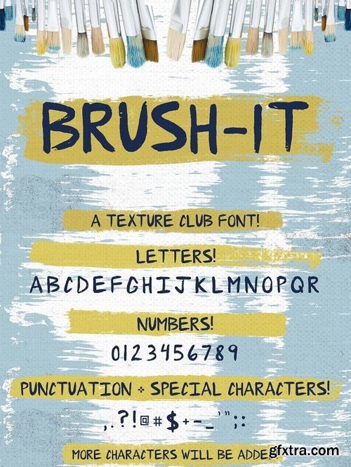
I've been a professional graphic designer (primarily in the music industry) for 15 years now. During this time, I've had tons of people ask me "what font did you use on that design?". 90% of the time, the design they are asking about features something I've handwritten. Over the next few months, I will be releasing several fonts featuring different hand lettering that I have used over the years.
https://creativemarket.com/justinryan/1243450-Brush-It-brushed-font

We, GalaStudio (Lilia & Galina) represent the font SlimOne BESTIARY – the fourth from our new MELTING FONTS collection. Besides the regular version of SlimOne font, we designed a decorative one by playing with it, converting the glyphs to funny animals, and thus creating a zoo. You can use this decorative version of the font for children’s books and notebooks. Also, this fashionable font can be used in all kinds of advertising.
https://creativemarket.com/GalaStudio/1243600-SlimOne-Bestiary-Decorative-Font
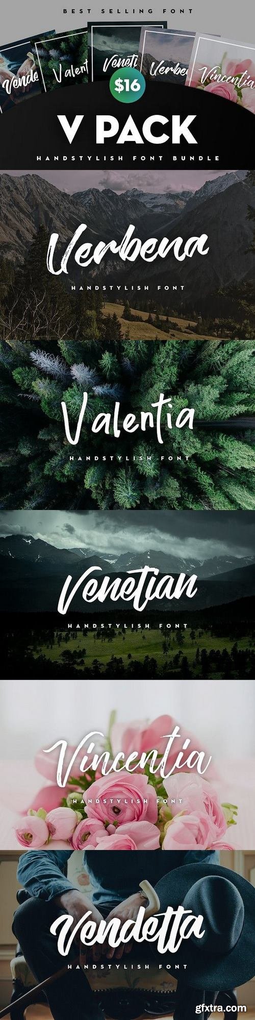
LIMITED TIME OFFER! DON'T MISS, GET TODAY! (NORMAL PRICE $74) For the first time all my "V" Handstylish Fonts in 1 package and with big discount. A gorgeous Handstylish Font Bundle of my most popular and best selling products! Use these fonts for logos, titles, invites, prints and any other awesome projects you are working on!
https://creativemarket.com/devandvan/1264364-V-PACK-HANDSTYLISH-FONT-BUNDLE
THESE V PACK ARE INCLUDED
- Vendetta Handstylish Font https://crmrkt.com/aXmyR
- Venetian Handstylish Font https://crmrkt.com/NXObk
- Valentia Handstylish Font https://crmrkt.com/BDE2D
- Verbena Handstylish Font https://crmrkt.com/em394
- Vincentia Handstylish Font https://crmrkt.com/vyO6M


https://www.youworkforthem.com/font/T7916/antipasto-pro
Antipasto is a geometric sans serif font designed by Cosimo Lorenzo Pancini. The original family of three weights has been revised and expanded in 2017 with Antipasto Pro that now includes Cyrillic and greek characters, open type features (small caps and old style numerals) and six new weights from the hairline to the extrabold.
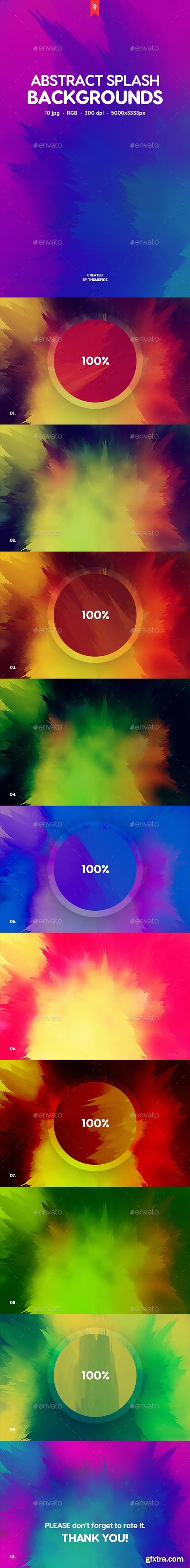
This pack contains 10 jpg abstract splash backgrounds for your projects. You can use these backgrounds in the different purposes. It can approach for your website, application or a desktop wallpaper.
https://graphicriver.net/item/abstract-splash-backgrounds/20054161


https://www.stormtype.com/families/ideal-gothic/
At the turn of the 20th century monolinear alphabets were often despised for their dullness. Typographers, therefore, took great pains to breathe some kind of individuality into the monotonous sans-serif scheme. They started with subtle differentiation in the thickness of vertical and horizontal strokes and finished by improving details. By this they arrived at a more decorative appearance of the type face which thus became more regardful of the eye of the bourgeoisie. Ideal Gothic is no exception. It is characterized by a correct stiffness which will improve the morals of every idea printed by this type face. The awkward curves of the italics are a little suggestive of late 19th century cast-iron garden furniture. The so-called “hidden” and, furthermore, curved serifs complete the inconspicuous charm of this type face. All its above-mentioned features, however, suddenly turn into advantages when we need to design a brochure, calendar or an annual report, or whenever illustrations dominate. It is not by accident that the basic design of Ideal Gothic has such a light tonal value – it competes neither with fine pencil sketches, nor with sentimental landscapes. It is also very suitable for maps, pub inscriptions, magazines and corporate identity.


https://www.stormtype.com/families/dyna-grotesk/
DynaGrotesk may look like a revival of an old typeface family, but it is not. It uses many historical reminiscences, sharp edges and richly curved italic shapes. The bigger the size, the more evident and pronounced are the spicy details. In smaller and even smallest sizes it’s appearance is qieter, hence very welll suited even for long portions of text. All 50 styles contain common OTF features like Small Caps, 3 sorts if figures, ligatures, Cyrillics, Greek etc. Perfect for branding, lettering, as well as cultural posters and catalogs. The 2009 version of DynaGrotesk is a substantial upgrade to our first sans-serif superfamily. Among the most important add-ons you find SmallCaps, Cyrillics & Greek. DynaGrotesk was first published in 1995. Since then it is widely used in all areas of graphic industry from small publishing to international corporate identity. The warm character of DynaGrotesk derives from early sans-serif type faces, those which appeared before Helvetica. The complete installation of all designs of DynaGrotesk Pro is a professional designer's choice.


https://www.stormtype.com/families/amor-serif/
Monumental inscriptional majuscule originally carved in stone, sometimes called "Roman Capital", is a craddle of upper-case part of latin alphabet. Its narrowed form, derived from handwritten original used between first to third century A. C., served as inspiration to typeface Mramor, which I have drawn with ink on paper in 1988 under Jan Solpera's leadership. After composing negative letters on a strip of film there was possible to use Mramor through first phototypesetting devices. In 1994 with the help of Macintosh IIvi I have made also lower-case letters and bolds, and issued this typeface as 14-font family. After some years of using Mramor for various purposes, I realized a need of modernization and humanizing its very fragile appearance, as well as removing of numerous decorative useless parts. Besides that, type design made a huge technical progress in past few years, so I was able to finish the remaining cca 9600 glyphs contained in the present font system names Amor Sans & Serif Pro. It is already usual to combine sans- and serif fonts within one family, in order to distinguish historical part from contemporary, a plain chapter from a special one, or, in quotations, to divide speaking persons. Sans-serif typeface don't arise by simple removing serifs, it has to be drawn completely separeately, when ocassionally many declined forms may be made, considered to the serifed original. Neverteless, both parts of this type system appear consistent as for proportional, aesthetic and emotional atmosphere. Usage of type is often closely linked to its original inspiration, in this particular case with architecture and figurative sculpture. An inner "order" was also text setting in smaller sizes. A smooth scale of weights enriches the possibilities in designing of magazines, brochures, exposition catalogues and corporate indentity. Economizing, but opened shape of characters is well legible and antique hint comes into play after longer reading.
CM 1458138 - Line Icons – Miscellaneous Icons
A useful collection of '60 Miscellaneous Line Icons' suitable for web, print, symbols, infographics and apps. This set includes icons for weather, e-commerce, navigation, UI, UX, finance, retail and many more!
Features:
• 60 unique Icons (120 in total, 60x Outlined, 60x Live )
• Expand to any size
• Master: AI, PDF, SVG, EPS and PNG Files
• Individual: AI, PDF, SVG, EPS and PNG Files
• Ai file which can be edited (Colours, sizes, ect)
• Transparent individual files
• All same line width and style
• Outlined & live stroke

Chietah Font Script Chietah Script is a stylish calligraphy font that features a varying baseline, smooth line, classic and elegant touch. Can be used for various purposes.such as headings, signature, logos, wedding invitation, t-shirt, letterhead, signage, lable, news, posters, badges etc. Chietah Script features 404 glyphs. including initial and terminal letters, alternates, ligatures and multiple language support.
https://creativemarket.com/Polem/1128161-Chietah
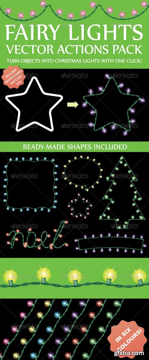
The Fairy Light Action converts Illustrator objects into Christmas lights at the touch of a button! It uses a mixture of scatter and pattern brushes to give a finished result which doesn’t warp. Suitable for web or graphic design (posters, brochures, magazines, catalogues, cards, invites, flyers), particularly banners and borders. The download also contains all of the objects that are shown in the preview image, back-saved to CS (in six colours).
https://graphicriver.net/item/fairy-light-generator-actions/2310954
OTF | + preview | File size: 104 MB
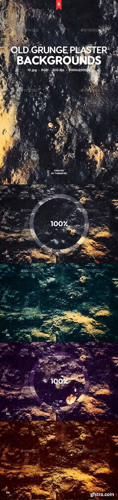
This pack contains 10 jpg old grunge plaster texture backgrounds for your projects. You can use these backgrounds in the different purposes. It can approach for your website, application or a desktop wallpaper.
https://graphicriver.net/item/old-grunge-plaster-texture-backgrounds/20051667
SermonBox - Seasonal Collection

SermonBox - The Series Pack Collection

Top Rated News


Would you like to be a Author?


