

Being inspired by early Czech type design, Maiola is clearly a contemporary typeface, that is mindful of its historical heritage, implementing old-style features and calligraphic reminiscence, more frankly so in the Italic. Nevertheless, through its personality, it attempts to create a welcoming tension on the page, without shouting too loudly at the reader. It handles its expressive tendencies with care and in doing so increases its usability, with legibility being of great importance. Subtle irregularities of the letterforms enhance furthermore the dynamic spirit and liveliness of the typeface. With the advent of Opentype, allowing for bigger character-sets and better language support, as a natural consequence, Maiola Multiscript covers Latin A, Cyrillic and Greek. Although basically independent from each other, they are, however, designed in the same spirit as the Latin, and harmonize well in multilingual text settings. The update to this beautiful font family includes the addition of over 240 glyphs featuring new ornaments, stylistic alternates, ligatures, superior letters, fractions and more. Furthermore, several glyphs were significantly improved and the kerning was fine tuned for better performance. Originally released in 2005, Maiola was an immediate success. It won the renowned TDC competition in 2004 where it was also recognized as a “judge’s choice”, was part of the touring exhibition e-a-t, and was selected in the Creative Review design competition in 2005.
OTF | 6 Fonts | JPEG Preview | 5.5 Mb RAR

Arbotek has the original skeleton that the author used for the development of his typeface Arboria, a real ‘architect typography’, with a basic and radical approach to pure geometric forms. The three basic styles - Thin, Light and Light Rounded - try to approach the cartographic technique annotations and their output on plotters. The voluptuous style, Ultra, keeps the same structure of the Light versions, but develops as a historic Art Deco variant of this 20s and 30s graphic style.
OTF | 4 Fonts | JPEG Preview | 4.9 Mb RAR
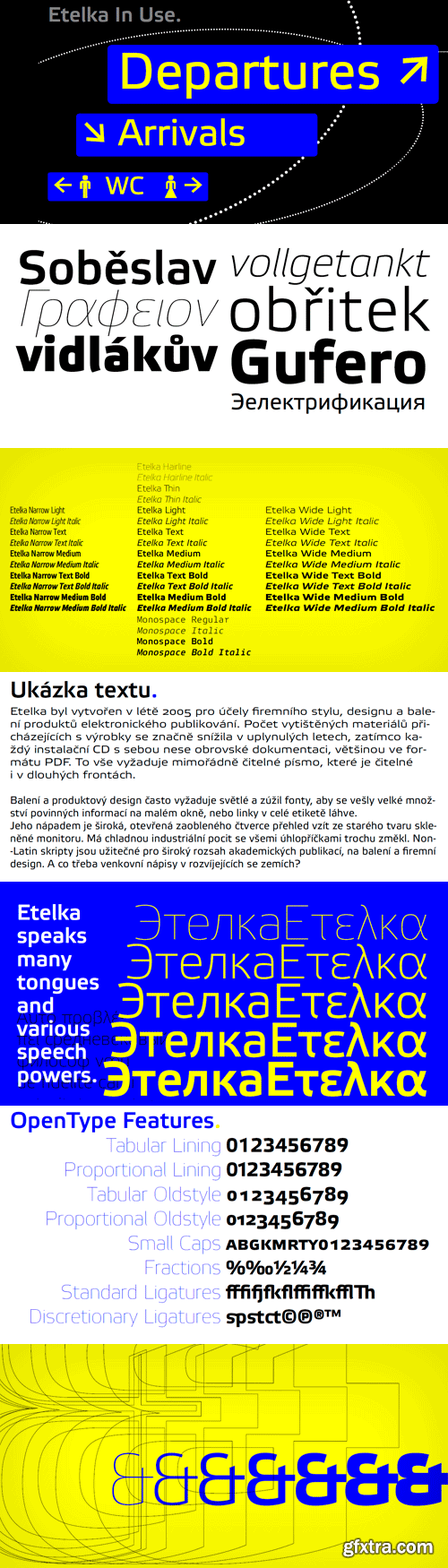
Etelka was designed in summer 2005 for purposes of corporate style, product package design and electronic publishing. The number of printed materials coming with products has been significantly reduced in past years, while every installation CD carries a huge documentation, mostly in PDF format. It requires an extremely legible screen typeface which is readable even in long lines. There is absolutely no need of narrowed, economizing design, because the length of electronic brochures is virtually unlimited. Etelka is excellent also for printed technical manuals, containing Cyrillics and useful ideograms and signs. Its design idea is wide, open rounded square outline taken from old glass monitor shape. It has cool industrial feeling with all diagonals slightly softened. It is suitable not only for product manuals, boxes or electronic books, but also for all kinds of visual communication, especially corporate identity and orientation systems in architecture. The Monospace fonts are useful supplement for corporate style based on this family, for technical paragraphs in educational texts and office applications, where its light weight saves your toner cartridges.
OTF | 34 Fonts | JPEG Preview | 4.3 Mb RAR
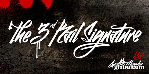
Graffiti Classic is a graffiti font that blends the improvisational urban quality of graffiti with the smoothness and regularity of a typeface. Growing up in Brooklyn, graffiti appeared to me as an explosion of expression and color in a sea of concrete. Inspired, I became a graffiti artist and practiced in both notebooks and subway tunnels. While I moved on to somewhat more traditional art forms in future years, with Graffiti Classic I pay homage to my artistic roots in a calligraphy marker/tag font. Like my other fonts, the entire Graffiti Classic font is spaced letter to individual letter so that the spacing will work smoothly, in spite of the expressiveness and irregularity of the forms. The Graffiti Classic family also includes an ornaments font, “Taglets,” which has clouds, underlines, arrows, crowns, halos and more to add flavor to your designs.
OTF | 2 Fonts | JPEG Preview | 3.3 Mb RAR
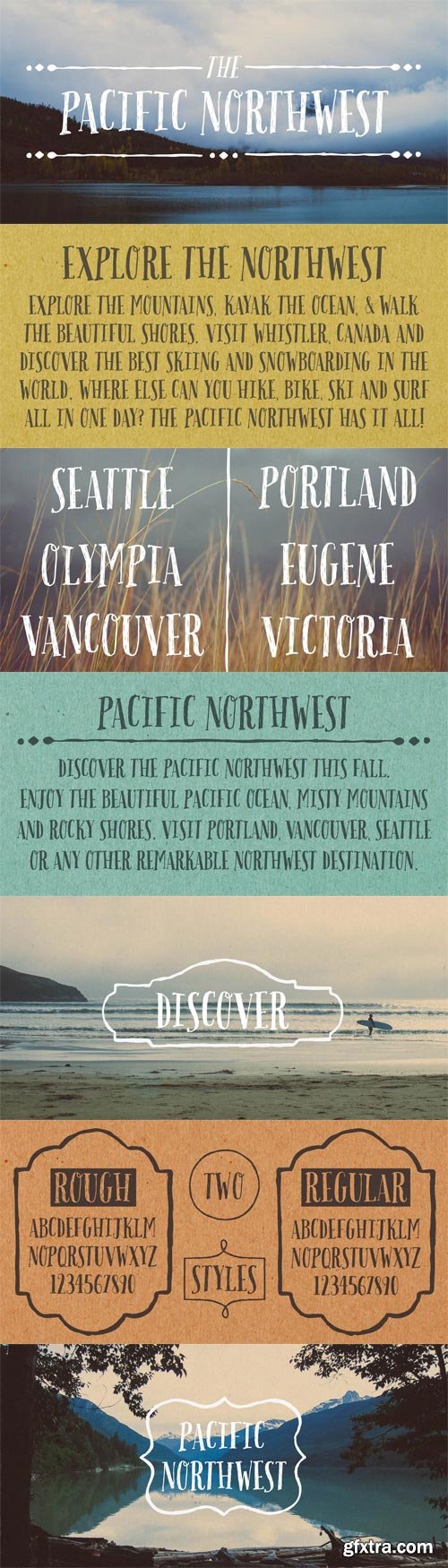
Pacific Northwest is a fun, handwritten font by Cultivated Mind. Pacific Northwest has been carefully hand painted and comes in two styles (Regular/Rough). This font works perfectly with the Pacific Northwest hand painted labels.
OTF + TTF | 3 Fonts | JPEG Preview | 4.4 Mb RAR


OTF | 7 MB
Sale Page
Mecheria conjures up images of a far off place in another time. At first glance, she’s delicately rounded and brimming with sensuous swashes. Enigmatic, exotic, slightly goth, Mecheria reveals only a tantalizing glimpse of her potential. She’s a font whose appeal defies simple description. Mecheria was inspired by the letter forms from a 1939 font called Amanda. If you'd like a classic, authentic revival of Amanda, without the extra curls and scissor-cut style, check out Canada Type.
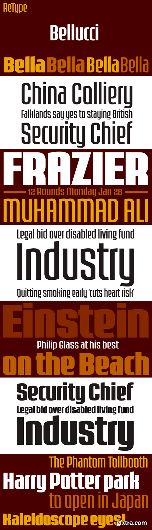
Bellucci is the redesign of Ramiro Espinoza’s first typeface, Mabella. Being not happy with the original design, he decided to redraw it completely and add 3 new weights. Bellucci is a constructivist, modular, compressed family intended for headlines and posters. The name is an homage to Mabel Bellucci, an Argentinian feminist activist.
TTF | 4 Fonts | JPEG Preview | 4.6 Mb RAR
OTF | 760 KB
[url=http://www.myfonts.com/fonts/emily-lime/revel/Sale Page[/url]
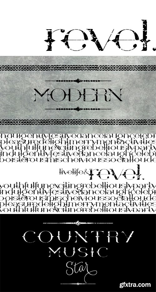
Revel is a stylish blend of high fashion meets country western. Use all Caps for an ultra-modern, sophisticated look. Or type in all lowercase for a more youthful, rocker effect. This cool font also comes with alternates, decorative elements, ligatures and even a few swashes thrown in the mix.
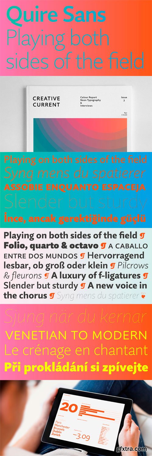
"My goal was to make a design that might fit in anywhere,” says Jim Ford about his Quire Sans™ typeface. “I wanted it to be highly functional and sexy at the same time.” With one foot comfortably in the realm of oldstyle design and traditional book typography, and the other in evolving electronic media, the Quire Sans family does, indeed, fit in just about anywhere. As for sexy, someone once quotably wrote, “A great figure or physique is nice, but it’s self-confidence that makes someone really sexy.” Yes, Quire Sans is sexy, performing confidently in virtually any setting.
OTF | 20 Fonts | JPEG Preview | 6.6 Mb RAR
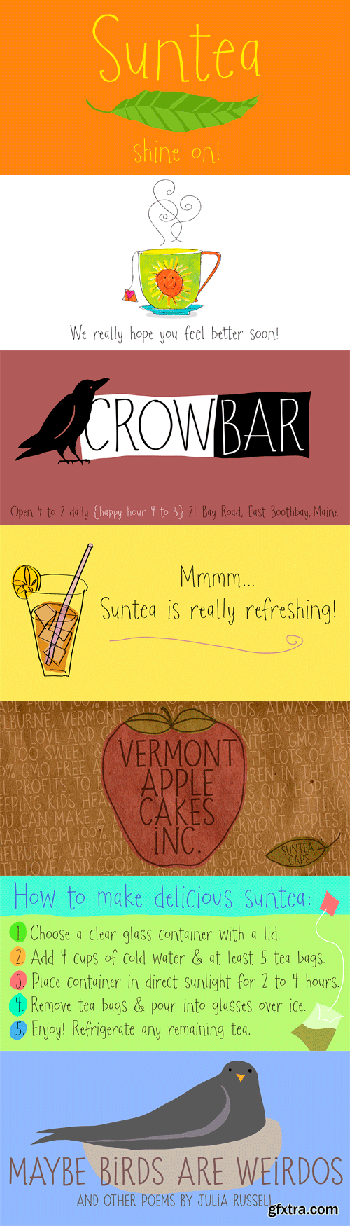
Flavored with a cool set of discretionary ligatures, and infused with delicate sweetness, Suntea is quirky and refreshing! Suntea Caps keeps it bold with all-caps and alternates for each character. Hand drawn and delicious, let Suntea quench your thirst for a friendly font.
OTF | 2 Fonts | JPEG Preview | 5.4 Mb RAR
OTF | 9.56 MB
Sale Page
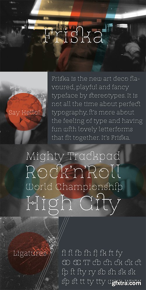
St Friska, based on old movie title lettering, is made just for headlines. It comes with a slight touch and feeling of art deco but it’s designed to be contemporary in 2010 and beyond. Friska comes with a big bunch of OpenType features, so a designer can play with it like Lego, using it alongside old or new typefaces. It has stylistic sets and lots of ligatures.
OTF | 10.9 MB
[url=http://www.myfonts.com/fonts/letterbox/terital-united/Sale Page[/url]
The long and frustrating search for a dynamic, monoline script drew our attention to the lack of such a typeface. This prompted us to create our very own, Terital, named after the 1960s Italian overcoat advertisement that was the original reference point for its 2003 creation. Fearing the odd all-caps script setting, we cheekily designed Terital as a lowercase set. This limitation was revised in the 2011 version. Beautiful swash capitals were also added.
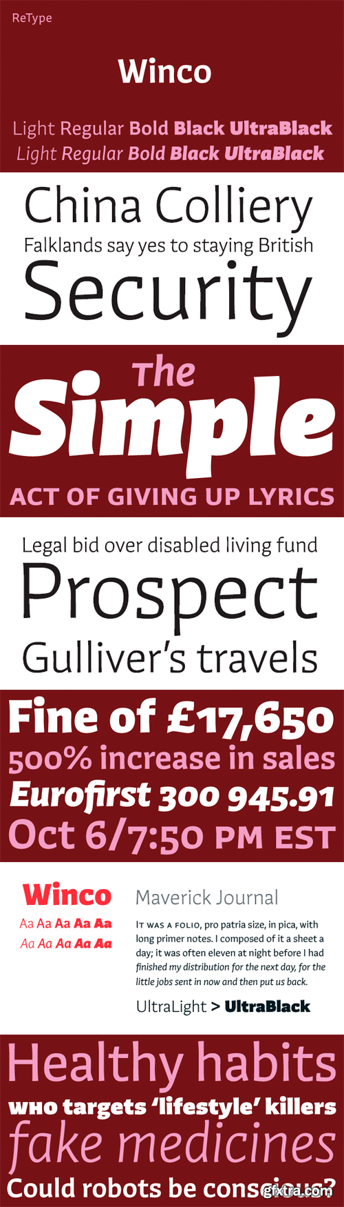
Winco family can be labelled a humanist sans-serif, but in spirit it is more closely related to that rather rare typeface category called ‘glyphic’ or ‘incise’. While conceiving Winco, Ramiro Espinoza studied the work of the masters of postwar book cover design: Helmut Salden, Boudewijn Ietswaart, Berthold Wolpe; among others. He also looked into German and Czech traditions of expressive printing types that had such a strong presence in the earliest decades of the 20th century. Having established a stylistic framework, Espinoza designed the typeface from scratch. This allowed him to create an original, typographically consistent and versatile family in five weights, from Light to Ultra Black. The process has resulted in a typeface that successfully combines the high legibility and seriousness of a text face with the expressiveness, dynamism and subtle irreverence of the original hand-rendered alphabets. Winco is a versatile family whose extreme weights – Light, Black and Ultra Black – make for striking headlines, while the middle weights work well in both display and text settings. Produced as CFF OpenType fonts, all weights come with small caps and multiple numeral sets, including superscript, subscript and fractions, alternate glyphs and ligatures, making Winco a typographically sophisticated family suitable for a wide range of editorial and corporate work.
TTF | 10 Fonts | JPEG Preview | 10.1 Mb RAR
SermonBox - Seasonal Collection

SermonBox - The Series Pack Collection

Top Rated News


Would you like to be a Author?


