CM 1528075 - Ramadan Icon Bundle
Eid Mubarak!! Ramadan Icons - A set of 30 unique Vector Icons in 13 different styles! Celebrate this Ramadan with a set of 390 Vector Icons! What's Included: mecca, shahada (faith), charity, moon, crescent, lamp, crescent + hands, star + hands, taqiya (prayer cap), desert, tomb, quran, moon + mosque, festival flag, read quran, arab, moon + stars, lantern, gift, accept gift, ramadan gift, aladdin lamp, muslim man praying, mosque, salat (prayer), decoration, camel, mosque + hands, carpet, mosque location.

We all learned in school: thou shalt not set script faces in uppercase! … unless, that is, they’re Tangelo. Tangelo is a fun, casual display script that could be more accurately termed a unicase – it borrows characters liberally from the lower case, but scales them up to cap-size. Tangelo is ideal for kid-friendly products like candy packaging, game boards or apps, and clothing labels. It includes 115 alternates and swash characters for a convincingly hand-lettered look.
https://creativemarket.com/L_Worthington/1286409-Tangelo

Hi guys! In order to provide quicker answers for common question what fonts I'm using in my illustrations I decided to to present them as independent products. I needed a bright bold variable font for my illustration works which is handmade and with plenty of alternative symbols. I couldn't find nothing better than draw it myself. :–) I drew it by hand and named it the Boltt, James Boltt. It's not packed into a font file such as .ttf или .otf. I use it by hand typing the words I need in Adobe Illustrator. You can't either install it into a system, or type a brief in MS Word or change the text body just within one click. These are outlines which can be edited only by hand. And I like them. :–)
https://creativemarket.com/FoxysGraphic/1286472-Hand-drawn-font-Boltt-James-Boltt

Simple This "Simple Font" is well suited for various design projects, such as logos, advertising, quotes, packaging design and others.
https://creativemarket.com/AnnWay/1237698-Simple-25-off

SOUTHERN RAPTOR is an edgy, supercharged and contemporary brush font with realistic texture and energy plus extra attention to quick strokes and sharp details to guarantee of people attention within a seconds. This font was hand-drawn and has lots of tiny details in every character. You will love seeing this font up close! Perfect for projects brands, logos, product packaging, posters, invitations, greeting cards, news, blogs, everything including personal charm or whatever which need a typographic turbo-boost.
https://creativemarket.com/Qadry/1241690-Southern-Raptor

Kaligry is a unique typeface. This is font would be perfect to combine in your design with arabic or gothic style. The font is great for product logo, clothing brand, prints, invitation, business cards and much more. Kaligry packs a set of uppercase, numbers and punctuation. Hopefully you enjoy the result!
https://creativemarket.com/alexey.blogoodf/1241785-Kaligry-Font
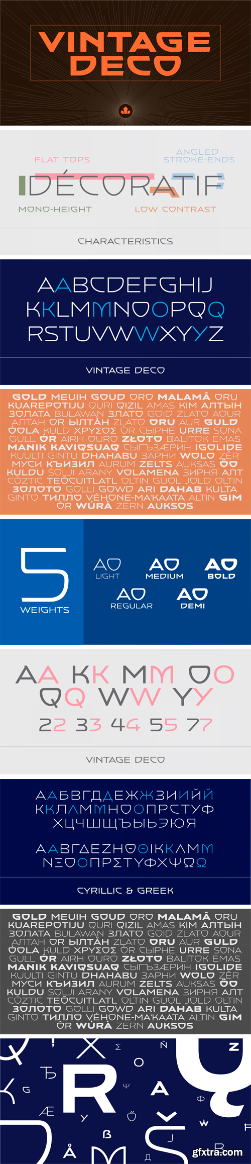
https://www.myfonts.com/fonts/canadatype/vintage-deco/
One of the most enjoyable activities at Typecon conferences is Paul Shaw’s lettering/type walk. Wherever the conference happens to be, and even if you’ve been to that city a hundred times and know it intimately, going on that walk with Paul & friends gives you a brand new, local-history-rich perspective. If you’ve never been to a Typecon conference, you owe it to yourself to go at least once just to have that fun experience.
Typecon 2016 was in Seattle, and the usual eye-opening walking adventure with Paul led us to the old sky-high vertical sign of the Vintage Hotel at Spring Street and 5th Avenue. Wide, breezy, unique caps with sharp cuts and wide semi-rounds. Letters of unknown origin, though brimming with that casual west coast chic. You could almost smell the hot rod fuel and optimism there. The late 1950s idea of futuristic. Almost like Bank Gothic or Microgramma gone totally deco. Hard not to get ideas when you see this stuff. The seed for Vintage Deco was planted, and the rest is now history.
The Vintage Deco family comes in five weights, from Light to Bold. The multi-script glyph set is quite extended. Each of the fonts contains 635 glyphs, Pan European language support, many stylistic alternates, and five types of figures. This is the kind of family that makes graphic designers seek out a project just to use the fonts in there.


https://www.myfonts.com/fonts/canadatype/basilio/
In the late 1930s, old Egyptiennes (or Italiennes) returned to the collective consciousness of European printers and type houses — perhaps because political news were front a centre, especially in France where Le Figaro newspaper was seeing record circulation numbers. In 1939 both Monotype and Lettergieterij Amsterdam thought of the same idea: Make a new typeface similar to the reverse stress slab shapes that make up the titles of newspapers like Le Figaro and Le Frondeur.
Both foundries intended to call their new type Figaro. Monotype finished theirs first, so they ended up with the name, and their type was already published when Stefan Schlesinger finished his take for the Amsterdam foundry. Schlesinger’s type was renamed Hidalgo (Spanish for a lower nobleman, ‘son of something’) and published in 1940 as ‘a very happy variation on an old motif’. Although it wasn’t a commercial success at the time, it was well received and considered subtler and more refined than the similar types available, Figaro and Playbill. In the Second World War, the Germans banned the use of the type, and Hidalgo never really recovered.
Upon closer inspection, Schlesinger’s work on Hidalgo was much more Euro-sophisticated and ahead of its time than the too-wooden cut of Figaro and the thick tightness of Playbill. It has a modern high contrast, a squarer skeleton, contour cuts that work similarly outside and inside, and airy and minimal solutions to the more complicated shapes like G, K, M, N, Q and W. It is also much more aware of, and more accommodating to, the picket-fence effect the thick top slabs create in setting.
Basilio (named after the signing teacher in Mozart’s Figaro) is the digital revival and major expansion of Hidalgo. With nearly 600 glyphs, it boasts Pan-European language support (most Latin languages, as well as Cyrillic and Greek), and a few OpenType tricks that gel it all together to make a very useful design tool.
Stefan Schlesigner was born in Vienna in 1896. He moved to the Netherlands in 1925, where he worked for Van Houten’s chocolate, Metz department store, printing firm Trio and many other clients. He died in the gas chambers of Auschwitz in 1944. Digital revivals and expansions of two of his other designs, Minuet and Serena, have also been published by Canada Type.


https://commercialtype.com/catalog/chiswick_sans/chiswick_sans
Chiswick Sans demonstrates that the past can offer inspiration for new typefaces which are not slavishly historical. The high contrast sans serif offers a letterform that shares the unadorned simplicity of a low contrast sans, but also shares the beauty of a serif letter.


https://www.myfonts.com/fonts/canadatype/vip/
VIP is a humanist sans serif uppercase and figures combined with a freshly redrawn revival of the classic Constanze initials originally designed by Joachim Romann for Stempel in 1956. As well as a vehicle to revive the Constanze initials, VIP was inspired by modern typography found in many artful books, on many product packages, and on the windows and literature of high-end restaurants, jewelry stores, haute couture fashion sellers, architecture firms and trendy brand name establishments. If you've walked through the soho or downtown of any major metropolitan, you've seen them: Widely tracked words or lines starting with a script majuscule and going on with clean and comfortable sans serif caps. If classy modern combination typography is your thing, you will find much pleasure in using VIP. VIP was updated with expanded language support in 2012. It now supports a very wide range of codepages, including Cyrillic, Greek, Central and Eastern European, Turkish, Baltic, Vietnamese, and of course Celtic/Welsh.

https://www.myfonts.com/fonts/paragraph/tertre/
Tertre is a display/short text typeface with a wide range of applications from signage or posters to menus and pricelists; branding, packaging or publishing. It is named after Place du Tertre, a square located at the top of Montmartre—a hill overlooking Paris, made famous by the artists of the 19th and 20th Century. Like in Galette, the letters have no overhangs and the stroke thickness of capitals and lower case letters is identical, making hinting or anti-aliasing more uniform at any point size and zoom combination.

https://www.myfonts.com/fonts/lanston/ltc-jefferson-gothic/


- 12 US size business cards (3,5 x 2 inch) . INDD-file & IDML-file (InDesign CS4+) . AI-file & EPS-file (Illustrator CS1+) . PSD-file (Photoshop)
- 12 EU size business cards (85 x 55 mm) . INDD-file & IDML-file (InDesign CS4+) . AI-file & EPS-file (Illustrator CS1+) . PSD-file (Photoshop)
- 12 typography logos . INDD-file & IDML-file (InDesign CS4+) . AI-file & EPS-file (Illustrator CS1+) . PS-file (Photoshop)
- 20 seamless pattern . EPS-files (vector) & PNG-/JPEG-files (300 dpi, approx. 3300 x 3300 px)
- Font and picture download links


CM 1525640 - Limber Script & Mockups
Hello! Presenting a calligraphic handcrafted font named "Limber". It has 26 alternate glyphs, 12 ligatures and multilingual support. Also you will get 4 high quality renders of modern interior mockups in layered psd format.
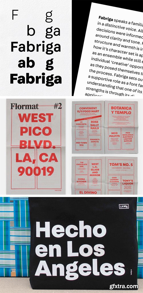
https://vllg.com/luxtypo/fabriga/
Fabriga speaks a familiar language in a distinctive voice. All emblematic decisions were informed by ideas around clarity and tone. Fabriga’s structure and warmth is influenced by how it’s character set is approached as an ensemble while still exploring individual ‘creative’ opportunities as they posed themselves throughout the process.
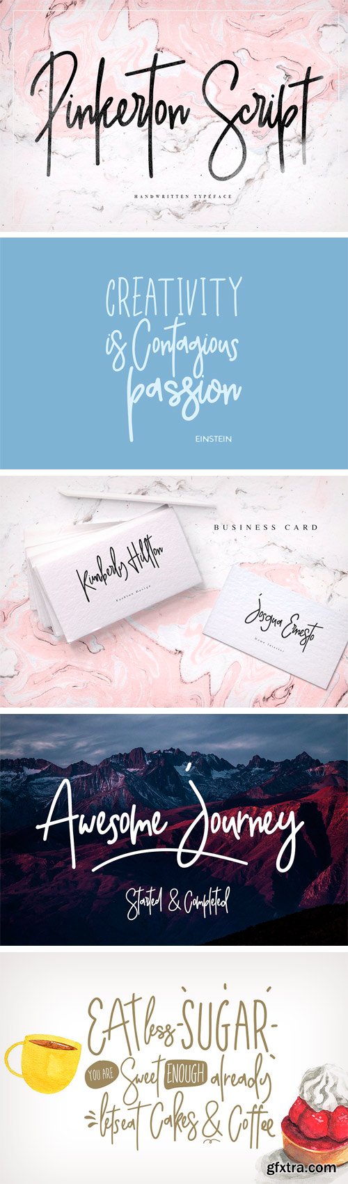
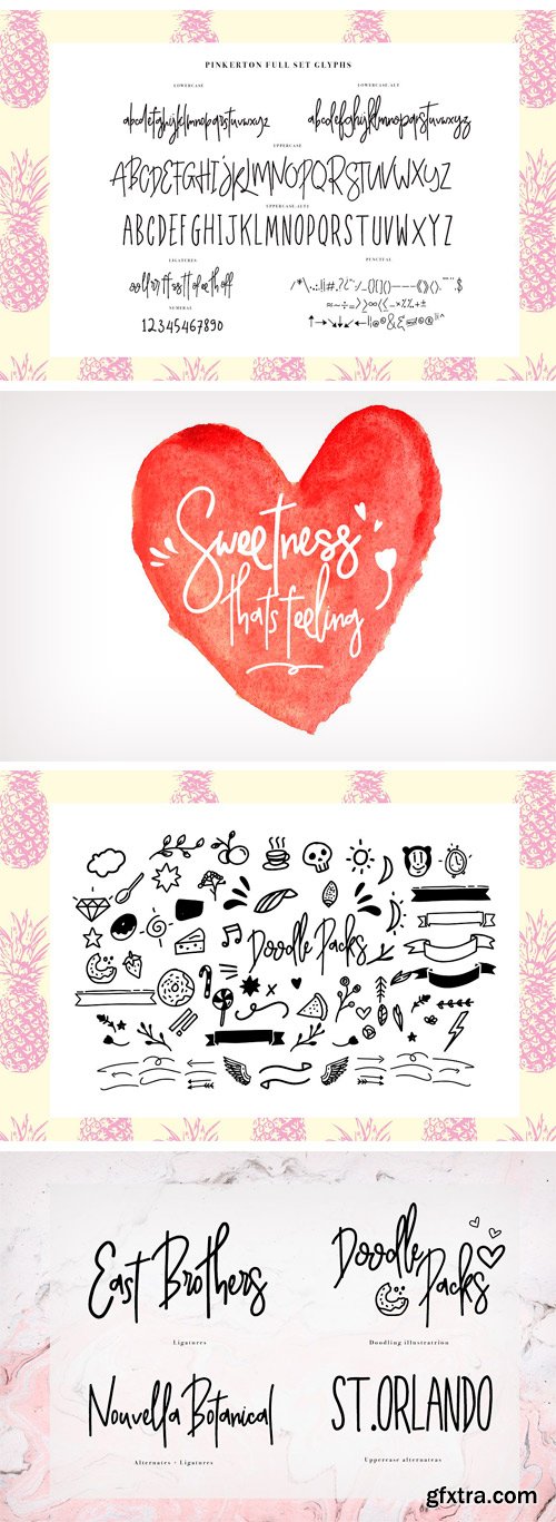
CM 1489091 - Pinkerton Script + Extras
Pinkerton is a handwritten font duo, this font very easy to use and really playful, you can create lable, logo, create, book cover, poster, quotes poster etc. Just combine with doodling you can create some good designs.
![CM - Leixo Stencil [Family] 1273925](https://www.gfxtra32.com/uploads/posts/2017-06/1496750463_presentation-family-01-kopyala-vert.jpg)
Leixo is a fancy stencil with a lot of features to use. You can use lower and upper case to create a mixture of a stencil touched multifunctional headline. To use the ligature, just type "theliga" and you will get a unique designed pre-set eyecatcher. And there are even more ligatures! The full version includes numbers, symbols and language support with more than 320 Glyphs!
https://creativemarket.com/phitradesign/1273925-Leixo-Stencil-Family
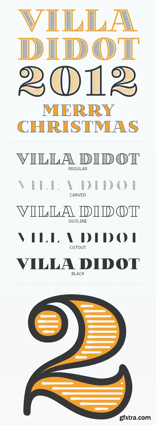
Villa Didot Font Family
The Idea behind the Villa Didot Typeface was to create a group of typefaces, that where used on the posters of the club villaWuller. All where handdrawn and now i want to create a complete set. Artill (Lukas Bischoff) launched his christmas calender for the 5th time and i gave him as a present this small typeface. It's not complete and i will release a new version of it next year.
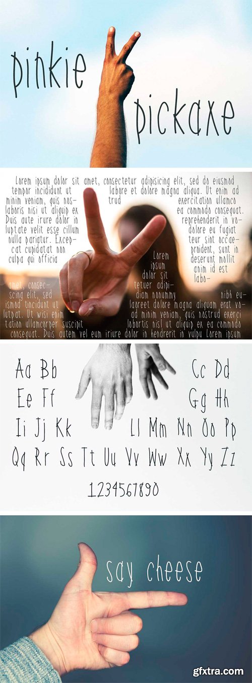
CM 1489091 - Pinkie Pickaxe
Pinkie Pickaxe is perfect for projects and pages and posters.
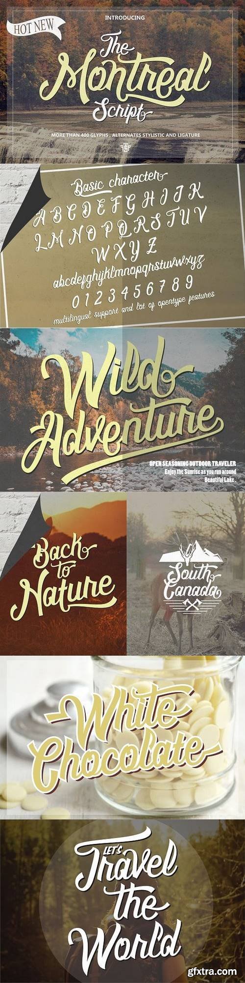
Montreal Script is one of taste of modern and classic touch , Inspiring of various artist of lettering , they make montreal have some alternates in every character to helping you make a perfect design with more possibilities.
https://creativemarket.com/uncurve/1273466-Montreal
SermonBox - Seasonal Collection

SermonBox - The Series Pack Collection

Top Rated News


Would you like to be a Author?


