
CM 1479287 - Doors Vector Set
Set of house doors in different styles. Available in JPG, EPS, PNG and SVG formats.

https://www.schick-toikka.com/noe-text
Historically, typefaces are born at smaller sizes, with titling versions coming later on. Noe’s family tells a different tale. Noe Text was conceived several years after its Display companion. This reversed order of operations challenged Schick Toikka to develop a text face that functions in body copy while retaining its parent’s bold personality. With readability as the central goal, Noe Text reigns in Noe Display’s contrast and severity. It adds heft to the hairlines, and blunts the corners just enough to keep the details visible at reduced sizes while maintaining the crisp character of the family overall. Its proportions are broader, too, with counters that are larger and more open, enabling smaller type and longer passages of copy. The result is a rugged face that pairs well Noe Display, as well as it plays on its own. Noe Text is a true multipurpose workhorse for demanding typography, equipping the user with judicious ligatures for optimal readability, case-sensitive punctuation, and figure styles for any situation – including a set to match the height of the accompanying small caps. Among its five weights plus italics, Noe Text has a Book weight that is just slightly heavier than the Regular to accommodate subtle preferences in text color, or to facilitate different printing or screen-rendering conditions. Like Noe Display, Noe Text includes a Latin Extended character set, supporting virtually every language of Western and Central Europe.


https://www.colophon-foundry.org/typefaces/visuelt/
Originally created as a bespoke face for the 2013 and 2014 identity for Visuelt, Oslo, Norway, Visuelt spawned from a more considered and constrained version of Aperçu. From its initial roots and underlying aesthetic, new details were brought in to remove some of the more distinguishable features of Aperçu to make way for a new tone of voice. In 2014 we revised and revisited the typeface in two additional weights – Light and Black to accompany the pre-existing Regular. The Light took on thin precise curves whereas the Black’s counters were opened and sharp terminal ends chiseled at the ends to provide small technical details to an otherwise brut-ish and heavy face. July 2015 sees the addition of accompanying Italics for all weights.


http://www.fontsmith.com/fonts/fs-lola
Like the subject of the Kinks’ song, FS Lola is a little bit of both – a font with a rare combination of masculine and feminine. The font was inspired by the song, which itself was inspired by the night the Kinks’ manager spent dancing drunkenly in a Soho club with a beautiful woman... Or so he’d thought, until her stubble started to show halfway through the evening.

https://www.myfonts.com/fonts/stone/arepo/
Arepo is a display typeface inspired both by the Imperial Roman letter and the forms of Giambattista Bodoni. Together with Stone Print, SFPL, and Cycles it makes up a superfamily of typefaces.

https://www.myfonts.com/fonts/garagefonts/freight-text-pro/
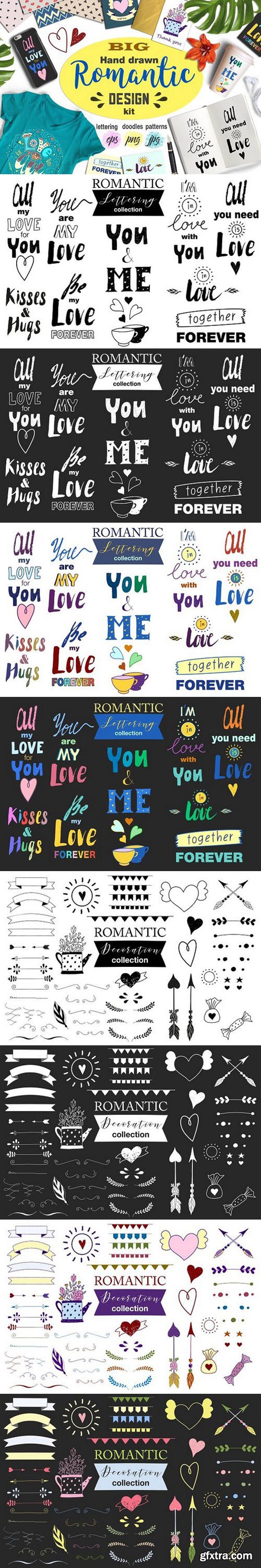
- EPS vector files with a set of romantic letterings (all letterings - on one vector file)
- EPS vector files with a set of romantic doodles and design elements (all elements - on one vector file)
- JPEG files with romantic letterings (each lettering - on individual JPG file 5000x5000px 300 DPI)
- PNG files with romantic letterings (each lettering - on individual PNG with transparent background 5000x5000px 300 DPI)
- PNG files with romantic doodles (each element - on individual PNG with transparent background 5000x5000px 300 DPI)


- EPS10 files with all graphics stuff from screenshots
- OTF and WOFF font files
- 5 fonts in complect (with special effects), plus aged version
- You can mix light, texture and shadow effects (look at 4-th screenshot)

- EPS10 files with all graphics stuff from screenshots.
- OTF and WOFF font files.
- 5 styles of font, named Team Spirit Regular, Team Spirit In-Out plus effect fonts named Team Spirit In-Out FX, Team Spirit In FX, Team Spirit Out FX.
- You can mix these styles how do you like. Because in complect 2 of the additional fonts - Team Spirit In FX and Team Spirit Out FX. For example: type your phrase in Regular, copy and past at same position and change font to In FX. Copy and paste at the same position and change font to Out FX. You will get Team Spirit font with outline and inlight! And you can change color of each element!

- EPS10 files with all graphics stuff from screenshots.
- OTF and WOFF font files.
- 6 styles of font, named OldWindsor Aged, OldWindsor LightFX, OldWindsor Regular, OldWindsor ShadowAndLight, OldWindsor ShadowAndLightFX, OldWindsor ShadowFX.
- You can mix these styles how do you like. Because in complect are included additional fonts - BOldWindsor LightFX, OldWindsor ShadowAndLightFX, OldWindsor ShadowFX. For example: type your phrase in Regular, copy and past at same position and change font to Shadow FX. Copy and paste at the same position and change font to Light FX. You will get OldWindsor font with shadow and light effect! And you can change color of each element!

Libertinas & co. is a handwritten typeface, with a casual, elegant and sensual style, with many possibilities to compose different titles, flyers, publications or typographic posters for example. In the commercial version, the font has an extra set of capital letters and another one of decorative lowercase for word end, also 3 stylistic set with more alternative letters and many other Open Type functions. Includes the Bitcoin symbol.
https://creativemarket.com/deFharo/1274649-Libertinas-co.
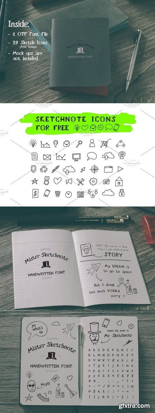
MISTER SKETCHNOTE HANDWRITTEN FONT And free bonus - 39 vector sketchnote icons. Mister Sketchnote Font is perfect for custom logotypes, sketches and doodles, personal diary or sketchnote workbook. Tell your own story using Mister Sketchnote. And make it a special with free sketch icons
https://creativemarket.com/dacascas/1243237-Mister-Sketchnote-Handwritten-Font
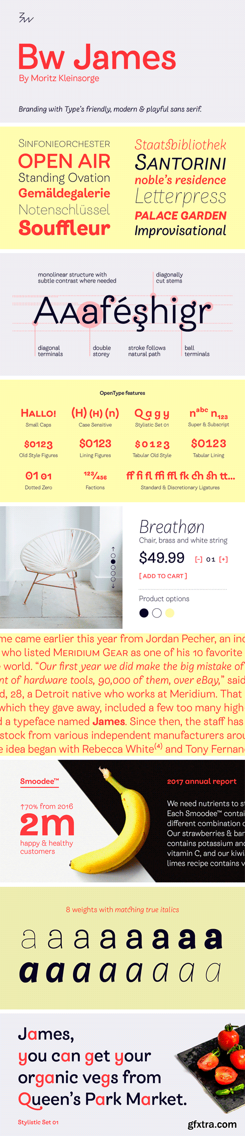
https://www.myfonts.com/fonts/branding-with-type/bw-james/
Designed by Moritz Kleinsorge, Bw James is a friendly and playful sans serif: The angled stems, branching spurs and ball terminals all contribute to a personable and friendly mood, while the mono-linear body makes the typeface appear fresh and modern. Bw James is a multi-purpose font family boasting eight weights, ranging from Thin to Black with accompanying true italics. This flexibility offers a wide range of design possibilities both for print and on screen. With more than 900 characters per style, Bw James comes equipped with plenty of OpenType features like small caps, ligatures, old-style and lining figures (proportional and tabular), fractions and case-sensitive forms. Moritz started working on Bw James during his university studies back in 2015. The typeface was further developed under the guidance of Pilar Cano from Letterjuice, as part of the Alphabettes mentorship program, then published by Branding with Type.


CM 1501378 - Sixpounder
Sixpounder - a new fresh handmade calligraphy font. Very suitable for greeting cards, branding materials, business cards, quotes, posters, and more! This font are perfect for wedding postcard. Or you can create perfect and unique design of your logo, blog, stationery, marketing, magazines and more :)

CM 1513792 - Horacio | A Prestigious Sans Serif
Introducing Horacio - perfect for any project you need to add a little prestige to. Create Prestigious Branding With Horacio! Whether you’re designing for a client or for yourself, you may be looking for a clean and minimalist font, one that oozes quality and is so versatile it won’t go out of fashion. Horacio is sleek, striking and timeless. It achieves this through its bold lines, discreet angles and smooth rounding. Horacio is perfect for corporate projects, branding, publishing, editorial, and logotypes, but is also adaptable and versatile enough to be used for multiple different projects.

https://www.myfonts.com/fonts/bitstream/bauer-bodoni/
Firmin Didot cut the first modern face about 1784 in Paris; Giambattista Bodoni followed prolifically on his heels; his punches and matrices survive in Parma. Bauer has produced the most faithful and delicate contemporary version of his types.
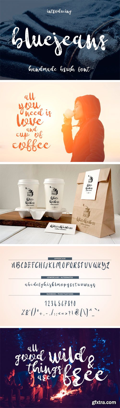
CM 1501782 - Bluejeans
Bluejeans is quite lovely font that you can use in many projects / designs. Please check “great for” section below to find out more.

ZEITGEIST FONT | A messi hand-brushed It’s playful, casual, and fresh, based on real handwritting. Available in 2 versions, regular & alternative. Both scripts are quite versatile and surely meant to grab attention yet bring positivity and excitement. Mix the characters up for more fascinating result!
https://creativemarket.com/hindiastudio/1371138-Zeitgeist-Font-25-OFF-Limited

CreativeMarket 30 Vector Topographic Maps 1414426
AI,EPS,
https://creativemarket.com/projectile/1414426-30-Vector-Topographic-Maps
This topographic map pack contains 30 unique designs generated from actual maps (using Google Maps elevation API) so they represent real places from all over the globe, including some deep ocean floors!
Some of the lines have been cleaned a little so that you can focus on those beautiful, natural contours created by the mother Earth herself. Just like real life, there will be some imperfections here and there i.e. rough lines or paths at some points.
Make sure you click on the preview / screenshots to see all 30 designs!
These authentic maps come in a few variations: multicolor (different contour line colors based on elevations), single color, sharp edges and rounded edges (done in post-processing). They are 100% vector so you can edit them in any ways you can think of.
Use the topographic maps for digital and print designs, gift wraps, backgrounds, social media banners, headers, wallpapers, book covers, gadget skins, patterns, fabrics – they will look so good!
Features:
30 unique vector maps
Natural contours generated from actual maps
Sharp and rounded edges options
Multicolor and single color options
100% editable and customizable
AI (CC & CS) and EPS formats

https://www.myfonts.com/fonts/linotype/alternate-gothic-lt/
Alternate Gothic was designed by Morris Fuller Benton for American Typefounders Company in 1903. All three weights of Alternate Gothic are bold and narrow. In fact, this face is essentially a condensed version of Benton’s other well-known sans serif types, Franklin Gothic and News Gothic. In the early twentieth century, the modern concept of type “families” had not yet been formed — and though Benton designed these sans serifs to harmonize with each other, the foundry gave them different names. Robust, dark, and coolly competent, Alternate Gothic is a good choice when strong typographic statements must fit into tight spaces. As a modern usage, it is currently the font of YouTube’s homepage logo.

https://www.myfonts.com/fonts/fontfont/ff-brokenscript/
Dutch type designer Just van Rossum created this blackletter FontFont in 1991. The family contains 2 weights: Bold and Condensed and is ideally suited for advertising and packaging, festive occasions, editorial and publishing, logo, branding and creative industries as well as poster and billboards. FF Brokenscript provides advanced typographical support with features such as ligatures, alternate characters, case-sensitive forms, and stylistic alternates. It comes with proportional oldstyle figures. This FontFont is a member of the FF Brokenscript super family, which also includes FF Brokenscript Rough.
SermonBox - Seasonal Collection

SermonBox - The Series Pack Collection

Top Rated News


Would you like to be a Author?


