
https://www.myfonts.com/fonts/fontfont/ff-brokenscript/
Dutch type designer Just van Rossum created this blackletter FontFont in 1991. The family contains 2 weights: Bold and Condensed and is ideally suited for advertising and packaging, festive occasions, editorial and publishing, logo, branding and creative industries as well as poster and billboards. FF Brokenscript provides advanced typographical support with features such as ligatures, alternate characters, case-sensitive forms, and stylistic alternates. It comes with proportional oldstyle figures. This FontFont is a member of the FF Brokenscript super family, which also includes FF Brokenscript Rough.

https://www.a2-type.co.uk/grot10
A contemporary take on the renowned ‘Grot Series’ from Stephenson Blake’s type foundry in Sheffield, England. The original cut of Grot No.10 was used as a principal source of inspiration for the design, from which we also added our own italic style.


http://www.fontsmith.com/fonts/fs-truman
Like Truman Burbank, the star of The Truman Show, FS Truman was born for TV. You’ll know it from Sky One’s on-screen trails and announcements, but it’s just as at home in other media. Its starting point was the skeleton of a highly legible, space-saving, corporate font with some of FS Dillon’s geometric discipline built in. Its distinctive tone of voice and “ownability” are in its boxy but friendly shapes, and characters with hybrid features. FS Truman’s weights and widths were honed to work at TV screen resolutions. A face for TV it may have been, but this is a font that works on every level, on screen, in print, in headlines, in listings, in longer text, in tight corners and open spaces.

https://www.typotheque.com/fonts/diurnal
Diurnal, is a Sans serif companion to Nocturno typeface, providing superb legibility at all sizes. Diurnal belongs to that group of rare humanist sans serifs designed for long, continuous reading, following the lead of Hans Eduard Meier’s Syntax (1969), or more recently Evert Bloemsma’s Legato (2004). Diurnal’s generous x-height and unapologetically calligraphic rhythm emphasise the sense of horizontality, leading readers’ eyes along for an immersive experience.

https://www.myfonts.com/fonts/wiescherdesign/eleganza/
Eleganza is my most elegant typeface. At least that is what I think! I use it for business cards and everything that has to be elegant with that extra touch.The font comes in pairs for the price of one. The “plus” version being the one with less embellishments.
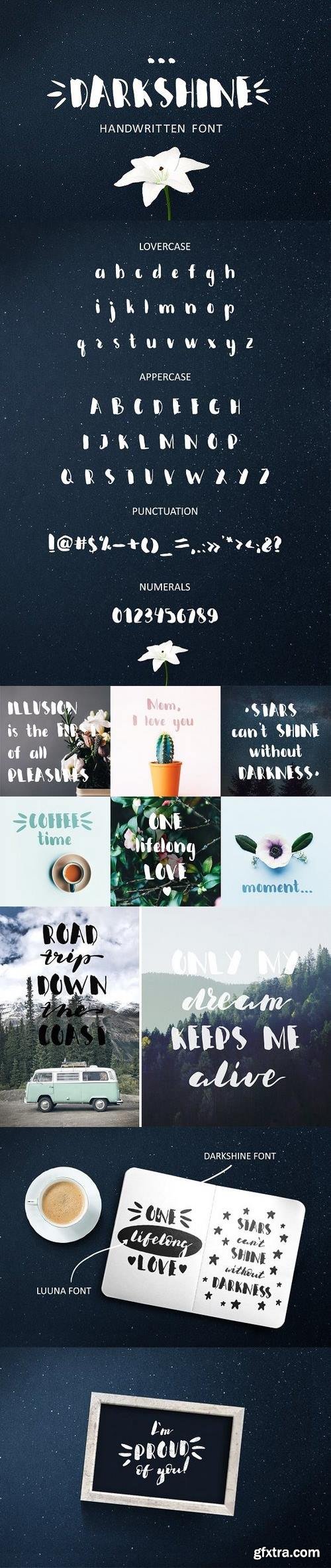
Hello everybody! I present to you my new font DARKSHINE! It's hand lettered script font which combines dramatic sweeping lines and a thin brush stroke. This is a great decoration element for your belongings, interior, pillows, shirts, posters, prints, weddings, apparel, packaging, invites, etc. Also you can place these phrases to your photos.
https://creativemarket.com/Wewhitelist/1243091-Darkshine-Brush-Font.-Script.

Bakinskay - comes is various styles - Regular, Slanted , and Upright - each with it's own unique personality to suit the look you are after. No special software - You do not need a special design program. The font will work in ANY text editor. This font are perfect for wedding postcard. Or you can create perfect and unique design of your logo, blog, stationery, marketing, magazines and more
https://creativemarket.com/zao4nik/1236867-Bakinskay-Handmade-Font-Brush

Sandglow is a fancy hand lettered script typeface with a clear style, good mood, and dramatic movement. It allows you to create beautiful hand-made typography in an instant. It’s suitable for headlines, logotype, editorial design, branding, letterhead, poster, apparel design, product packaging, label or anything that need handlettering style. Comes with many variations on each character, including uppercase, lowercase, numerals & punctuation, stylistic styles, ligatures, discretionary ligatures, and titling. You will also discover extras swash added to give that finishing touch to your texts.
https://creativemarket.com/Burntilldead/1243358-Sandglow

Give your designs an authentic brush handcrafted feel. “Boostpest” is perfectly suited to stationery, logos and much more.
https://graphicriver.net/item/boostpest-brush-font/20028030


http://www.myfonts.com/fonts/type-type/tt-norms/
Working on TT Norms font family, we've aimed to create a modern geometric grotesk with the widest implementation range, a reliable workhorse. This concept is reflected in the name of the font family TT Norms (Norm – from English norm, standard). The basis for TT Norms is the classic type character proportions. We've been especially careful working on geometry of each glyph, both from the point of view of visual correctness and forms continuity. The main version of TT Norms is of a neutral nature, which becomes more humanistic when stylistic alternates are on. Nine weights and nine corresponding true italics, a large number of ligatures, and broad support of OpenType features (ordn, case, frac, sinf, sups, dnom, numr, tnum, pnum, liga, salt) allow to easily adapt the font family for different purposes. TT Norms works equally well in large text arrays and in small headings, and it is “the one” universal geometric grotesk.

CM 1528069 - Anydore
The Anydore font is an elegant and strong handwritten script, Open Type and PUA Encoded. It comes packed with lots of alternate characters (Stylistic Set 1-18) that allow you to come up with unique designs each time you use it.
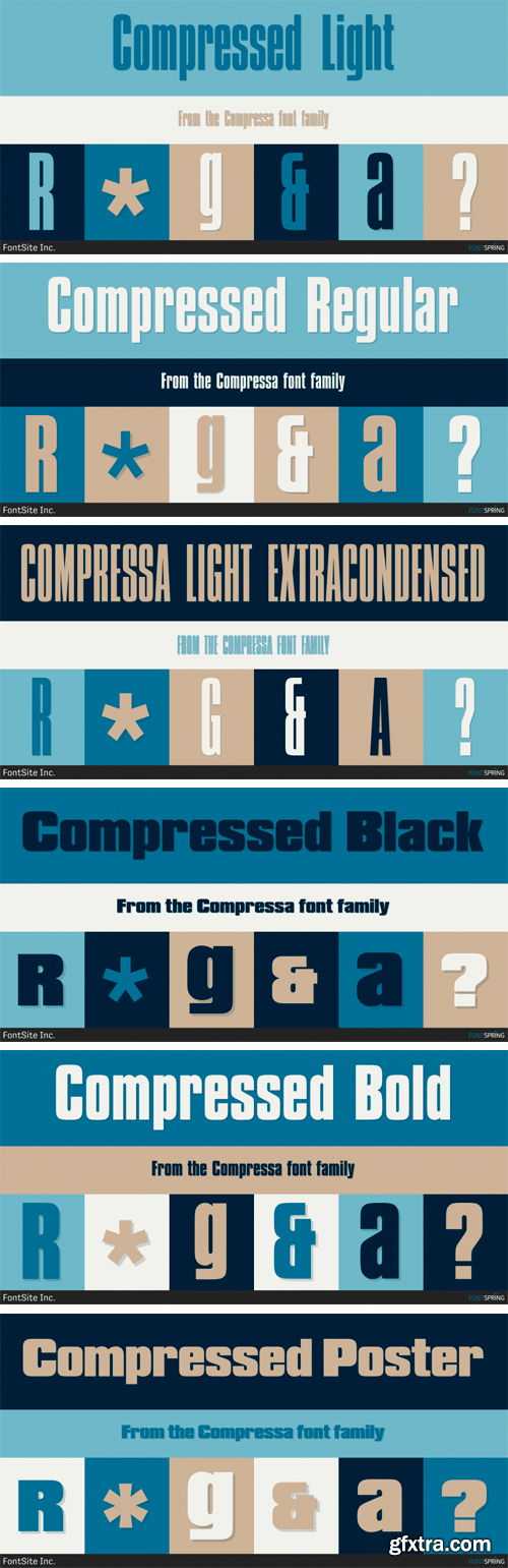
https://www.fontspring.com/fonts/fontsite/compressa
Compressa is a display sans font family. This typeface has six styles and was published by FontSite Inc.

CM 1527034 - Just Darling Hand-Lettered Font Trio
Just Darling was lovingly hand-lettered on an iPad, and offers a bit of variety. Just Darling is perfect for invitations, monograms, & cute feminine branding.

CM 1522497 - Ravello
This "Ravello Font" is well suited for various design projects, such as logos, advertising, quotes, packaging design and others.


https://commercialtype.com/catalog/chiswick_grotesque
Industrial in style, while retaining the essential character of the other families in the Chiswick collection, Chiswick Grotesque is a letterform from the nineteenth century’s bustling metropolises. Its boldness and crude, no-nonsense style suggest a form as suited to architecture as to print.
SermonBox - Seasonal Collection

SermonBox - The Series Pack Collection

Top Rated News


Would you like to be a Author?


